Palladio is a data analysis tool that leaves me wanting more information. Although it has the ability to group students by matching song choice, it does not attempt to make a judgment call on why a student chose the songs they chose. By grouping us in the groups I see, Palladio is obviously a number cruncher of sorts. This ability to produce connections based on raw data numbers helps us to eliminate the people who we had song choices that did not match up with our own and to focus on those that are most connected. To know WHY a student chose the songs they chose is not possible based on the data; however, we have a treasure trove of information in our WEEK 8 assignment to guide us. In order to find real connections, I took a look at my group. Next, I looked at a few specific song choices where I matched up with the masses. I also looked at three songs that I picked that were very sparsely chosen. Finally, I picked one student who seemed to make the fewest matches to my song choices.
Part 1 – People who matched up with my choices the most.
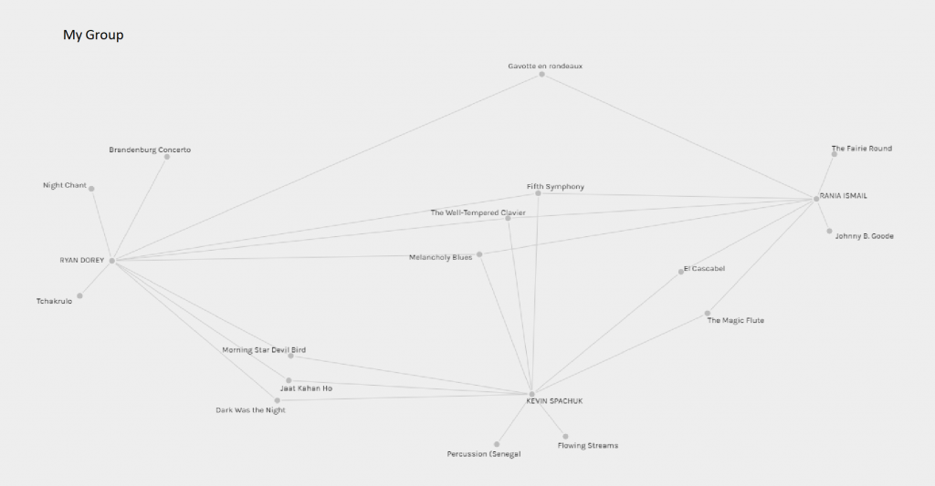
The graphic above is a Palladio visualization of group I was placed in along with Kevin and Rania. While we shared a set of 3 songs in common out of our 10-song choice, we also had 2 to 3 songs that none of us shared with the other. This led me to question the grouping system used by Palladio. I was unable to decipher whether Rania and Kevin were fans of Bach based on the results. The fact that Kevin and I shared 6 of our ten songs was amazing from a probability standpoint, however, when I saw that we were about the same age and both white and male, I began to see connections. Having both avoided Johnny B Goode seemed like it was against the odds in some ways, but my choices wee curated based on the events of the week as much as my love for old time rock and roll.
Looking at the remaining groups I got a picture of what was popular and what was not. The Blue denotes popular piecesthe read is a map of the curators. The Lime green were songs that appeared very few times.in the groups analyzed.
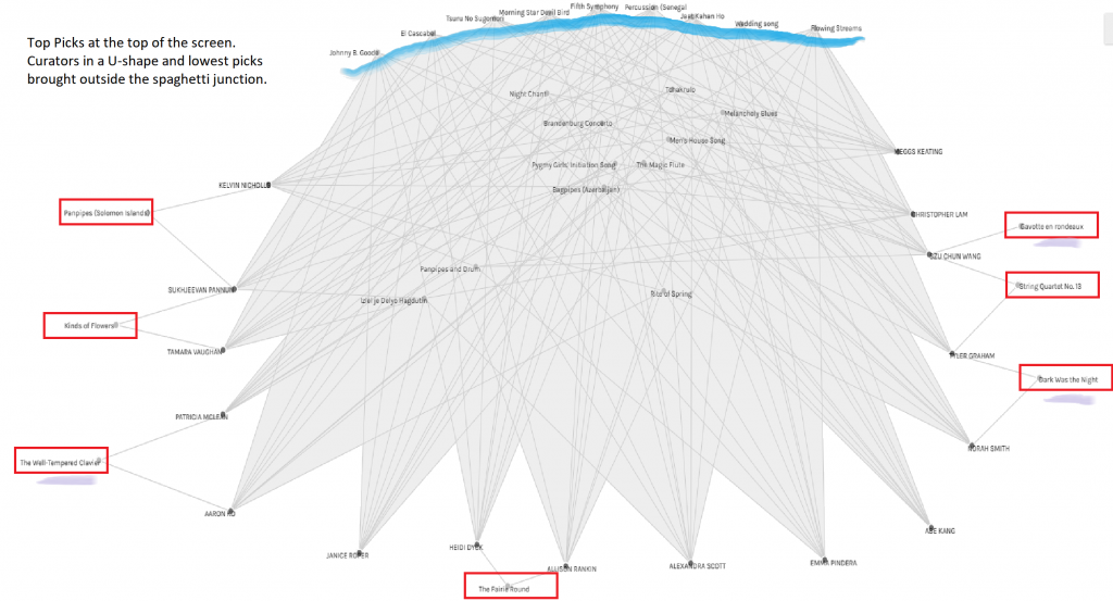
The big winners in the musical lottery were Jaat Kahan Ho, Morning Star/Devil Bird, and Beethoven’s 5th. Of the three pieces I had only ever heard of Beethoven 5th. After listening to the other two pieces, I knew they had to be apart of my collection. While I was not able to tease out why these three were so popular, I know that they all took us under their spell. There is little connection between the three pieces beyond being great examples of their craft.
What made me go back and study the Palladio visualization even more was the songs that I chose that did not find a connection in the minds of my classmates. These songs were Bach’s Fugue in C minor played by Glenn Gould, Bach’s Gavotte Rondeaux and the Blind Willie Johnson song “”Dark was the Night”. The Bach pieces were probably true outliers with all the classical competition from Beethoven and Mozart in the list.
The one that surprised me the most was the Blind Willie Johnson song. We had just come through a painful week of recognition that our societies basic systems were flawed. People were protesting the fact that an individual’s safety was not only not guaranteed in the hands of the people that have pledged to serve and protect. In fact, it was worse than we had thought based on the number of cases of injustice that had come to light. This song echoed the plight of a man whose position in society should have been secure, yet he died a pauper in the burned-out hull of a house that he should have called home. Life is not fair, but we are now more aware than ever that the scales are tipped in favour of one group over another, and this played a part in my decision to choose this song. I gave the aboriginal songs from the Navajo and the Australian outback a second look after discovering they had not made my top 8. Both songs were chosen on merit, but the fact that we were reflecting on race during this time, gave me pause.
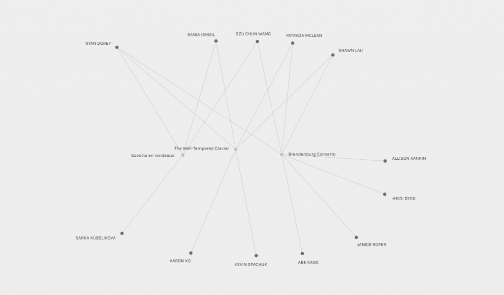
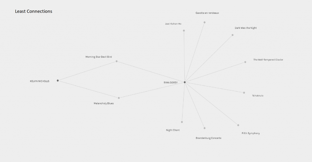
The Palladio visualization for the people least connected to me was my favourite part of the night. I have a love of choirs and a distaste for panpipes, so Kelvin and I did not see eye to eye on our choices. Kelvin mentions that he began his selection by focusing on instrumental pieces and then looking for a diverse selection that showcased world music. He also mentions growing up with the radio playing music in his house a lot. Piano lessons and CBC were a main stay for me and as a choir boy, I started my selection by picking choirs. This may partially explain our differences. While Palladio does not tell us why, it does lead us on a path that we may not have been able to find on our own. With a mere two overlapping songs though, I think this represents a near statistical impossibility, and we might benefit from buying a lottery ticket each this week.
While our musical taste may differ, it is unclear whether that is a conclusion we can reach based solely on the factors involved when choosing a set of songs. We all came at the problem with our own set of preferences, but there was no clear rubric that outlined how to choose the songs and this leaves so much up to fate that it would be silly to try and reach real conclusions strictly based on the results of the Palladio visualization. The true nature of our decisions lies deep within us, like an iceberg that may appear as one thing on the surface of the ocean but be something wholly different when viewed from below. I think the cables that stretch across the ocean floors might see the iceberg from a different perspective.
Hammel, N., & Yurshansky, L. [Nat and Friends]. (2016, December 16). A Journey To The Bottom Of The Internet