Comments on the front page of the UN Refugee Agency website.
From my point, the front page of the UN Refugee Agency is pretty good. First, the color choice is good and clear. The designer used light pink to represent the refugees, dark blue to show the asylum-seekers and light green to represent the internally displaced persons. The designer also used a light grey to show the world map. The combination of these colors not only makes a good contrast, but also increase readers’ interests on this map. Second, the user experience is also good. When people move the mouse over the map, they can notice the specific number occurring on the country. Then they click on the country, the chosen one will be highlight and other countries will become dim. This is more convenient for readers to choose countries and get the data. In addition, this map collects the refugee’s data from 1951 to 2015, and a histogram is created for the statistics. When readers click on other years, the corresponding map will change. This is easier for readers to see the differences during these years. However, the most obvious defect is the circle size. Even though the circle is enough big and clear for some countries, like Syrian, Iraq and Colombia, it is very small or invisible for some South America countries, like Bolivia, Argentina and Peru. Readers cannot see the circle occurring on these countries, but when they click these countries, the number of refugees is still existent. Moreover, the legend and explanations are clear and detailed for the readers. The designer made a particular interpretation for the representative colors. As a result, to be an infographic, this page contains good and visible map, detailed text information and clear graphs. On the whole, this front page is attractive and beautiful.
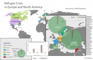
Inforgraphic