Monthly Archives: December 2017

Environmental Risk Assessment: Garibaldi at Squamish Project

The Maps and report included below are taken from Lab 5 of my Geob 270 Class. Out of all the labs, this lab, and the resulting map and report was my favorite to produce, as well as some of my best work from this class. As background, the report is written from the perspective of a natural resource planner working for the project proponents. The report is meant as an environmental impact assessment, in order to advise the proponents on how to continue in the face of environmental concerns. I will first present the map, report and hillshade, followed by a conclusion after the fact. Hope you enjoy.

The Garabaldi at Squamish Project is a ski resort development project located on Brohm Ridge just outside of Squamish. The ski resort includes 124 ski trails and 21 lifts, along with resort accommodation and multiple commercial developments. There are a number of past criticisms of the project’s environmental impacts from the BC Environmental Assessment Office, as well as Whistler Ski Resort. The BC EAO found the original proposal lacking in information as to potential effects on vegetation and wildlife habitat, while Whistler cited climatological considerations which had been overlooked, such as the scientific climate projections which would make skiing unreliable or not possible on the lower 600m of vertical.

As a natural resource planner hired by Garabaldi at Squamish project, I hope to evaluate in this report, previous criticisms of the project as well add my own opinions and assessment to light. I will first explain my analysis of the development and its environmental concerns as well as present the results of this analysis. I will pair this with a discussion what I personally believe to be the most important of the environmental concerns presented, as well as my thoughts on what options the project developers have as to mitigating these environmental concerns.

Analysis:

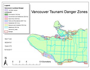
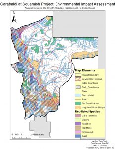
My analysis and assessment of this project is situated around a map I created in order to visualize the cumulative effect of all environmental concerns which pertain to Garabaldi at Squamish. Each concern will be also be discussed and analyzed on its own, in order to show the relative weight of each of these concerns.

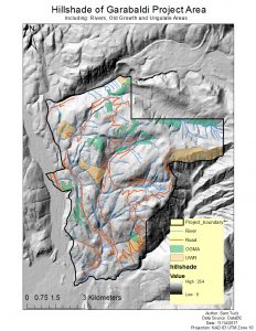
In order to analyze the proposed projects effects on the natural resources and ecosystem services that Brohm Ridge provides, I first obtained data from the BC Government as to relevant environmental concerns in the area. These included: Ungulate Winter Ranges, Old Growth Management Areas, Terrestrial Ecosystems, Rivers and a digital elevation model and landscape contours to highlight climatic change concerns. I then combined all relevant layers and clipped them so that only the environmental concerns which existed within the project boundary were addressed:

The first concern addressed was climatic. I used a digital elevation model to find just how much of the proposed resort would be in danger of un-skiiable conditions, based on climate change models indicating significant loss of snow pack on the lower 600m of vertical by the time this resort would be built and operational. According to my analysis, the lower 600m makes up 31.789% of the total project area.

I then moved to analyze what animals and vegetation would be impacted by the project; specifically, species and habitats which are already endangered, redlisted or protected under environmental law. I found, through comparing the area that these protected habitats and species take up to the total project area, that:

  • Old Growth Forests make up 6.78% of the total project area.
  • Ungulate Winter Ranges account for 7.89% of the total project area (mule deer = 4.24%, and mountain goat = 3.65%)
  • Fish bearing streams and associated riprarian habitats make up 28.43% of the total project area.
  • Red-listed species habitats make up 24.83% of the total project area. (Falsebox, Salal, Cladina, Kinniokinnick, Flat Moss and Cat’s Tail Moss)

Response and Suggested Mitigations:

Not including the lower 600m of vertical, the total amount of project area which is taken up by protected areas is 53.7%. As you can see from the map, many of these protected areas overlap, and thus a key element to analyzing environmental impact is the cumulative effect that the project could have on protected flora and fauna, especially in these key areas of overlap. As such it is important to not think of these environmental concerns as existing as mutually exclusive from one another, but as acting interdependently, as all of these elements of concern such as vegetation and animals exist as part of an ecological system where effects on one ripple throughout, to impact the whole system.

That being said, if I had to point to what I believe to be the two greatest environmental concerns to the projects development, I would choose 1. Climatic change models affecting snowfall and 2. Red listed species habitats.

I choose climate change models due to the fact that climate change is a very real process which is very difficult to mitigate in a short period of time. Assuming the models presented are correct, then by the time the project is completed and open to the public, actually having snow for guests to ski on may threaten the viability, and profitability of the initial investment to build the project.

Red-listed species I also believe to be one of the greatest concerns due to the fact that, based on the map, these species exist generally within the lower 600m of vertical. Furthermore, and possibly of greater importance, as vegetation they can be easily disturbed or threatened from not only the massive construction, logging and general resort development, but also the continued use of the area as a ski resort. As they are species which are already significantly threatened, and due to the fact they take up such a large percentage of the project area; I would argue they are of greatest concern to the projects environmental impact.

Conclusion:

While the first concern I have presented really has no way of being mitigated directly through the building of the project, the second concern might be mitigated in a number of ways. First, I would suggest that these areas be identified and marked so that construction surrounding them is minimized or controlled so as not disturb their growth. I would also suggest creating environmentally sensitive boundaries for skiers and resort guests so as to further protect these species from disturbance.

For this Lab I was assigned the role of a natural resource planner who was hired by the people in charge of Garabaldi at Squamish. Thus, while in the report I try and stress the importance of addressing environmental concerns; I inevitably have to side with the project and assume that it will continue as planned. However, personally I do not believe that this project should go through; not only because of the environmental concerns associated with it (which, from my analysis and resultant map seem to be overwhelming) but also, as hinted in my suggestions, simply not economically viable for the project proponents. It seems to me to be absurd to be building a completely new, and incredibly ecologicaly distruptive ski resort at a time when science is overwhelmingly in agreement of the empirical truth of climate change and global warming. Not only will temperature levels continue to rise along with the number of extreme weather events, but these are only estimates based on our current consumuption levels, and are not able to predict the cumulative effects of continued consumption over the number of years it takes to slow down our current rates of growth. Furthermore, earths climate cycles are slow in relation to human cycles of development. It is possible that we are only seeing the tip of the iceberg when it comes to climate change, and that all we do to stop our consumption will still not have and effect on the resultant warming levels. Thus; not only is it irrational to build this resort in the face of this science and the predictions for snowfall on the lowest 600m of vertical, but it is also seems absurd to pair this fact with the large-scale ecological disruption needed to build such an inevitably  doomed project. While the project proponents may make their money back, the time frame in which it will take to complete the project, attract visitors and begin making profit is just too long to fit inside the short window climate change has allowed us to continue our current lifestyle. Thus I believe it is not only absurd from the point of view of a resource conservationist or environmental scientist; it is also economically irrational and unviable as an idea.

Housing Affordability: Vancouver vs. Ottawa

The classification of quantitative data in an extremely important process in GIS. However, it is also a process which involves ethical questions relating to what information are you trying to get across to the reader. Because it is displaying how social data interacts with the physical environment (and possibly a combination of social data sets such as in the maps for this lab), it is necessary to take into account whether the classification you have chosen is the right one for presenting your data.

For example, the above map shows the same data displayed using four different classification methods; for each one, different conclusions can be drawn simply based on the mode of analysis. Therefore, understanding the purpose of the map is paramount. For example, if I was a journalist and I wanted to choose a classification in order to present this data to my readers, the map I would choose would depend on what the point of my article was. If I wanted to present Vancouver’s ‘livability’ being exaggerated due to the unaffordable housing in the city then I would probably choose Natural Breaks as a classification method. This is because it would have the most shock value in terms displaying just how unaffordable it is to live in certain areas of Vancouver.

Or, if I was a real   estate agent and wanted to use these maps to convince my client to buy a house near UBC, my choice of data classification would ultimately depend on the prospective buyer and their situation. If they had a lot of money, I would probably show them the Manual Breaks. This would be to show them that, as shown on the map, housing prices near UBC, while expensive, give them the best location and access based on price. Furthermore, according to this representation they are not the most expensive. If they were lower income, I would probably present the Equal Interval map, as it makes it seem as though housing costs in that area are lower than they actually are.

From these examples the idea that there is no such thing as ‘true’ data or ‘true’ maps. How I present the data to the buyers or to the public has ethical implications as really it is just a representation, which can be used or skewed in order to argue a point, or present a situation a certain way.


These points relate strongly to the question of housing affordability, especially in a city such as Vancouver. Housing affordability is defined as the ratio of household income to cost of owner dwelling. This is an example of a mix of social data sets, which represents affordability better than just having, say, housing cost alone, due to the fact that it takes into account the socioeconomic factors of the population in that area. If housing costs are very high in a city, but people in that city are, on average very rich, it may make sense to call that area “affordable”. Thus, we can see from the above two maps how this combining of data has an effect on the issue it displays.

However, what is “affordable” also depends on the accepted standards. The housing affordability ratings in the above map is determined by the “13th Annual Demographia International Demographia International Housing Affordability Survey”; a survey produced by leading researchers from Australia, Canada, China (Hong Kong), Ireland Japan, New Zealand, Singapore, United Kingdom and the U.S. I would argue that this rating can be trusted as it is created by leading researchers from around the world. However, these countries still represent a small fraction of the world; representing mainly the West, and countries which are largely “developed”. Thus I would stress the importance of only analyzing the affordability of regions which fall into a similar category of development.

Moreover, the question arises as to what housing affordability really represents in terms of the city. Is affordability a good indicator of a city’s ‘livability’? I believe that yes; It is a good indicator generally speaking. However, it would be wrong to take it as the only factor in determining ‘livability’; a number of other factors must necessarily enter into the picture. Take Vancouver for example. While housing is deemed ‘unaffordable’, the city is deemed (or at least promoted as) ‘livable’. Therefore there is a further question of what ‘livability’ is, and who gets to define it.

If anything, these maps and their analyses point to a need to look at maps a simply a representation, and to question categorizations of data or things as easily distinguishable from one another. These spatial analyses of qualitative data are inherently related to the political and social message which accompanies their representation of phenomena across space.


Vancouver Flood Risk Analysis: Identifying Tsunami Danger Areas

In this lab, we were tasked with making a map indicating the effects of a tsunami on Vancouver. While we have Vancouver Island to protect us from the majority of the flood damage, Vancouver would still be affected. The analysis asks: what areas would be deemed ‘danger zones’ for flooding, or ‘zones’ which are at least one kilometer from the shoreline, and are 15 meters or less above sea level. The above map includes land use type and roads for these areas which would be affected, as well as areas indicating a need of signage in the event of a tsunami in order to communicate the danger to the general public.

I found from my analysis that a total of roughly 15% of Vancouver’s total area is in danger of being affected. To find this figure I completed a number of analysis steps in Arc Map:

  • Reclassified the areas below 15 metre elevation
  • Performed a buffer analysis of areas 1 kilometre from the shore
  • Used the intersect tool to combine the two factors into one polygon summarizing the total area at tsunami risk.
  • Using this polygon, I was then able to clip the landuse data to it and determine the landuse categories which existed in this ‘danger zone’ as well as their individual areas.

For further analysis, I also identified healthcare and educational facilities which exist inside this zone by clipping city data on the location of healthcare and educational facilities to this ‘danger zone’ polygon, and identifying the location from there.

The facilities in danger from a Tsunami I found to be:

  • Healthcare = BROADWAY PENTECOSTAL LODGE, COAST WEST COMMUNITY HOME, FALSE CREEK RESIDENCE, VILLA CATHAY CARE HOME, YALETOWN HOUSE SOCIETY
  • Education = EMILY CARR INSTITUTE OF ART & DESIGN (ECIAD), INSTITUTE OF INDIGENOUS GOVERNMENT (IIG), HENRY HUDSON ELEMENTARY, FALSE CREEK ELEMENTARY, ST FRANCIS XAVIER, VANCOUVER MONTESSORI SCHOOL,ST JOHN’S INTERNATIONAL, HERITAGE 3R’S SCHOOL, ST ANTHONY OF PADUA, ECOLE ROSE DES VENTS

Some skills I gained as a result of this analysis:

  • Reclassified DEM data from the City of Vancouver in order to identify low-elevation areas in risk of flooding through a proximity buffer analysis.
  • Created vector polygons in Arc’s edit feature, delineating zones in need of tsunami danger signage, based on above areas of elevated flooding risk.
  •  Calculated area of risk through using attribute query functions to identify specific land use types affected by flooding.

GIS – The Basics: Coordinate Systems, Data, Projections

Hi everyone! As term 1 is nearing its end, I will be uploading parts of the labs I have been working on throughout the term. Throughout this course we have had a lot of hands on experience in lab, building our understanding of ArcGIS software, its uses and properties. I hope some of what I learned comes across in these posts, and I hope you enjoy the maps and final project that I have created along the way.

Coordinate Systems:

Coordinate Systems are basically arbitrary designations for spatial data. They provide a common basis for communication of a particular place or area on earth (for example, conic projections vs azimuthal projections). The reason why you can’t combine data with different coordinate systems to analyze it is that when data is projected into a different coordinate system, properties of Shape, Area, Distance and Direction can all be affected. In lab, we were given a number of misaligned or improperly referenced spatial data and we had to fix these in order to analyze the data properly. There are two methods to achieving this, both with distinct pros and cons:

  • Projection on the fly: this is a built in feature of ArcMap, where the software makes it look like the two data layers are in the same coordinate system, when actually they may not be. Projecting on the fly also allows you to go into the properties of a layer and change the information in order to make this happen manually.
  • Arc Toolbox: Project Command – While the above method works for display, for spatial analysis it is better to use Arc Toolbox’s ‘Project’ Command to actually go in an transform the data in order to create a new layer under a common spatial reference system.

Landsat Data:

What are the advantages of using remotely sensed data for geographic analysis?

Landsat Data is basically data gathered using a satellite to scan and capture images of earths surface. This data can be very powerful, as, due to the nature of satellites in relation to earth, a very large number of images can be captured over a long time frame. This is great for large scale raster analysis; for example analyzing land use change over time. However, one disadvantage is the fact that because it is satellite imagery, localized analysis of features such as roads are inaccurate. This connects to the mixed pixel problem, which states that in raster at low resolution, all variation within a pixel is lost. I have included a number of images created in lab showing the pros and cons of this data. The image in red is a landsat analysis of landuse change for Mount St. Helens, while the green shows the mixed pixel problem at work; the vector line is the actual position of a road, while the pink and red raster pixels also represent the road; albeit a less accurate version from raster landsat data.