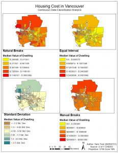
The classification of quantitative data in an extremely important process in GIS. However, it is also a process which involves ethical questions relating to what information are you trying to get across to the reader. Because it is displaying how social data interacts with the physical environment (and possibly a combination of social data sets such as in the maps for this lab), it is necessary to take into account whether the classification you have chosen is the right one for presenting your data.
For example, the above map shows the same data displayed using four different classification methods; for each one, different conclusions can be drawn simply based on the mode of analysis. Therefore, understanding the purpose of the map is paramount. For example, if I was a journalist and I wanted to choose a classification in order to present this data to my readers, the map I would choose would depend on what the point of my article was. If I wanted to present Vancouver’s ‘livability’ being exaggerated due to the unaffordable housing in the city then I would probably choose Natural Breaks as a classification method. This is because it would have the most shock value in terms displaying just how unaffordable it is to live in certain areas of Vancouver.
Or, if I was a real estate agent and wanted to use these maps to convince my client to buy a house near UBC, my choice of data classification would ultimately depend on the prospective buyer and their situation. If they had a lot of money, I would probably show them the Manual Breaks. This would be to show them that, as shown on the map, housing prices near UBC, while expensive, give them the best location and access based on price. Furthermore, according to this representation they are not the most expensive. If they were lower income, I would probably present the Equal Interval map, as it makes it seem as though housing costs in that area are lower than they actually are.
From these examples the idea that there is no such thing as ‘true’ data or ‘true’ maps. How I present the data to the buyers or to the public has ethical implications as really it is just a representation, which can be used or skewed in order to argue a point, or present a situation a certain way.
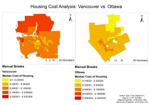
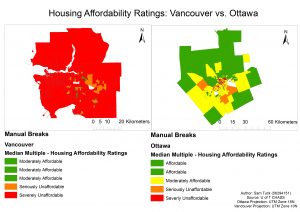
These points relate strongly to the question of housing affordability, especially in a city such as Vancouver. Housing affordability is defined as the ratio of household income to cost of owner dwelling. This is an example of a mix of social data sets, which represents affordability better than just having, say, housing cost alone, due to the fact that it takes into account the socioeconomic factors of the population in that area. If housing costs are very high in a city, but people in that city are, on average very rich, it may make sense to call that area “affordable”. Thus, we can see from the above two maps how this combining of data has an effect on the issue it displays.
However, what is “affordable” also depends on the accepted standards. The housing affordability ratings in the above map is determined by the “13th Annual Demographia International Demographia International Housing Affordability Survey”; a survey produced by leading researchers from Australia, Canada, China (Hong Kong), Ireland Japan, New Zealand, Singapore, United Kingdom and the U.S. I would argue that this rating can be trusted as it is created by leading researchers from around the world. However, these countries still represent a small fraction of the world; representing mainly the West, and countries which are largely “developed”. Thus I would stress the importance of only analyzing the affordability of regions which fall into a similar category of development.
Moreover, the question arises as to what housing affordability really represents in terms of the city. Is affordability a good indicator of a city’s ‘livability’? I believe that yes; It is a good indicator generally speaking. However, it would be wrong to take it as the only factor in determining ‘livability’; a number of other factors must necessarily enter into the picture. Take Vancouver for example. While housing is deemed ‘unaffordable’, the city is deemed (or at least promoted as) ‘livable’. Therefore there is a further question of what ‘livability’ is, and who gets to define it.
If anything, these maps and their analyses point to a need to look at maps a simply a representation, and to question categorizations of data or things as easily distinguishable from one another. These spatial analyses of qualitative data are inherently related to the political and social message which accompanies their representation of phenomena across space.