Network Assignment Using Golden Record Curation Quiz Data
For this task, our Golden Record choices were compiled into a .json file and then uploaded to the Palladio Data Tool where we were asked to analyze the visualizations and reflect on the implications and outcomes of their generation.

“Holy interconnected web of confusion, Batman!” – Is what I imagine Robin would say if he opened Palladio and saw our .json file. At first look, I felt immediately defeated because not only was this something completely new to me, but visually, the text was small and overlapping which made it difficult to read, and it seemed as though there was no rhyme or reason to why ALL the data was displayed this way.
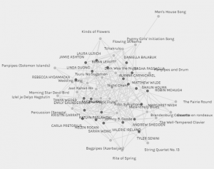
Entire Curator/Song Group
After watching a few tutorials and troubleshooting my way through the various options for displaying the data that Palladio offers, I created 3 different graphs that I was interested in exploring further; All male data and all-female data. The reasons for the interest in gender are actually based on discussion and learning that took place in the ETEC 565s summer intensive I just finished. I was curious to see if there were similar responses for each group and what type of data might be missing, misinterpreted, or assumed because of it.
When I looked at the male graph grouping there were a few things that I noticed:
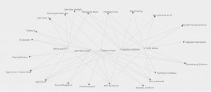
Male Grouping
The first was that there were only 5 males in our section of this course. I actually went back to check the student blog spaces to make sure I wasn’t assuming gender based on stereotypical male/female names and ended up finding that one male in our section on the site was not listed here, in Palladio – this made the results of this particular graph somewhat invalid as not all the data is represented. As an aside, this is something that is challenging for all programs where data needs to be imputed as something can always be missed or miss-inputted. I thought it was very interesting that only 6* males were in this course, though my thoughts surrounding that is another bag to unpack at a later date.
Next, there were three songs that all 5 curators chose; Johnny B. Goode, Fifth Symphony, & Night Chant and based on this grouping one could say that it represents a diverse selection of musicality. However, knowing that these 3 songs were all chosen by male curators, one could also make the assumption that each of these songs represents strong male voices and instrumentation in three different aspects of music, thus coming to a biased conclusion that the songs were chosen to represent the strength and power that males have in the musical world.
But, there is data missing, specifically, qualitative data that is not provided here. If we are asked to determine the reasons behind the choices, then no, this form of visualization is unable to show us that. But that is not the purpose of the Palladio project. From its website it is stated that “Palladio works best with data that is uniform, consistent, and simple.” Asking for the reasoning behind personal choices is not simple data. It’s complex, unique, and characteristic of the individual with whom the data belongs to.
I then moved on to the female graph:
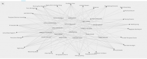
Female Grouping
Again, you can see that there are 17 females but that unlike the male grouping, we didn’t have a single song that all of us chose. There were many songs that had more than half selected, and only 2 that were chosen by one person each. One could say, looking at this data, that it represents again, a variety of diverse selections of evenly weighted choices. That this visualization represents a group that holds no biases towards race, gender, or ethnicity and has selected songs that are both instrumental and vocal. However, a person who is gender-biased, among other things, could also say that this data shows that women can’t make up their minds, narrow down their choices, have opposing opinions, or have no opinion at all based on the wide variety of songs that were chosen. Again though, this is based on assumptions of gender bias and what is quantitatively shown.
However – food for thought: When you look at the 27 songs that we were asked to choose from, 23 of them were either recorded or sung by males, with only 4 sung by or recorded by women. So could we actually say that the songs of the Golden Record held political implications of gender bias as it did not provide an accurate representation of all genders? I think so.
In my final thoughts, I look back to our readings this week, when it was said that “documents with more hyperlinks were statistically more likely to be encountered.” Could the same be true about the link between each curator and song choice? That the songs with the more links were actually found to be “searched” for more on the web than those with fewer links? Possibly. If we take Beethoven’s Fifth Symphony for example, it is one of the world’s most popular songs, and therefore, more likely to be searched more often than others. If we pull gender into the equation, the only bias and assumption that can be made are from those analyzing it, not the visualization tool itself. I was the one who created those groups, not the tool. Therefore, while I think that quantitative data can give us understanding into counting and measuring information, qualitative data is needed to derive answers that are conceptual and descriptive. Visualization is important, as we can construct meaning from it, however, we need more if what we are looking at doesn’t make sense to us or for the answers we are looking for.
This is a MEGA fascinating approach, and one I did not even know was possible with this software! Agh! I need to go on a Palladio course and have this conversation all over again.
A highlight for me:
“Asking for the reasoning behind personal choices is not simple data. It’s complex, unique, and characteristic of the individual with whom the data belongs to.”
Also, the fact that you mentioned how quantitative data may easily reinforce gender biases that already exist. That I think is the crux of this week for me, that data visualisations make it feel like you’re getting accurate insights into complex data sets but there is no way to really ensure objectivity.
We both ended up reflecting on the need for a combination of qualitative and quantitative data for insights, which I’ve seen a few others post about as well. Seems it is another key finding for this week!
“That I think is the crux of this week for me, that data visualizations make it feel like you’re getting accurate insights into complex data sets but there is no way to really ensure objectivity.” – You really nailed it, Jamie. This method of data collection and production really doesn’t allow for us to be objective as we’re basically told what the connections are in a quantitative matter. It would be interesting to see how the nodes would arrange themselves it the data included personal information, such as reason’s why, demographic, etc.