Linking Post #6

For my last linking post #6, I’ve decided to link to Jamie Ashton as both our Final Projects spoke to the Hashtag. 

You can find Jamie’s final project HERE, and my final project HERE.
Summary

Jamie created her final project using a slide deck and saved it to a PDF for easy viewing on any device – though apparently mobile is the best way to view it. Each slide had an image or two, placed beside written text with some keywords or phrases bolded to make an impact on the reader. Through wittiness and rich history, she explains where the symbol originated,  “libra pondo,” and how it has evolved into what we know now the “hashtag.” Furthermore, she speaks about educational literacies and how the hashtag might, or might not, have a role to play. She ends off by showcasing the different usages and names that the symbol has represented over the years and asks her readers to see if they can determine why.

Reflection

What a fitting end to a great conversation. Throughout the course – Jamie and I have responded to each other’s posts on multiple occasions – Jamie even linked to my emoji story earlier on. She has provided me with opportunities to reflect on my posts through her rich analysis and reflection of my writing – and this last linking assignment seems quite fitting as we both have chosen to discuss the hashtag – though it’s been done in a different medium and with different information. In fact, I would say that Jamie has undoubtedly provided a Wikipedian description, whilst I have dug deeper into an Oxford Dictionary definition of the Hashtag. 

While both Jamie and I chose the “Hashtag” as our main topic, we each took a very different approach to how we shared the information. I believe that choosing a medium where her writing could shine was a smart and obvious choice for her based on the information she has shared on her personal blog space. Jamie has a major in Linguistics, part of which focuses on semiotics, and along with her religious studies degree which involved history/anthropology/sociology/media/economy and politics of religion – a final project on the evolution of the hashtag fits perfectly. While I chose to do a podcast, again this could potentially be an obvious choice for me since for 2 previous tasks I chose to create audio versions using my own voice to share information. Even though our mediums are different, looking at it through this lens shows a connection to our own prior knowledge and preferences. 

The choice of using a slide deck allows Jamie to handpick the images that she wants her readers to see – almost creating their connections for them, while in a podcast, the images are left to the listener’s imagination or own prior-knowledge of what is being discussed. Neither is better than the other as they both provide different experiences – however, for what is being discussed, I think Jamie chose a great medium. I also think that a video documentary would have added to her project more – as I think that hearing a voice speak the words provides a deeper connection to the text. Vice versa, if my podcast has been video recorded as well, I could have imputed images into the video version, thus allowing for a similar experience that Jamie is able to provide. The constraints of the course design allowed for us to choose our medium, however, I’m not sure which medium Jamie’s deck fits into – which leads me to believe that she spoke to our instructor to come up with requirements for it. 

On a final note, something I did find interesting was when she said that hashtags are now shifting,  “taking grassroots groups and moving them into the digital realm for global audiences to participate in.” This is exactly what Messina had wanted all along, to allow “anyone who could write text on the internet to participate in global conversation.”


Linking Post #5

For my link #5, I decided to link to Rebecca Hydamacka’s Speculative Future, in particular “The History,” with my final project, The Hashtag as a Narrative. 

You can view Rebecca’s Speculative Futures HERE, and my Final Project HERE
Summary

Rebecca really dove deep into this task creating two speculative futures, one that features a twine game (co-created by yours truly) and the other about generational future and how knowledge has been preserved. She speaks about many different technologies we could see in the future, from Memglasses, solar powered wrist interfaces, solar cycle, and nanofiber, to The History – which is what I am linking to. She includes images, conversations, the twine game, documents – creating a true multi-modal piece of work.  

Reflection

Firstly, if you haven’t read any of Rebecca’s posts the one thing you need to know is that she is a vivid storyteller. Her imagination is full of inventive and alluring creations and this speculative future does not disappoint. I had the opportunity to work with Rebecca in two separate courses now and find that our experiences and the ways in which we tackle projects and tasks complement each other very well. Where I am more concrete, Rebecca is more fluid. Where she pulls at your heart, I aim for the mind. You get the point. This particular task allowed me to make connections to my final project both theoretically and through experience. Furthermore, we were able to communicate back and forth in comments to further our connections to these pieces – which just adds to our connection. 

Rebecca’s speculative future was quite detailed and had many different aspects to it. I chose to link to one aspect within her story, “The History:”

A digital collection of voices and images of the world

The moment I read this, I thought immediately about how we are all contributing to a digital history by engaging in online activities, such as social media. I thought about how every post that we make on instagram is adding to this catalog of events and the emotions surrounding those events. This led me to think about my final project, and how when we engage with hashtag activism we are adding to the narrative, which is this creation of a digital history. 

Rebecca went on to discuss how in this future, it becomes “crucial to have all people’s voices observing and creating this collective memory so that it is reflective of all.” If I think about the hashtag and how only those who choose to use it are the ones adding to the narrative, I wonder how big the digital history would become if it was something all people had to do. If it was crucial to hear all sides of the story for example – and to really think objectively here; what if we could decipher between the truth of the story behind it? What if we could look at those who are using the hashtag and be able to vividly see their connection to it? Like a webcam or microchip (like Rebecca speaks about). How then, would the “final story” as Rebecca puts it, look, as it filters through to find the truth? An interesting and possibly dark hole that some might not want to go down. 

As Rebecca and I were commenting on her post, she mentioned that the hashtag & technology are crowd-sourcing history – a term I hadn’t thought of – though it’s something that I spoke to in my final project. Furthermore, to take it so far as to create hashtags with our grandparents to ensure that all voices and generations are being heard and that our entire history is being recorded, digitally, would be a great thing to do – and is something that could be done now, not necessarily in the future.

Overall, I believe that the connection between “The History” and the use of the hashtag as a narrative connects us to the idea that people are creating digital histories and that in the future – people are going to look back on these creations and hope to understand our experiences and truths as they have been shared.  


Linking Post #4

For my 4th linking post, I’ve decided to link to Andrew Shedden’s Task 9, Network Assignment for the Golden Record Curation Data as we both approached this quite differently. 

You can find Andrew’s Task 9 HERE, and my Task 9 HERE.
Summary

Andrew’s post began with a positive note on how he felt towards creating our own dataset for this task using Palladio, whereas I felt emotionally overwhelmed at first look. Andrew immediately began to analyze not the data itself, but rather who the data was coming from in his next three paragraphs, followed by his interpretation of the information, a few questions for the reader, and then a note about how he listened to the music choices. Unlike mine, there were no pictures of the Palladio nodes present in his post or notes about what data was presented to him. 

Reflection

Upon first reading Andrew’s post, I was immediately drawn to the fact that he analyzed where the data was coming from – making some valid points as to the assumptions that were made. He spoke about how we are in a Graduate Program and that this means we have been in school for many years, competing numerous programs and receiving varying designations. He was curious if our educational backgrounds influenced the music that we chose for our records, asking, “If we were to ask a group of people who didn’t graduate high school, how would their answers differ? I think we would receive a number of different responses to this question, and it would all depend on when they didn’t graduate. If I asked my students today to listen to these songs, I believe they would only know a handful…maybe, but if you asked someone my father’s age, he might know many more, if not all of them. I think the timing would be a better question to make assumptions on. 

Andrew then goes on to talk about economic factors wondering if people in poverty would select the same songs as those who were billionaires. This is an interesting thought as one could only assume that those in poverty have not had the opportunity to listen to any of these songs – which gets me thinking; they might be the closest group of people to those with whom this record was originally made for. I wonder what takeaways they would have from listening to these songs that they have never heard of…and depending on what part of the world they are from, they may have no idea about what sound a piano or flute makes…

What I found most interesting in Andrew’s post, was that although he recognizes that “we are an extremely varied group of people,” he doesn’t present any information from Palladio to showcase this. He goes on to talk about needing to look “at potential factors that could skew the data” but we can’t see any of the data that is present. This makes it difficult to understand what data, if any, is skewed. In my Task 9, I brought in 3 screenshots of the groupings that I spoke directly about in order to provide visuals for the readers to be able to interpret what I was talking about. I think that the lack of visuals in Andrew’s post negatively affects how the reader interprets the analysis of the data – because there is no data. 

Furthermore, what was also interesting was that Andrew, near the end of his post, talked about how he had the “luxury of having a properly sound-treated studio” in order to listen to each of the songs, how they should be listened to. I wasn’t sure as to why this was necessary information to this particular task and made me think about how he wondered if our economic status would affect what song choices we made. He notes that regardless of this sound studio, he chose songs based on a pre-existing relationship – which answers his question for him. 

Although Andrew and I took a completely different approach, both aesthetically and theoretically, I appreciated his initial analysis of the people for whom the data represents. I think it’s interesting that within his analysis he didn’t mention gender as something we know already, and I wonder if that’s because we cannot assume the gender of others, or if it wasn’t on his radar. There could be another reason of course, but it’s something to think about. 

Finally, we did connect on one point, which is that we can only assume the reasons why people chose the songs they did and never really know for sure without further qualitative research. Palladio is an excellent visualization tool, depending on the results you’re looking to interpret. 

Quote of the day:

During my journey of exploring Palladio, I had a revelation that it’s dangerous to feed my data into the machine and wait for it to spit out a beautiful-looking graph. It’s like a “black box”. And it is risky to blindly trust a black box. If we don’t understand what algorithm it uses, we won’t be able to correctly interpret the results. Hence in this post, I focused on a seeming no-brainer question-what a node size represents-and from there dig in this question and uncover its underlying algorithm. – Sarah Zhang

Final Project: Describing Communication Technologies

Instructions:

Taking the notion of reciprocal relationships between communication needs, invention, and practices as a scaffold, extensively research a particular development in technologies for writing and reading and the implications it had on literacy and education. You may work with a partner if you wish.

You may produce either a video documentary, a podcast, an infographic poster, or a written piece based on your research. Regardless of medium, you must contextualize the technological development historically and culturally, taking into consideration the needs that such a development addressed and the existing practices that shaped it. You will also suggest what implications this development may have had for literacy and education.

The technical requirements for this assignment vary depending on the chosen mode of delivery.

  • For podcasts: The audio should be 10 minutes long (+/- 1.5 minutes of leeway) per person, excluding credits. Credits should be given at the end of the audio. The references can be added in a separate document or in a post to your personal webspace. The URL of the reference document should be mentioned in the audio recording.

My Final Project:

You can listen to my podcast: Text & Technology, below or, click the link HERE.

References:

References Podcast

Task 12: Speculative Futures

This week we were asked to create two speculative futures on media, education, text, and technology in the next 30 years.

The first future that I’ve created is based on a Virtual Emotions Assistant (VEA, vey-ah) who helps to guide your social-emotional well-being and to allow you to see what consequences your actions or non-actions have. It takes the, “think before you speak” to another level.

Speculative Future #1: What if we could stop bullying but understanding how it feels?

racetrack.ai

Ethan: Ugh. Liam is so annoying. He always wants to join in on our conversations but has nothing important to say. What a pest. I’m definitely going to tell everyone what a loser he is. 

VEA: I wouldn’t do that if I were you Ethan. Think about the consequences, both short and long term, if you go head with that type of bullying…

Ethan: Bullying? VEA you’re joking right? There’s no way a guy like Liam is gonna care if I say anything. Everyone else calls him out all the time. Even in front of the teacher. 

VEA: Not joking. Remember. You don’t know what kind of day, week, or year people are having and how your words could affect them. 

Ethan: Fine. Show me. 

**Ethan is suddenly overwhelmed with a flood of emotions: sadness, anger, hurt, and embarrassment. The thing is, they’re not his emotions. They’re Liams. 

Ethan: That’s what he’ll feel if I do that? I wouldn’t even really mean it. It’d just be a joke. 

VEA: True for you maybe. But that’s not how he’ll feel. Remember, you have the power to make someone happy – so choose that.

Ethan: Thanks VEA. I had no idea. 


The second future that I created is based on another virtual AI assistant, except this one uses your social media habits, thoughts, daily conversations, and experiences to auto-tag your posts in the new TwitterGram in order to connect communities of people with similar stories to tell.

Speculative Future #2: What if the hashtag is the narrative?

values.com.au

Iyla sits on her couch and pulls up TwitterGram to scroll through the feed. She had a long day working with international contacts on the movement #mymindmyfuture as AI continues to use algorithms to screen female student’s future abilities for educational pathways. When she first came up with this idea, she had no idea the narrative that it was going to create. It’s become the biggest social media movement since #metoo and has increased the number of women going into STEM careers after graduation by over 60% in the last 10 years. If it wasn’t for the VHA, the actual hashtag of #mymindmyfuture would never have happened. 

Since the introduction of the Virtual Hashtag Assistant (VHA), this movement has created a shift in power dynamics since the days of 2020. It’s now more common to see females of all races and ethnicities holding top positions and creating new and exciting technologies. The movement of #mymindmyfuture was created by the VHA based on Iyla’s creation of the Screening AI and her ideas surrounding it. 

Take a look below at how the VHA works: 

The VHA and its algorithm track people’s thoughts, habits, daily conversations, etc. Then, when they post on Twittergram it automatically adds the correct hashtag, (sometimes it’s one that has already been created, and sometimes it’s brand new, like in Iyla’s case), thus allowing the hashtag to grow the narrative. The hashtag is no longer seen as a useless extra 10 characters that you do “just cause.” i.e. #fun #eating #tired. Rather, the hashtag is now used as a way to connect groups of people together in order to share experiences and create a history of thoughts and meanings. No more are the days of typing in or thinking about all the hashtags you need to add to your posts, the VHA does it for you.

Task 10: Attention Economy

For this task, we were asked to work out way through User Inyerface – which is described as a, “challenging exploration of user interactions and design patterns” (Baggar). What they haven’t told you though, is how frustrating this game can be, specifically for people who are lucky enough to engage in easy-to-interact with user interfaces on websites. Furthermore, this game reminds us of how innocently ignorant we are to the dark patterns of deception during our plugged-in time.

Right from the beginning screen of the game, you can see that deception and deviousness are at play. Brignull (2011) discusses how human reading behaviour lends itself to deception. “…people tend to start reading at the beginning of a piece of text and as they advance, an increasing percentage of people give up and do not read to the end.” Well, if you take a look at the image below, you’ll see that not only do you need to read to the very end of the page, but you also need to understand what the text is telling you, while throwing out the window when your attention goes, in order to progress to the next page.

The game proceeds by throwing a bunch of curveballs and really making you strain to figure out the correct next step. It doesn’t help that the game had challenged you to complete it as quickly as possible, which for any competitive person was icing on top to finish fast. While “the level of deception is very subtle,” (Brignull, 2011) you can see that Bagaar really did their research with understanding design patterns that humans fall victim to, such as colour, positioning, and icons. We instinctively skim information and this game knows all our secrets and has decided to use it against us.

So what’s the point?

I believe that it’s about making us more aware of the information that is being presented or pushed at us and to understand that many companies out there, including social media advertising, are being deceptive in order to benefit their business. As the user, companies are hiding key information, benefiting from our mistakes, and burying negative feedback (Brignull, 2011). This is not okay. As we move forward it will crucial to continue to call out these companies and look for their reactions and what they will do next – which is to move towards honest interfaces instead of dark patterns.

End Game:

Task 9: Network Assignment

Network Assignment Using Golden Record Curation Quiz Data

For this task, our Golden Record choices were compiled into a .json file and then uploaded to the Palladio Data Tool where we were asked to analyze the visualizations and reflect on the implications and outcomes of their generation.

Open Access Tools

“Holy interconnected web of confusion, Batman!” – Is what I imagine Robin would say if he opened Palladio and saw our .json file. At first look, I felt immediately defeated because not only was this something completely new to me, but visually, the text was small and overlapping which made it difficult to read, and it seemed as though there was no rhyme or reason to why ALL the data was displayed this way.

Entire Curator/Song Group

After watching a few tutorials and troubleshooting my way through the various options for displaying the data that Palladio offers, I created 3 different graphs that I was interested in exploring further; All male data and all-female data. The reasons for the interest in gender are actually based on discussion and learning that took place in the ETEC 565s summer intensive I just finished. I was curious to see if there were similar responses for each group and what type of data might be missing, misinterpreted, or assumed because of it. 

When I looked at the male graph grouping there were a few things that I noticed:

Male Grouping

The first was that there were only 5 males in our section of this course. I actually went back to check the student blog spaces to make sure I wasn’t assuming gender based on stereotypical male/female names and ended up finding that one male in our section on the site was not listed here, in Palladio – this made the results of this particular graph somewhat invalid as not all the data is represented. As an aside, this is something that is challenging for all programs where data needs to be imputed as something can always be missed or miss-inputted. I thought it was very interesting that only 6* males were in this course, though my thoughts surrounding that is another bag to unpack at a later date. 

Next, there were three songs that all 5 curators chose; Johnny B. Goode, Fifth Symphony, & Night Chant and based on this grouping one could say that it represents a diverse selection of musicality. However, knowing that these 3 songs were all chosen by male curators, one could also make the assumption that each of these songs represents strong male voices and instrumentation in three different aspects of music, thus coming to a biased conclusion that the songs were chosen to represent the strength and power that males have in the musical world. 

But, there is data missing, specifically, qualitative data that is not provided here. If we are asked to determine the reasons behind the choices, then no, this form of visualization is unable to show us that. But that is not the purpose of the Palladio project. From its website it is stated that “Palladio works best with data that is uniform, consistent, and simple.” Asking for the reasoning behind personal choices is not simple data. It’s complex, unique, and characteristic of the individual with whom the data belongs to. 

I then moved on to the female graph:

Female Grouping

Again, you can see that there are 17 females but that unlike the male grouping, we didn’t have a single song that all of us chose. There were many songs that had more than half selected, and only 2 that were chosen by one person each. One could say, looking at this data, that it represents again, a variety of diverse selections of evenly weighted choices. That this visualization represents a group that holds no biases towards race, gender, or ethnicity and has selected songs that are both instrumental and vocal. However, a person who is gender-biased, among other things, could also say that this data shows that women can’t make up their minds, narrow down their choices, have opposing opinions, or have no opinion at all based on the wide variety of songs that were chosen. Again though, this is based on assumptions of gender bias and what is quantitatively shown. 

However – food for thought: When you look at the 27 songs that we were asked to choose from, 23 of them were either recorded or sung by males, with only 4 sung by or recorded by women. So could we actually say that the songs of the Golden Record held political implications of gender bias as it did not provide an accurate representation of all genders? I think so. 

In my final thoughts, I look back to our readings this week, when it was said that “documents with more hyperlinks were statistically more likely to be encountered.” Could the same be true about the link between each curator and song choice? That the songs with the more links were actually found to be “searched” for more on the web than those with fewer links? Possibly. If we take Beethoven’s Fifth Symphony for example, it is one of the world’s most popular songs, and therefore, more likely to be searched more often than others. If we pull gender into the equation, the only bias and assumption that can be made are from those analyzing it, not the visualization tool itself. I was the one who created those groups, not the tool. Therefore, while I think that quantitative data can give us understanding into counting and measuring information, qualitative data is needed to derive answers that are conceptual and descriptive. Visualization is important, as we can construct meaning from it, however, we need more if what we are looking at doesn’t make sense to us or for the answers we are looking for. 

Task 8 – Golden Record Curation

There are 27 pieces of music included on the Voyager Golden Record. For this activity, we were asked to review the record’s musical contents and curate the 27 pieces down to 10.
You can listen to all 27 pieces here: Voyager Golden Record

This task seemed easy at first, but the more that I listened to each song and the more that I read about the reasoning behind them being chosen, it became quite complex and challenging. To add to this was my own personal struggle of understanding why these songs were chosen when the purpose of the Golden Record was “to portray the diversity of life and culture on Earth.” (Nasa) 

After listening to all the songs numerous times each, I couldn’t help but feel that there was a lack of diversity amongst them. Yes there are songs from across the globe and the list is exceptional in many ways, but there is also an overwhelming number of western songs than those from other countries. 

I couldn’t also help but think about Carl Sagan and the team that was chosen to help create this record. Again, made up of a group of people who all live in the same part of the world. This fact alone made it quite challenging to understand that this record is truly portraying the diversity of life and culture on Earth. Of course, the curators were limited to some of the music they wanted as they needed to obtain a physical recording of each song. This could lead one to say that they chose certain songs based on ease of access rather than true representation – but then again, we can’t be certain as we weren’t there. 

Dr. Abby Smith Rumsey talked about false narratives or false pasts and how we often tell people what they want to hear and what makes sense of the present age. The songs on this list don’t tell the entire history of our Earth, the hurt, pain, wars, and death that occurred, but I think that’s okay. When you meet someone for the first time, you don’t tell them your worst experiences, rather you “make a good first impression,” and I think that’s what the Golden Record was aiming for. When Dr. Smith Rumsey discussed how we need to collect information for the future, she mentioned that it’s incredibly important that we are taking all viewpoints, all experiences, and creating a network of “information archives.” When I look at the team that curated the songs for the Golden Record, I do not see all viewpoints and all experiences, but rather the opinions of a select group of similar people. 

I think if there was to be a Golden Record 2.0, the group of people selected to curate would be vastly different and the songs chosen would represent a better portrayal of life and culture on Earth, along with the evolution of how we obtain and evaluate information and texts today. One of Dr. Smith Rumsey’s quotes really sat with me, “We do not add text to the technology, the texts are the technology.” After reading last week about The New London Group’s multiliteracies and how all texts are multimodal, it makes sense to say that text is the technology because the way we represent information is more than just the surface. Representation of information and the ways in which we collect that information is becoming more diverse. In fact, The New London Group states that such multiliteracies “are actually quite dynamic in the way they interact with cultural contexts” (Dobson & Willinsky, 2009). 

This moves me toward my reasoning for how I chose my curated list of 10 songs. Based upon using multiliteracies, I broke down the layers and made two groups; Non-verbal or Audio Design and Verbal or Linguistic Design. You can click on each song to listen to it. 

Non-verbal or Audio Design:

I chose the above songs for a few reasons. Firstly, I wanted to showcase a variety of musical instruments; wind, percussion, strings, etc. and how they represent such unique sounds and rhythms from around the world. Secondly, in the podcast, Twenty Thousand Hertz, Tim Ferris discussed the reasoning behind including the songs of Bach, Beethoven, and Mozart. He said he “was concerned to represent some music that has strong mathematical foundations because we might well be communicating with creatures who don’t have hearing or don’t have hearing in the range or whose timescale is different so that our rhythms might not make sense.” It is for this reason that I included a composition from Bach (Non-verbal) and Mozart (Verbal). 

Verbal or Linguistic Design:

I enjoyed almost all of the songs on the record that provided linguistic characteristics. I wanted to ensure I was including strong female voices which were my main reason for choosing the Peru Wedding Song, Pygmy girls’ initiation song, and Mozart’s aria. Each of these songs represents not only beautiful voices but allows the listener to see the range and emotion that a human voice can portray. The other two songs listed here were chosen to represent the opposite; a strong male voice or collective male voices. I think these songs represent power, strength, vulnerability, pain, and joy, and if aliens can understand emotion even at the fraction that we as humans do, I believe these songs will make a lasting, well-received, impression. 

References:

Dobson, T. M., & Willinsky, J. (2009). Digital literacy. (pp. 286-312) Cambridge University Press.

McDonald, L. (2019). Twenty Thousand Hertz, #65 Voyager Golden Record. Retrieved from https://www.20k.org/episodes/voyagergoldenrecord

Nasa. (n.d) Voyager-The Golden Record. https://voyager.jpl.nasa.gov/golden-record/

Task 7: Mode-bending

The purpose of this task is not to record myself talking about the items in my bag from Task 1, but instead to redesign the original purpose of the task, more specifically, the semiotic mode.
The original purpose was to introduce ourselves to the instructor and fellow students by explaining, “What’s in your bag?”

The New London Group stated that “designing is making use of old materials,” and that the new redesigned material is something that has been “reproduced and transformed.” When thinking about text and technologies, I’ve noticed a shift in my understanding of what it means. Text is not just grammatical and of written form and meaning but rather it is expressed as multiliteracies. Text is any medium that aims to provide its user with a message. As figure 1 in the New London Groups’ article demonstrates, the mode of meaning is not just a one-way street but rather a multi-way street with avenues, sidewalks, alleys etc.

With this new understanding of what text is, I have redesigned this initial task to incorporate a multi-modal landscape that rests on audio (voice), linguistic (delivery/normalization), and gestural designs (behaviour/feelings and effect).

Click below to listen to the Task Instructions.


Now that you’ve heard what the details of the task are, click below to continue the task. Feel free to take notes as you listen, this might be helpful.


Now that you’ve listened to the instructions and hopefully made notes on the person who was speaking, can you comment below and tell me, “What’s in their bag?” Alternatively, can you tell me what bags this person might carry and what that says about them?

When you’re finished commenting, click here to find out if you’ve made any connections:

Task #1 – What’s in my bag?

Task 6 – An Emoji Story

Our task this week was to depict the last movie, tv-show, or book that we watched or read using only emojis. I used the website www.emojikeyboard.io – I should note that we could not write anything orthographically. Can you guess what I watched?

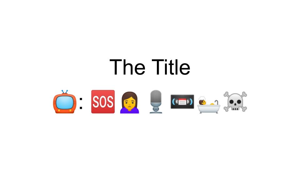
I found this task quite challenging actually. I wanted to make sure that I was being truthful and actually using the last movie, tv-show, or book that I watched or read. I had three options and went back and forth between just two of them. At first, I thought I could use the words in the title, but I couldn’t find any emojis that I believed would translate well without breaking the rule of doing something orthographically. Within the first word of the title I chose, the viewer would have most likely known right away, so I had to be more creative. I then switched back to my other choice and tried it with syllables. This worked, but when I tested it out on some friends, they associated the emojis I was using differently than I did. If the viewer doesn’t understand the expression I might be using, let’s say a multi-syllable word broken down into two emojis; i.e. Spider emoji, Man emoji, for Spiderman, then the emojis are rendered useless for this particular viewer. Their association with the various emojis is important in order to get my point across. In the end, I opted for a combination of ideas and words for both the Title and the Plot.
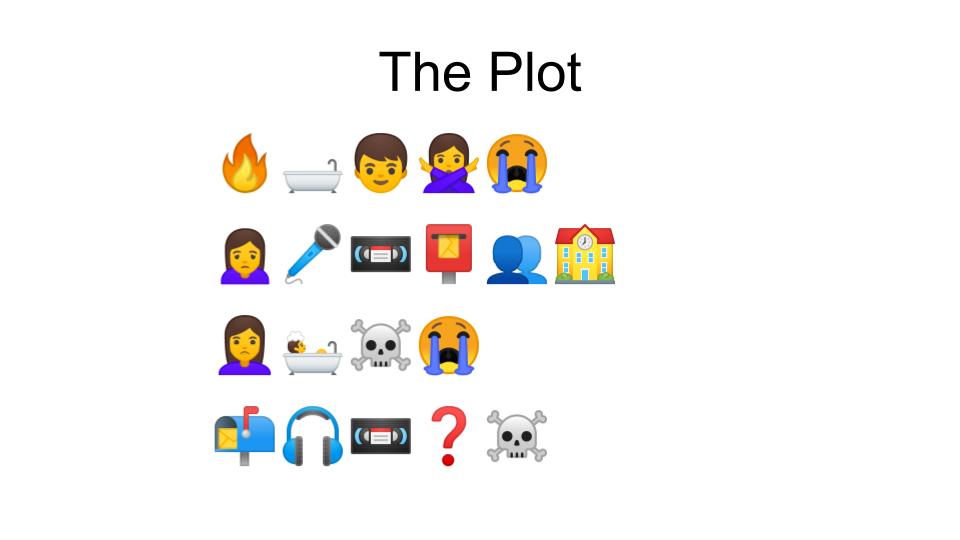
I decided to start with the title but ended up using some of the ideas from what the plot was. This made doing the plot a little easier I think because I had it in my mind already. I like starting at the beginning, which, when I think about it is a little backward based on how most movies, tv-shows, and books are written. I’m pretty sure it all starts out with an idea for the plot.

When I did finally decide on what I was going to choose, I did it because there was more oomph to it than what I could have done with the other two options. More information in the plotline, relevancy, and popularity at the moment. I’m interested to see what people come up with and would love to know if they would have done it differently.

Show me what you got.

Spam prevention powered by Akismet