
For this weeks task we had to play a game called User Inyerface. Inyerface was a VERY frustrating game to play. You need to pass 4 levels to get to the end. There were a couple of actions I took that were based off instincts – such as clicking the big colourful button which is usually meant for “NEXT” but it actually said “CANCEL”. I ended up spam clicking it a couple times before realizing that the next button was actually next to the big cancel button (Figure 1).
I can see how these “dark patterns” (Brignull, 2011) are definitely at play for all of us. We do things that we think are obvious or are so used to doing specific actions to get to the end result as fast as possible. There was a lot of trial and error to see what I needed to do to get to the next page/level of the game. I think knowing that this was a game and not something where I can accidentally download something malicious on my computer made me more bold with my clicks and use the trial and error method to get through this game.
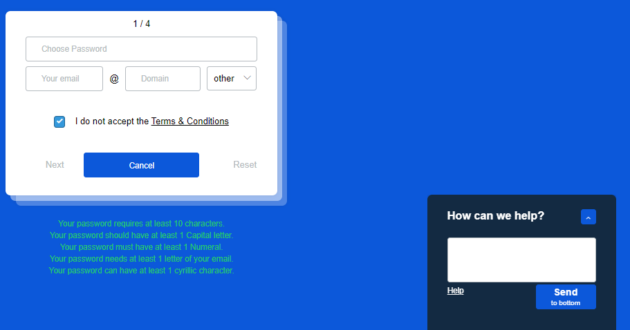
Figure 1: Image of the password criteria in neon green at the bottom and the pop up of “How can we help?” in the bottom right corner. Box for “I do not accept the terms and conditions” was already prechecked. And the “next” button is less noticeable than the “cancel” button.
The part I found most annoying was where it asked you to make a password. The criteria for making a password had many common ones such as having at least one capital letter and a numerical character, but there was one where it asked for a “cyrillic character” (Figure 1). I had to google what it was and copy and paste a random letter to input into my fake password (I pasted in: Њ). I also had to uncheck the “I DO NOT accept the terms and conditions” and click “next” which was greyed out in order to get to the next page/level.
The “How can we help?” pop up on the bottom right of the screen (Figure 1) was easy to get rid of since I didn’t have a “dark pattern” for it and clicked the correct button for it. I realized after the fact that most people would have clicked the arrow on the top right of that pop up to try to get rid of it. I generally just ignore those types of things when I see them on my screen.
I ended up ignoring interacting with the red cookies banner at the top since it didn’t stop me from playing the game. Often sites won’t let you proceed to use their site unless you accept the cookies and when that happens I usually just exit out and don’t use the site. You can see in Figure 2 that the red banner is still there even when I beat the game.
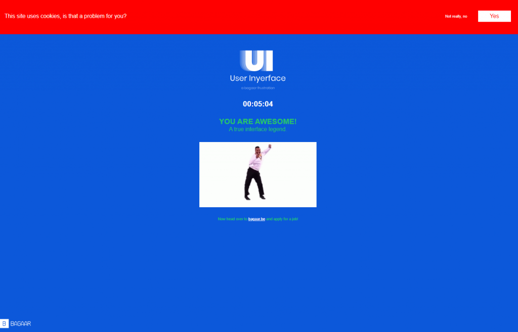
Figure 2: I got to the end of the game! The red cookie banner is still there.
Reading about dark patterns (Brignull, 2011) made me realize just how much UI is designed and used by websites/companies to rely on these patterns and use it to deceive people (knowingly or unknowingly). I would say knowing and understanding that this is happening to everyone is important in order to develop better digital literacy and be more critical about what is being shown on your screens. I would love to discuss this with my high school students. They love hearing about some of the new things I learn in MET and I think this would be an interesting one to talk about with them.
Reference:
- Brignull, H. (2011). Dark Patterns: Deception vs. Honesty in UI Design. Interaction Design, Usability, 338.