Final Project: Describing Communication Technologies

For my final project, I have prepared the following video documentary and tutorial on Microsoft Excel. 

Microsoft Excel is such a powerful software program, with a vast array of capabilities. I only scratch the surface of what is possible with this technology.

I hope my video documentary and tutorial teaches you something new about Microsoft Excel’s capabilities and inspires you to give it a try, the next time you have data to analyze, or calculations to perform. Please feel free to reach out if you have any questions or if you feel like geeking out with me, over Excel formulas.

Enjoy!


Task 12: Speculative Futures

Prompt:

Describe or narrate a scenario about a piece of clothing found a few years into a future in which “progress” has continued. Your description should address issues related to communication and elicit feelings of contentment.

Scenario:

Suzette stands in front of her closet looking at her collection of clothes. The articles of clothing look like ordinary pieces that resemble pieces that exists today; however, each piece is filled with possibility. Technological advances have transformed the clothing industry, and each piece of clothing now has the ability to transport the wearer into a virtual world, recreating the environment, time, and surroundings of when that piece of clothing was first worn.

In this future, regrets, life-altering decisions, and questions such as ‘what-if’ or ‘if only’ are no longer hypotheticals. They can be revisited and re-experienced, providing a unique opportunity for re-living, re-direction and closure.

Suzette reflects upon her life and one regrettable moment that has haunted her is not standing up for her friend who was bullied in the second grade. Determined to face this regret, she chooses a summer dress that she first wore on the first day of second grade. As she ties the bow at the back of her dress, she looks up to find herself standing in the middle of her second-grade classroom. She is there, right in the middle of the group of children, but this time, with her adult mind in her younger self’s body, she feels a newfound courage. She steps forward to speak up and re-write the moment that has caused her so much regret for years.

Reflection:

Part of being human as we know it today is living in the present moment, cherishing memories, experiencing moments that we sometimes wish we could take back or change, making decisions that have life-long impacts, and wondering ‘what-if’. With these human aspects come mindsets and emotions that we have become accustomed to – acceptance, happiness, sadness, anger and regret. Dunne and Raby (2013) pessimistically state that “many of the challenges we face today are unfixable and that the only way to overcome them is by changing our values, beliefs, attitudes, and behaviour” (p. 2). Suzette’s closet filled with ‘time travelling, do-over’ clothes opens a world in which we may re-visit or alter moments. If everyone got a do-over on some regrettable moments in their lives, would the world be a better place? Could we change the trajectory of the world, if every person engaged in a small change of one moment? If do-overs were possible, would life, moments, and memories have different meanings and mean less to us?

Dunne and Raby (2013) differentiate between probable futures, plausible futures, possible futures, and preferable futures. While it is arguably not possible to engage in ‘real’ time travel (at least not today!), virtual time travel is in our probable futures with virtual reality technologies becoming more accessible. It will be interesting to observe how the risk-free experimentation that is possible in virtual realities impacts decisions and emotions, blurring the lines of what can be experienced in reality versus fantasy.

Reference

Dunne, A., & Raby, F. (2013). Speculative everything: Design, fiction, and social dreaming. The MIT Press.

Task 11: Text-to-Image

Prompt: Podium winners of the all-around gymnastics competition in upcoming Paris 2024 Olympics

Prompt: Border collie swimming

With the upcoming Paris 2024 Olympics and being a long-time follower and fan of the U.S. Women’s Artistic Gymnastics team, my first prompt was: Podium winners of the all-around gymnastics competition in the upcoming Paris 2024 Olympics.

I assumed that biases and stereotypes would be apparent in the generated image, but I was hopeful that I may be proved wrong. I hoped that the image would contain three gymnasts, including Simone Biles, an African American gymnast who is heavily favoured to win the gold medal in this competition (Macmillan, 2024). Given that Simone has been dominant in her sport for nearly a decade (this will be her third Olympic games) (Simone Biles, 2024), I was hopeful that images of Simone would have been included in Craiyon’s training data and included in the generated image.

The generated image includes four, lighter-skinned gymnasts, none of whom are clearly identifiable and none of whom are Simone Biles. This indicated Craiyon’s lack of predictive ability, lack of associative ability, and stereotypical representations in its training data.

Unlike ChatGPT, which was able to predict winners (and good predictions in my opinion), the generated image did not indicate a clear prediction of the winners, as prompted. As a test to see if pictures of Simone Biles were included in Craiyon’s training data, I entered a second prompt including just her name. Several images of Simone Biles appeared, indicating that pictures of her were included in Craiyon’s training data. Upon reflection of my prompt, it did not explicitly include Simone’s name, but it included several words associated with Simone Biles – the words gymnastics, Olympics, and winner. However, Craiyon’s output was solely based on the words used, and not based on unwritten associations or inferences. The program cannot generate something that isn’t prompted. This also made me wonder how images are tagged and how tagging may be based on distinguishable people and objects in images, versus the news, events, or points in time that images may be associated with.

The generated image includes four-lighter skinned gymnasts, who also appear slender and long-limbed. This highlights stereotypical representations in Craiyon’s training data as the sport has historically been dominated by lighter-skinned gymnasts with slender body types being preferred. This highlights the first layer of bad algorithms as described by O’Neil (2017), which encompasses unintentional problems that reflect cultural biases. The image of lighter-skinned and slender gymnasts perpetuates stereotypes of who can be successful in the sport of gymnastics and the body type that gymnasts ‘should’ have. Note that in my prompt, I did not specify that I wanted an image of women’s gymnastics, and yet only women appeared in the generated image. This also highlights the stereotype of women doing gymnastics more than men, further perpetuating the stereotype and reflects unbalanced training data.

Craiyon was also ineffective at generating realistic images of people, as the gymnasts’ faces and limbs are…far from realistic. It performed poorer than expected in this regard and seems to be a result of cutting and pasting different images together.

Other generated images of this prompt included the Olympic rings and the Eiffel tower, but it seems as though my prompt was too complex for Craiyon as it generated pictures of either gymnasts or Paris or Olympic icons, but not all three together. This highlighted a lack of understanding or a lack of training data with clear associations between Paris and gymnastics.

My second prompt was : Border collie swimming.

It is evident that Craiyon’s training data included dogs and different breeds (border collies being one of them) as Craiyon successfully returned an image of a border collie. Similar to the stereotypes identified in my first prompt, the returned image of the border collie depicts a ‘perfect’ border collie with black/brown fur and symmetrical white markings. This could lead to skewed representations of dogs in the world, particularly when it comes to people picking their dogs that match these ‘picture perfect’ representations. Dogs with unsymmetrical markings or unusual colouration may be seen as less desirable.

As my second prompt was less complex, Craiyon was able to understand the association between the words in my prompt, and generated an image of a border collie swimming. Upon closer look however, the dog’s right leg is raised near its head, as if doing a ‘front crawl’ stroke, which is a swimming stroke performed by humans. This indicates that Craiyon’s training data likely included more humans swimming compared to dogs swimming. The image humanifies a swimming dog and doesn’t accurately capture the ‘doggy paddle’, which as far as I know, is the only stroke they know!

Task 9: Network Assignment Using Golden Record Curation Quiz Data

On first glance at the visualization, I see that two
tracks (boxed in green) appear at the outer edge of the visualization: Track 22 Panpipes (Solomon Islands) and Track 27 String Quartet No. 13 in B flat. Track 22 was only selected by one individual as indicated by one link and Track 27 was selected by two individuals, as indicated by two links. At this time, it is not apparent to me why these tracks were selected so few times.

Switching to the metrics section (using the icon that looks like a calculator at the top right of the screen) the data was presented in a table format, which I found easier to interpret compared to the graph.

This view allowed me to count the number of nodes representing students (23) and the number of nodes representing pieces of music (27) and by sheer inclusion of each piece of music as a node, this indicates that each piece of music was chosen at least once. Next, by filtering by ‘Degree’, I discovered the two tracks (boxed in blue) that are chosen most frequently and that have the highest degree of connectivity: Track 7 Johnny B. Goode and Track 14 Melancholy Blues. Based on Task 8, I recall that these two pieces are by American artists, indicating to me their popularity in the task perhaps based on recognition – maybe our class recognized these two pieces or based on geographical relevance – given that our school is based in North America, perhaps we are more likely (consciously or not) to ensure that North American musical pieces are represented in the Golden Record.

Next, I analyzed each group’s graph and found myself in Group #4, the smallest group consisting of only two students, myself and Brie.

I see that we have 5 tracks in common, which seems high considering we are a group of 2. From the visualization itself, I do not understand the rationale behind our choices. I based my choices based on geographical diversity and perhaps Brie may have taken a similar approach given the overlap of 5 tracks, but this inference is made using pre-existing knowledge of my curation process and is just a guess. There is no other demographic data for the nodes (e.g. location of students or location where pieces originated, ethnicity, age, etc.) that may help to provide insight on the reasons behind the choices.

After looking at Group #4 (the group where I was placed), I wondered how many links other groups had for each track.

Group 1 consists of 5 students, but there was not a single track chosen by all 5 students; the highest degree of connection was 4 links.

Group 2 consists of 5 students and had a single (1) track chosen by all 5 students: Track 6: El Cascabel. Do each of these 5 students have a preference towards or relationship with Mexican music? Their rationales for all choosing this track is not apparent based on the visualization.

Group 4 consists of 4 students and had 4 tracks chosen by all 4 students! The group seems very connected. I wonder if there are any other demographic, geographic, or psychographic similarities between Sebastian, Julia, April, and Lucy that may help explain the high degree of connectivity.

Group 0 consists of 4 students and had 2 tracks chosen by all 4 students and Group 5 consists of 3 students and had 4 tracks chosen by all 3 students.

This means that my group (Group #4) had the highest number of tracks in common, but we are also the smallest group, being the only group of 2 students.

Our class collectively curated the following 10 pieces of music, selected based on the highest degrees of connectivity:

  1. Track 7: Johnny B. Goode
  2. Track 14: Melancholy Blues
  3. Track 3: Percussion (Senegal)
  4. Track 18: Fifth Symphony (First Movement)
  5. Track 5: Morning Star Devil Bird
  6. Track 6: El Cascabel 12
  7. Track 11: The Magic Flute (Queen of the Night aria)
  8. Track 24: Flowing Streams
  9. Track 25: Jaat Kahan Ho
  10. Track 9: Tsuru No Sugomori (Crane’s Nest)

The most connected tracks, as indicated by the number of links, could indicate tracks that are most popular, but may also indicate the tracks most original regardless of whether one actually enjoys the track. I don’t think we can know the reasons or rationale behind a track’s ‘popularity’, only that the class, for some and likely varying reasons, thought it would well-represent music of the world.

Task 8: Golden Record Curation Assignment

My curated 10 pieces of music, selected from the 27 pieces of music included in the Golden Record:

  1. Senegal, percussion, recorded by Charles Duvelle. 2:08
  2. Australia, Aborigine songs, “Morning Star” and “Devil Bird,” recorded by Sandra LeBrun Holmes. 1:26
  3. Mexico, “El Cascabel,” performed by Lorenzo Barcelata and the Mariachi México. 3:14
  4. “Johnny B. Goode,” written and performed by Chuck Berry. 2:38
  5. Japan, shakuhachi, “Tsuru No Sugomori” (“Crane’s Nest,”) performed by Goro Yamaguchi. 4:51
  6. Georgian S.S.R., chorus, “Tchakrulo,” collected by Radio Moscow. 2:18
  7. Peru, panpipes and drum, collected by Casa de la Cultura, Lima. 0:52
  8. Beethoven, Fifth Symphony, First Movement, the Philharmonia Orchestra, Otto Klemperer, conductor. 7:20
  9. China, ch’in, “Flowing Streams,” performed by Kuan P’ing-hu. 7:37
  10. India, raga, “Jaat Kahan Ho,” sung by Surshri Kesar Bai Kerkar. 3:30

Of the 27 pieces of music, I focused on organizing the pieces of music geographically and I selected 10 pieces that capture different styles from around the world. I started by identifying any pieces originating by the same artist or from the same region and narrowed those pieces down to one. For example, Bach and Beethoven are both German composers so while both influential, only a single piece originating from Germany was curated as part of my 10 pieces. Similarly, there were at least three different American pieces of music, and I selected only one piece as part of my 10 pieces to ensure American-style music was not overrepresented. My final 10 pieces represent a collection of geographically-diverse music pieces.

Task 7: Mode-bending

Re-designed Task 1: What’s in your bag? in audio form:


Task 7 Reflection (separated into parts due to file size upload constraints):

Part 1:


Part 2:


Part 3:


Part 4:


Part 5:


Part 6:


References

ASMR University. (n.d.). What is ASMR? https://asmruniversity.com/about-asmr/what-is-asmr/

Dobson, T., & Willinsky, J. (2009). Digital literacy. In D. R. Olson & N. Torrance (Eds.), The Cambridge handbook of literacy (pp. 286-312). Cambridge University Press.

The New London Group. (1996). A pedagogy of multiliteracies: Designing social futures. Harvard Educational Review 66(1), 60-92.

Task 6: An emoji story

Emoji story:

First of all, I found this task very challenging and I will be amazed if anyone is able to guess what show and episode my emoji story depicts. My emoji story represents the most recent episode of a show I’m watching, and it was not chosen based on the ease of visualization. I am eager to hear your guesses!

This task was a lot harder than I expected and I ended up focusing on key ideas only, rather than trying to capture details, which I found couldn’t be ‘correctly conveyed’ with a limited set of emojis. The show I am watching has an immense amount of details – it involves live-action scenes, backgrounds, established characters, and I often couldn’t find the ‘right’ emoji to capture all of these details. We are limited by those who create emojis and while in my day-to-day usage I normally find the range of emojis to be quite broad, for this task there were certain details such as a light-skinned character with brown or red hair, that were not included in the emoji keyboard.

Another challenge was related to the fact that each emoji can have several meanings. I kept flip flopping between using emojis to convey their literal meaning versus their symbolic meaning. This is consistent with Bolter’s (2001) argument around each element in picture writing meaning too much than too little and having different meanings. This makes it challenging for any ‘reader’ or ‘viewer’ of my emoji story to understand what is being conveyed. An emoji’s meaning is also dependent on the creator and viewer’s context and culture – for example, the diamond ring emoji, which is meant to symbolize a wedding that took place in the show, may not convey the same meaning for a different viewer.

I used my iPhone’s Notes application to capture my emoji story and in doing so, it seems like text is still in control, despite not using any text in my story. Bolter (2001) discusses the tension between textual and visual forms of communication and while this entire task is made up of graphics (emojis in this case), they are used in a textual way. The emojis are organized as if in sentences and I used spaces between the lines of emojis, as if I was organizing paragraphs to separate ideas.

Prior to this task, I have never used emojis alone to tell a story; they have only been used as ‘decorative pieces’ to supplement text. It is interesting to think that emojis alone or text alone are both open to several interpretations – emojis alone can carry different meanings and text alone requires a reader to make several inferences or visualizations. However, when put and used together, they can help provide more contextualisation, resulting in less interpretation.

If visual forms of communications, including emojis, can help to enhance communication, it is surprising to me that emojis haven’t made their way into ‘professional’ or ‘business’ writing. When writing emails, it seems taboo to include emojis as they are deemed as ‘unprofessional’ but why is this, if they can enhance our communication?

Reference

Bolter, J. D. (2001). Writing space: Computers, hypertext, and the remediation of print (2nd ed). Lawrence Erlbaum Associates.

Task 5: Twine task – Student Decisions

Compressed HTML file (zip file) of my Twine: ETEC 523 Task 5 Student Decisions.html

This was my first time using Twine and as I was playing the game, I thought this type of interactive text could be very useful for breaking down complex topics. In particular, for topics that involve decision trees or different ‘pathways’, a hypertext could help students understand the connections between ideas, better than if presented in a linear way. I also thought this type of non-linear text could be useful for students who are navigating decisions; a Twine could help them make their decisions through a series of choices.

I intended to create the latter concept when creating my Twine, but it evolved into something a little different…

I envisioned a student coming to office hours to discuss their career, which is a common topic of choice for my students. As a starting point however, it felt too linear and unnatural to stick with one ‘storyline’ so I added a choice on the first screen, which then opened up the different pathways and a non-linear web of storylines.

I found working in a web to be a more natural way to capture how our thoughts work, and how conversations flow. Similar to what Bolter (2001) stated, I found myself “being overwhelmed with ideas as I [wrote]” (p. 34), and my ideas didn’t always flow in a linear way. It was helpful to capture ideas within a web rather than having to form them linearly. My hypertext grew exponentially, as each time a choice was offered, a new pathway and web would form. This seems similar to how conversations flow, as conversations often branch off of what is said, with one idea leading to another, but not necessarily in a linear way. A conversation may eventually loop back to earlier topics, but it may not.

This experience was very different compared to writing a story using a word processor, which requires that I order things from start to finish (i.e. top to bottom, or left to right). As Bolter (2001) discusses, this innately creates a hierarchical organization. A hypertext allows for non-linear flow of thoughts.

I am eager to try using Twine for a topic that involves decision trees and seeing how my students navigate through the topic. I think it may be a very effective tool to break down complex tasks.

Reference

Bolter, J. D. (2001). Writing space: Computers, hypertext, and the remediation of print (2nd ed). Lawrence Erlbaum Associates.

Task 4: Manual Scripts and Potato Printing

Do you normally write by hand or type? Did you find this task difficult or easy? Explain.

I normally type, so I found this task more challenging than expected.

Firstly, it was difficult to find the appropriate writing technology for this task. I don’t normally keep any paper on my desk, so I had to go searching for this technology and eventually found an old notebook to write in.

After only a few lines of writing, my hand started to cramp up. My muscles are not used to writing by hand and I was shocked at how ‘out of shape’ these muscles were. My students still often write in-person, paper-based exams and I often see them shaking out their hands in discomfort. I can better understand that several of them may not be used to writing by hand, but then are asked to do so on an exam, forcing them to use muscles they are not used to.

The task was to write a reflection of approximately 500 words. I quickly realized how reliant I am on electronic word count tools, and I realized that I have no idea how much writing would constitute 500 words. I ended up counting the number of words in a row and multiplied that by the number of rows to get an approximation.

I am also left-handed and I quickly remembered how annoying coils in a notebook are as they impede my hand placement. Writing near the bottom of the notebook was also difficult as my hand had to hover above the notebook – you may notice that my writing gets a little messier at the bottom of each page.

What did you do when you made a mistake or wanted to change your writing? How did you edit your work? Did your choice of media play a part in how you edited your work?

I made seven mistakes during my hand-written reflection and since I was using a pen, I simply crossed out the unwanted words. I opted not to use white out, mostly because I don’t know if I have any. Another option would have been to start over completely, but given that my hand written work is not being presented formally, it was not worth the effort to edit my work in this way.

My choice of media – pen and paper, limited my options to edit my work. Pen is more permanent than pencil and cannot simply be erased. I opted for pen as I find it clearer to read.

I often mark-up documents using my iPad and Apple Pencil, which merges hand-writing with digital affordances. With these two technologies, I can write ‘by hand’, but am given many more opportunities to edit my work, including erasing and re-arranging text.

What do you feel is the most significant difference between writing by hand and using mechanized forms of writing? Which do you prefer and why?

Writing by hand seems much more effortful, both physically and from a time perspective. It took me approximately 35 minutes to hand-write my reflection (keep in mind that this includes the time to think of what to write as I was writing), but it took me less than 10 minutes to type. The accelerated rate at which typing allows us to record thoughts and convey information seems parallel to the accelerated rates that the printing press enabled as examined by Innis (2007). As typing is more efficient than writing by hand, I wonder if this results in us writing more compared to if we were to hand-write everything.

From a physical perspective, it is more effortful to write by hand and the amount of effort can be influenced by the writing device (e.g. stylus vs. pencil vs. ballpoint pen vs. rollerball pen). The physical effort needed to write by hand can result in variations in the size, shape and overall legibility of our writing (Bolter, 2001). This is not the case with mechanized forms of writing, which has the ability to produce consistent text, in consistent sizes and fonts.

A significant advantage of mechanized (and digitized) forms of writing includes the ability to edit one’s work more easily. I wonder if this causes us to be more critical of our writing and whether we spend more time editing, simply because it’s easier to do.

For work and school-related tasks, I prefer typing as it is much more efficient compared to writing by hand. The formatting and editing abilities are also valuable. However, I find writing by hand more relaxing. I feel more grounded and at peace when writing by hand, perhaps because it is slower so it feels calmer, or perhaps because I associate typing with work and school.

Do any of my peer used mechanized forms of writing for personal hobbies (e.g. diarizing or story writing)? Between typing and writing by hand, which do you find more relaxing and why?

References

Bolter, J. D. (2001). Writing space: Computers, hypertext, and the remediation of print (2nd ed). Lawrence Erlbaum Associates.

Innis, H. (2007). Empire and communications. Dundurn Press.

Linking Assignment

Link #1: This is my response to Steph Takeda’s Task 3:

Hi Steph,

It sounds like we had similar experiences when using a speech-to-text tool to capture our stories! Similar to your experience, the very first thing I noticed was how unappealing the block of text was to re-read. The lack of paragraphs and errors in punctuation negatively affected my experience re-reading my story in written form. What speech-to-text tool did you use to capture your story? I used the dictation feature on my iPhone and it does have the ability to separate text into new paragraphs if you say “new paragraph”, but this obviously wouldn’t be included in an authentic oral story.

I really appreciate the differences you highlight between oral storytelling and written storytelling – most are differences I hadn’t thought of. The consistency of oral stories is a great one and reminds me of the game ‘Telephone’ that I used to play as a child and how the word / sentence was never the same when it got to the last person in the game. You raise an excellent point that there is flexibility with oral storytelling where the storyteller has the ability to adapt parts of the story based on the audience.

You mention another difference that written story telling requires a technology, whereas oral story telling does not. What about oral story telling through phone calls or through audiobooks – would you consider story telling through these mediums oral storytelling?

Shannon

Link #2: This is my response to Duncan’s Task 3

Duncan,

It was a mistake to read your post around lunchtime! I am now craving a big bowl of ramen…maybe not quite as big as your friend Anna’s bowl though…

I like your candid storytelling approach; it certainly made me chuckle a few times. My favourite typo was the misinterpretation of Ramen as “Roman men”.

Similar to you, I also used the Apple dictation feature and we had several similarities in our analysis, mostly around the poor punctuation, haphazard comma placement and misplacement of periods mid-sentence.

While you call your text a result of your meandering, there is a charm when reading the collection of run-on sentences that describe the ramen that you have eaten. I can feel the joy of you reminiscing about the delicious and different bowls of ramen you have experienced. I wonder whether this ‘charm’ may be lost if your story was presented in written form, resulting in a more structured and rules-based body of text.

Finally, can you please clarify the best ramen you have had in Vancouver? It seems like Ramen Domo was a frontrunner (is this Ramen Danbo??), but then you also mention Gill para Ramen (is this Gyo Para Ramen??).

Shannon

Link #3: This my response to Lachelle’s Task 4:

Hi Lachelle,

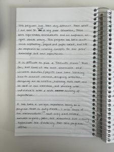
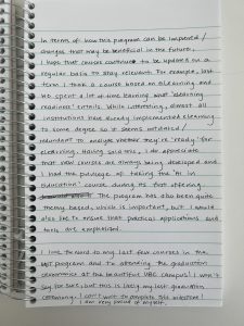
The first thing I noticed (even before reading your reflection) was that I used a lined notebook for this task, whereas you used a blank piece of paper. My response is boring and structured as I wrote in neat, straight lines, left to right, and top to bottom. While I could have added illustrations or ignored the light-coloured lines and wrote diagonally, I didn’t even consider this, allowing the type of paper to impact the structure of my words. It’s also kind of funny to think about the entire paper industry that has emerged…offering blank paper, lined paper, graphing paper, dot paper, columnar paper, etc. There is some practicality behind these options but it also seems a bit unnecessary. If I wanted to sketch something, I could easily do this in my lined notebook, but I would probably opt to buy use a blank-paper notebook instead…consumerism in action!

You mention writing non-linearly and this relates to Task 5 (Twine task) that I just completed. It felt liberating to add thoughts as they came, not in any kind of hierarchical order or structured way. Your blank piece of paper for journaling allows for jotting down thoughts in this non-linear way, as they pop into our minds. You mention that you like to contain thoughts in particular shapes; why is this? And which comes first, the shape outline or the text?

You raise two really interesting points about literacy (in your hand-written journal entry itself) and the human element associated with non-mechanized writing.

It’s funny to think of those birds – illiterate when it comes to human’s English language. This doesn’t mean they can’t communicate, but they can’t in the way that we can. This also makes me ponder about humans who are illiterate in certain environments (e.g. when a human travels to a foreign country, where all signs and oral language are in a different language). Signage depicting rules still apply to them, despite being illiterate in that particular language! Tools such as Google translate have been developed and can help reduce barriers in these types of situations.

Your point about us all having a ‘personalized font’ is very insightful and reminds me of when I mark my students’ hand-written responses. I often start to learn whose response is whose, based on their hand-writing and without looking at their name on the first page. I wonder if/when the concept of signatures will become obsolete, particularly as electronic signatures, which sometimes are just names typed in a standard cursive font, are accepted. Without signatures, do we lose a personal identifier or perhaps it was not a strong personal identifier to begin with. What do you think?

Link #4: This is my response to Jennie’s Task 6:

Hi Jennie,

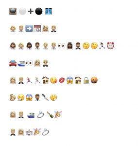
I was so eager to try and guess what show you’re depicting with your emoji story, but I’m stumped.

Does it have something to do with demons, drama, heartbreak, the police, and a father loving his son, despite his demons?? Am I on track at all?

Based on your first thought, it sounds like we both faced the challenge of trying to convey a complex show, using a limited set of emojis. Were there any imageries that you felt could not be captured with the emojis currently available? And if so, does this provide any insight into the creators of emojis? In my case, I felt limited by the lack of certain characteristics that are not currently available such as an emoji of a light-skinned character with brown or red hair. This detail would not capture the personality or rich character from the show I was trying to depict, but it would at least help to communicate which character I was trying to showcase.

Similar to you, I also used my iPhone’s Notes application to craft my emoji story and it’s interesting to see that we both split up our string of emojis into separate lines. To me, this made it feel like text is still in control, despite not using any text in the story. Despite no text being used, my emojis were organized as if in sentences and I used spaces between the lines of emojis, as if I was organizing paragraphs to separate ideas. What made you organize your emojis in lines and when were you prompted to start a new line?

Can you elaborate on some of the ‘important losses’ that you think are being lost in the shift to visual and multimodal texts?

Link #5: This is my response to Carlo DeFazio’s Task 7:

Hi Carlo,

Interestingly, we approached this task in a similar way by conveying our objects by the recognizable sounds they make (or the environmental sounds in which our objects are found). This may be partially due to Ernesto advising us to avoid simply describing the objects in our bag, but it also highlights that we both agree there are sounds that we have learned to associate with certain objects / environments. We also both refer to ASMR! It sounds like for both of us, it took longer to prepare this activity in audio form compared to preparing it in written (text) form. I mentioned that one reason for this was because I was inclined to write a script before recording my audio reflection, essentially doing double the work (written + audio form). Was this the case for you as well? You spoke so clearly, without um’s and ah’s so it’s not obvious to me whether you were reading off a script or not. I’m also curious what technology you used to record and edit your audio clip? One difference between our two tasks was your addition of background music. I didn’t think of this (I wish I had!) and I think it can impact the tone of your entire audio clip. For example, you chose an upbeat song, but had you chosen suspenseful music or a sad song, it would have completely changed the feel of your task. This also makes me think of movies / tv shows and how sound effects and the soundtrack can immensely impact the overall experience.

Thanks for your redesigned Task 1, I enjoyed listening!

Link #6: This is my response to Robyn Bernsen’s Task 8:

Hi Robyn,

Before diving into your Task 8, I went back to your Task 1 to get to know you via ‘what’s in your bag’. I’m so glad that I did, because it turns out we both teach at BCIT! I teach in the School of Business, specifically in the Financial Management program. Are you on campus often or do you teach remotely?

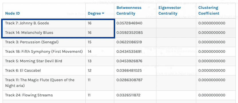
Similar to you, I found this task more challenging than anticipated and it felt ‘wrong’ to cut pieces and deprive a future listener of the diversity of music from our planet. I ended up taking a purely geographical approach, mapping out where the pieces and artists originated, and my final 10 pieces represent a collection of geographically diverse pieces. In doing so, I only kept a single piece originating from Germany (I cut all of Bach’s pieces (ah!) and kept one of Beethoven’s pieces and similarly, I only kept a single piece originating from the United States.

You pose whether this task would be easier or harder if the Golden Record was created in 2024 and I think it would be even harder today. The sheer volume of music pieces available today would make it more difficult and I think it’s also important to consider that music pieces nowadays have been ‘published’ in different ways. There are music pieces by well-known artists who have formally ‘published’ their work via records and labels, but there are also a lot of musical pieces shared by people on platforms such as YouTube that we should consider as well. I wonder if different forms of audio pieces such as podcasts or audiobooks should also be considered…

Considering the theme of diversity that you discuss, I wonder how age and stage of life impacts one’s perception. For example, a toddler’s most ‘meaningful’ 10 pieces may be very different from an adult’s most ‘meaningful’ 10 pieces. Perhaps in choosing 27 songs that represent Earth, we not only have to consider the diversity of the pieces themselves, but also ensure a diverse group of individuals are involved in curating the pieces to begin with.