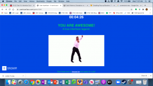
This was quite possibly the most frustrating exercise in almost futility that I have ever done. There were so many aspects that this task lends itself to uncompromising frustration:
- The timer, I got stuck thinking that I had to complete the task in under a minute, until I read on a classmate’s blog on how to turn off the clock. Initially, I had gone into my browser preferences to turn off pop-ups, but that didn’t work.
- I kept getting stuck on the ‘upload your photo,’ every time I dragged and dropped my photo into the upload square. The browser would direct me to another page just with the photo I dragged and dropped with nowhere to go. It was not until I realized the literal-ness of ‘click here’ that I clicked the ‘upload’ word on that page, that I was able to actually upload a photo.
- The profile page was difficult to navigate in terms of the manner in which it needed to be completed. For example, having to use the arrow up and down to get to your house number and the country selection were black and white pic of flags, and the slider for the age were all non-intuitive ways to complete forms.
- The final page of selecting all items was also counter-intuitive as the check boxes were placed above the image.
- Took me close to an hour to complete (which I am embarrassed to admit).
- Despite all these design issues, it made the completion of this task all the more satisfying, particularly getting a gif of Carleton doing the Carleton.
