
After uploading the .json file to the Palladio website, the resulting network graph was a little overwhelming to understand. It literally looked like a map of the Tokyo subway system (fig. 1), in other words, it seemed extremely difficult to decipher.

Figure 1 Tokyo Subway Map
Remembering various undergrad stats courses, I was reminded of the bell curve and that the majority of the data would naturally fall within the bell. The songs chosen most often by peers were represented by nodes located in or near the centre of the network (provided none of the nodes were deliberately pulled to the outside), see fig. 2. Songs such as Johnny B. Goode, Jaat Kahan Ho, Beethoven’s 5th, and Morning Star Devil Bird, has the most connections and can be found in near the centre. Following this initial assessment, my eyes went to the perimeter of network to look for the songs that fewer people had chosen. There were three songs that had only two connections; Kinds of Flowers, Panpipe (Solomon Islands), and String Quartet no. 13. I felt that these three songs represented the weakest connection to the rest of the network and this is where my analysis began.
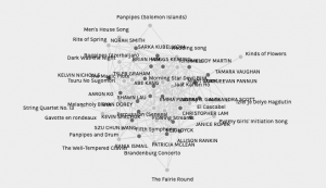
Figure 2 Network including all data
With these three songs in mind (fig. 3), I looked at the blogs of the people who chose each of these songs and the reasons why they had included them in their curation. Kind of Flowers was chosen by Sukhjeevan P. who said they like it because they enjoyed how it sounds and it represents Southeast Asia, while Tamara V. wrote that it is a song with voices which represented humanity. The Panpipes song from the Solomon Islands was chosen by Kelvin N., who wrote about its cultural impact on instruments and music while, interestingly, chosen by Sukhjeevan P. wrote again about its enjoyment factor and geographical representation. The last song, String Quartet no. 13, chosen by Tyler G. who describes the song as devastatingly beautiful and referencing its connection to another song of historical significance. The other person that chose this song was Szu C.-W., whose blog post about the curation was not available. Incidentally, another person posted a comment on Szu C.W.’s blog site requesting to see that same post. After finding the commonalities in these reasons and distilled them to; enjoyable to listen, and cultural/geographical representation.
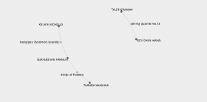
Figure 3 Network of least popular songs
I repeated this process for two of the four most popular songs from the track listing (fig. 4); Jaat Kahan Ho, Morning Star Devil Bird. The other two popular songs, Johnny B. Goode and Beethoven’s Fifth, I thought were easily included because of their popularity and representation in western popular culture. Johnny B. Goode has been covered by several famous artists and featured in pop culture movies, such as Back to the Future. Beethoven’s Fifth is possibly the most recognizable piece of classical music ever, included in many Looney Tunes cartoons. The Indian and Australian songs needed a little more analysis, so I isolated those two songs and looked at the blogs of the people who chose both. Many pointed to representation by population and the influence of Indian music to artists like the Beatles and the Rolling Stones as a reason to include Jaat Kahan Ho. And similarly, for the Morning Star Devil Bird, many chose this song as it is the only representative from Australia and the enjoyable sound of the Digeridoo. Interestingly, these reasons were similar to the reasons for the inclusion of the least popular songs.
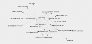
Figure 4 Network of most popular songs
In retrospect, the commonalities in the reasons for each song’s inclusion did not really reveal why some songs were more popular than others. A reason of ‘enjoyment and pleasurable to listen to’ is a subjective matter and can be applied to any diverse array of music, leaving cultural and geographical representation as the only quantifiable reason to include a song. Comparing the culture and population of India and Australia to the culture and population of the Solomon Islands and Java, Indonesia, is like comparing the famous to relative obscurity. Thus, we can use the bell curve to understand the centre and the outliers.