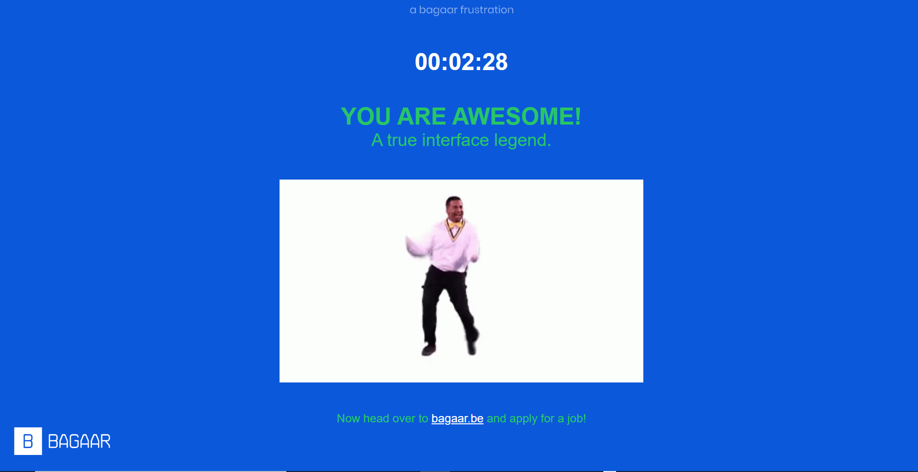
Infuriating was my initial thought; I think my reaction was so extreme because of some things that happened earlier in the day. After completing the “game” I visited the bagaar.be website and read through their job application page and realized what a great ice-breaker this would be at their job interviews. Now I think the people behind this idea are creative and could be fun in small doses.
To start the game I had to read the text under the giant NO button. While HERE was capitalized, click was underlined, making it look like a link. I clicked on click first because I wanted to check to see if it was a link. It wasn’t a link so I had to click on HERE. Often websites will make the surrounding words a link as well to make it easier for users and in consideration of any missed clicks that can happen. This process to start the activity reminded me of the attention and time needed to subscribe and unsubscribe for paid subscriptions.
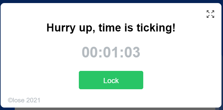
A pop-up reminding me time was passing took several tries to close. The option to close the pop-up was written in a small font in a light colour and it could be easily missed when scanning because it looks like a copyright line. I thought this pop-up design effectively took into account the Steve Krug’s psychological insight shared on Brignull’s (2011) article, “[w]e don’t read pages. We scan them”. The time pressure can make people skip or rush through the fine print and click on buttons without knowing what they’re agreeing to.
Another psychological insight Brignull (2011) mentioned is by Robert Cialdini, “[p]eople will do things that they see other people are doing”. Normally I would not bother completing a “game” like this. Even though the assignment says that the “game” does not have to be completed if an explanation is given, I chose to complete the activity. I could have written about my own experiences with dark patterns, but I thought that most of my classmates would complete the “game”.
Before completing this task and after reading about forced continuity practices (Brignull, 2011), I remembered a subscription that I should cancel. To get my cancellation processed, I was asked to confirm my cancellation. The Yes option to cancel was in red on the left and the No option to stop the cancellation was in green on the right; however, I’m not sure if I should describe this company as deceptive because they did send me a reminder email a few days before my free trial ended. They could have set up the options that way to avoid accidental cancellations, but resubscribing should be easy.
Prior to reading Brignull’s 2011 article, I saw dark pattern practices as part of everyday life. I think most organizations try to mislead customers, just like stores hike up prices before sales or make cheaper quality clothes to add to their sales and outlet stores. Just because these practices are common, it doesn’t mean that they’re acceptable.
Dark patterns can go beyond generating revenue; they can be used to drown out honest voices. I was looking for free AR apps to use in an educational setting and it seemed that the completely free AR apps recommended by educational blogs and educators online were out of business. Having never used them, I can only speculate what happened. Perhaps they used honest design in their UI which resulted in lower revenue and less advertising. If honest UI design leads to not having a voice, should honest companies resort to dark patterns to balance the field? Brignull’s (2011) Expedia.com example shows that companies can drop dark patterns, but would they have reached the success they experienced if they had started with honest practices?
References
Brignull, H. (2011). Dark Patterns: Deception vs. Honesty in UI Design. Interaction Design, Usability, 338.