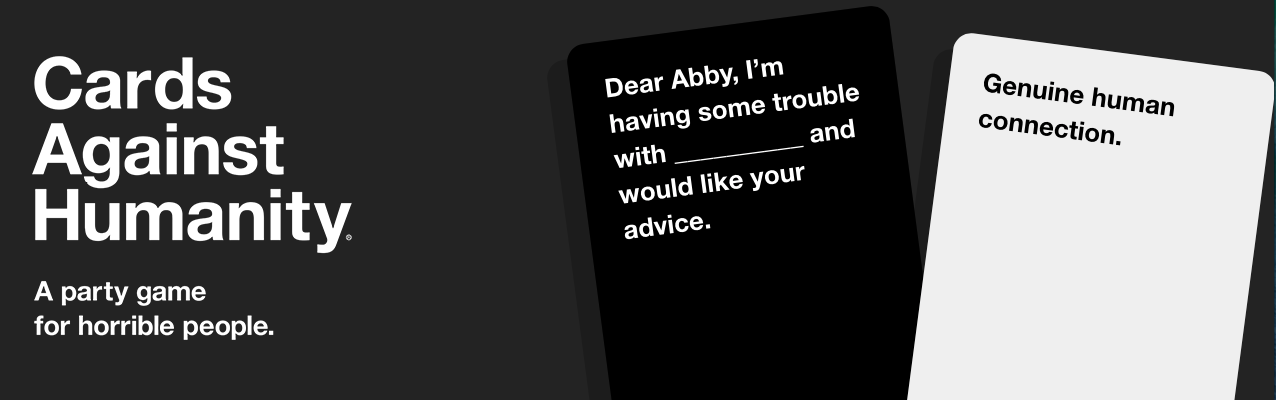


I’m a bit old-fashioned. I like brick and mortar shops when purchasing, and buy very few products online, except plane tickets, concert tickets etc. But last week, I decided to engage in what is commonly known as E-Commerce. I had heard about a fun card game called “Card Against Humanity”, and thought I’d give it a go. 5 minutes later, I had bought the card game, AND purchased an extension pack.
Why? Simplicity of website.
It was so intuitive. Big pictures, concise text and a big yellow button that said “Buy now”. Couldn’t have made it more easy to understand.
Why? Humour.
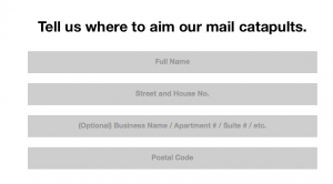 At all steps along the way, fun comments such as “Tell us where to aim our mail catapults” (titling the Address step), and “Congratulations, you have now exchanged money for products”, and mocking old-fashioned e-commerce by saying, “We don’t need your billing address, we aren’t from 1999”. I felt like I was dealing with a good friend who was cracking lots of jokes that day.
Why? Transparency.
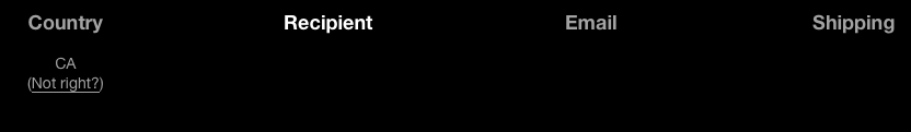
You could clearly follow your purchase “timeline”, if you will – a 4 step process leading you to the final purchase of the product. And along the way it kept reminding me that for $5 more, I would get free shipping, and so in the end I caved, and bought an extension pack for $10.
Why? A good experience.
When I had finalised my purchase, a button said “Now let’s go outside”, and it took my postal code, and directed me to my location Google Maps, suggesting parks and other places around me. It completed my experience, and not only was it a great way to link up with other platforms, it also reminded me that there is more to life than my laptop, and we should sometimes put it away, go outside, and explore.
So my message to all you marketers? Make E-Commerce simple, and I’ll buy.