Lab 1: Introduction to FRAGSTATS
The purpose of this lab was to introduce us to the FRAGSTATS program. FRAGSTATS is software from the University of Massachusetts. We used data from Saskatoon, Saskatchewan to observe landscape and class metrics. This data is Canada Land Use Monitoring Plan (CLUMP) data, which is a direct result of Canada’s development of GIS.
We investigated the following characteristics:
- Area: Total Area, Percentage of Landscape
- Edge: Total Edge, and Core Area and Core Area Percent of Landscape
- Aggregation: Number of Patches, Patch Density
- Diversity: Shannon’s Diversity Index and Shannon’s Evenness Index
This introduction provided the basis for our analysis in Lab 2.
Lab 2: Exploring FRAGSTATS
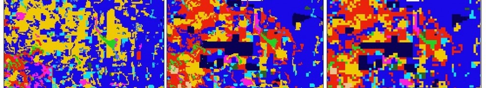
This lab was framed as though I were an environmentalist investigating the land use changes in Edmonton, Alberta over the 10-year period from 1966-1976. The lab built on the principles of Lab 1 and also used CLUMP data. We looked at the same class metrics (Total Area, Percentage of Landscape, Number of Patches, Total Edge) and landscape metrics ( Number of Patches, Patch Density, Shannon’s Diversity Index, Shannon’s Evenness Index). This time I also added three class metrics (Patch Density, Largest Patch Index, Edge Density) and three landscape metrics (Patch Richness, Simpson’s Diversity Index, Simpson’s Evenness Index).
The class metrics show how each class changed over time. As well, these metrics help to show the fragmentary nature of each class. Edge effects are especially problematic for natural areas because the periphery of a particular patch can become uninhabitable for the local species. The FRAGSTATS results demonstrated that the habitability of woodland areas decreased over the 10-year period.
Diversity indices measure the distribution of patches among different classes. Evenness measures how dominant one class is in the landscape. Both values increased for Edmonton by 1976.
I produced a transition matrix to demonstrate how each land class transitioned into others, and how much land changed as a result.

The maps I produced show the overall trend towards development in Edmonton. The greatest change was the transformation of the undeveloped land classes into urban and developed woodland areas. The fragmentation of the natural areas generally increased as well.
Comparison of Land Use Classes
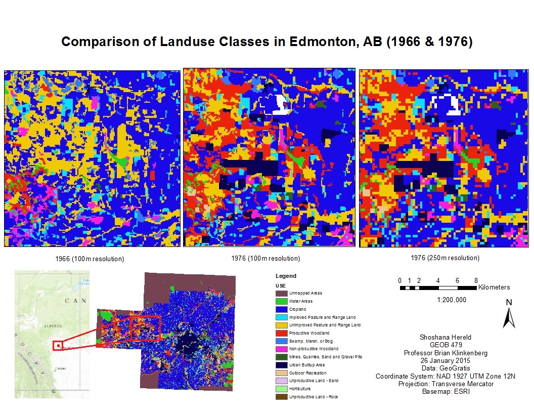
Comparison of Land Use Change
From the point of view of my environmentalist persona, these changes were alarming, because the increased development and fragmentation are both problematic for the maintenance of biodiversity in the region. My recommendations were for increased monitoring and enacting policy changes to protect the remaining undeveloped areas.
Lab 3: Introduction to GWR
The purpose of Lab 3 was to explore the different uses and values of Ordinary Least Squares regression (OLS) and Geographically Weighted Regression (GWR). Both methods demonstrate the strength of the relationship between two or more variables, but OLS provides a global average, and GWR takes local geography into account.
This project analyzed variables thought to impact the learning abilities of Vancouver children. Specifically I looked at how language scores (measure of a child’s language abilities on a scale of 0-100) compared to social skills, percentage of the neighborhood that does not speak English or French as a first language, and the income of a child’s neighborhood.
I used exploratory regression to demonstrate the relevance and utility of these independent variables. I used the exploratory regression tool on ArcMap, adding variables one after the other to see how well they explained the language scores and whether there was overlap between them. It turned out that the model with all three variables was the most effective at explaining the language scores.
I then ran grouping analysis, which divided Vancouver into 4 categories based on the characteristics of the Enumeration Areas (EA). This analysis showed that certain geographic areas of the city share many characteristics. The city can roughly be divided into the following areas based on similarities: downtown Vancouver, the Downtown East Side, Strathcona, the Westside and the Eastside. While these groups are not entirely uniform, they do demonstrate the larger geographic trends.
With this information, I was ready to run the OLS tool. The map I produced shows that the model tends to fit better globally on the Westside and Downtown. The Eastside is therefore more affected by local geography.
The results showed a tendency for the model to fit better globally in the Westside and downtown (coinciding with Group 4 from the Grouping Analysis) than in the Eastside (coinciding with Group 1). This means that the data for the Eastside was more affected by local geography.
OLS Results and Grouping Analysis
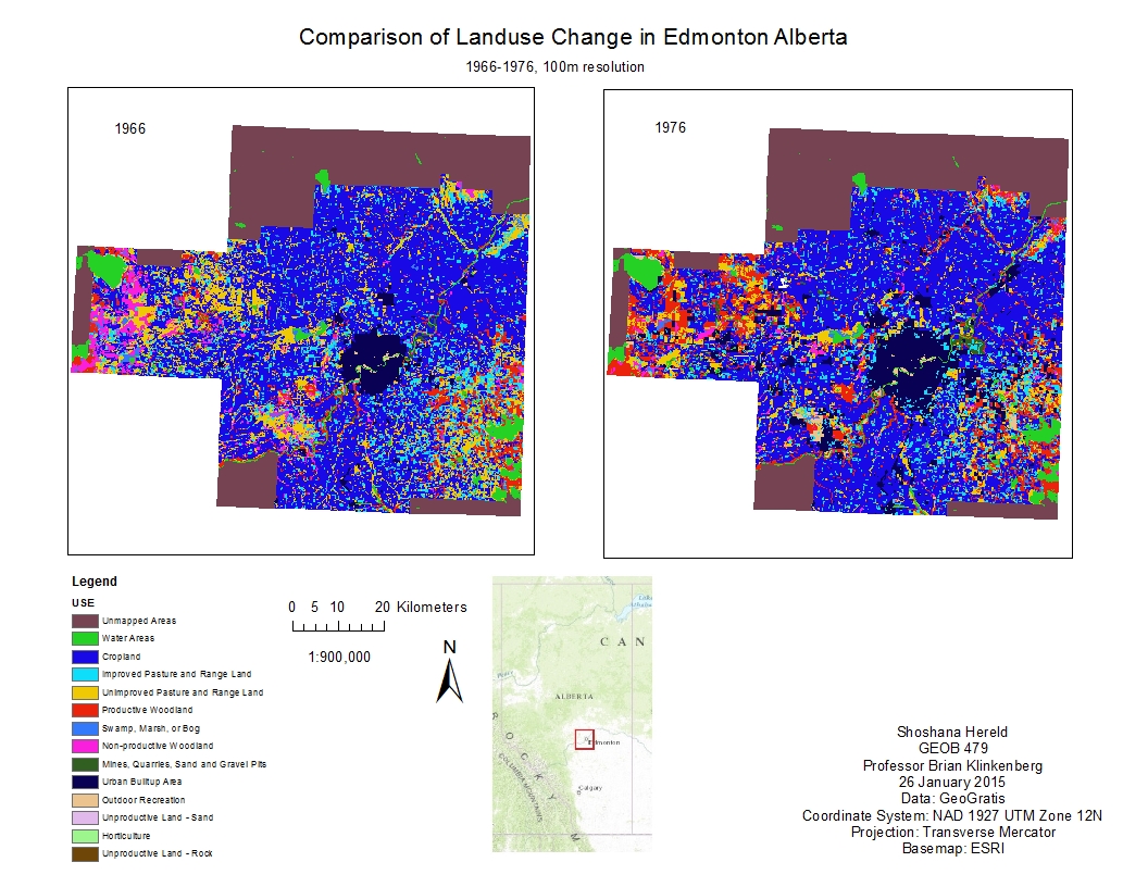
I then ran the GWR tool to produce a map comparable to the OLS map above.
GWR Results and Grouping Analysis
Additionally, I modeled how well each individual variable performed across Vancouver. The R2 values show how well the model worked.
GWR Results and Individual Variable Results
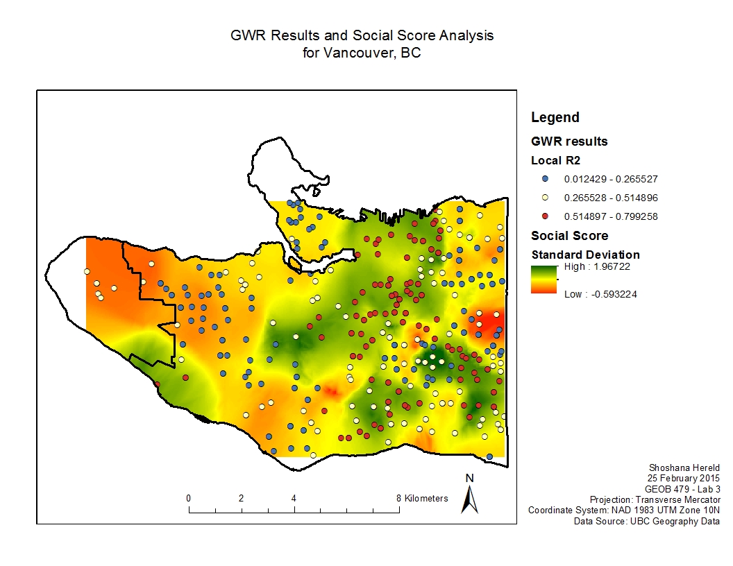
The comparison of the OLS and GWR (all variable) maps shows where local geography significantly affects results, and where a global model is appropriate. In the case of Vancouver, the Westside performed well in the global OLS analysis, while the Eastside was better analyzed with GWR.
Lab 4: Introduction to CrimeStat
Lab 4 introduced me to another program that can be integrated with ArcMap: CrimeStat. This program from UMass helps analyze crime data. In the lab I ran a number of analyses on data from Ottawa, looking at residential breaking and entering (B & E), commercial B & E and car theft. The purpose of the lab was to explore different tools to identify patterns in the data.
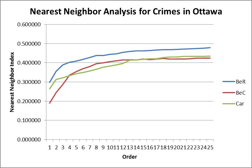
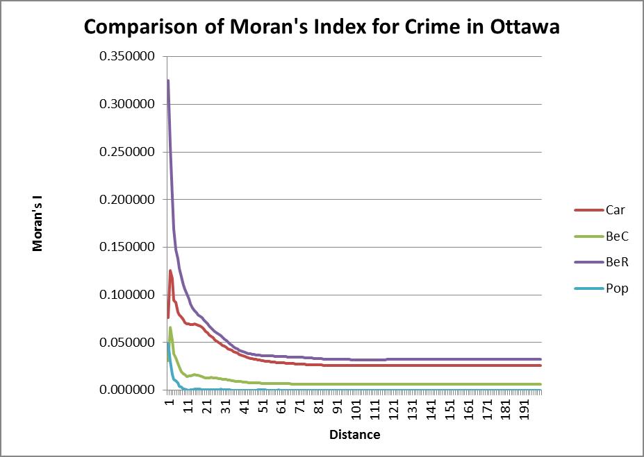
The first analysis we did was nearest neighbor analysis. This analysis showed whether the events for each type of crime were spatially autocorrelated. This type of analysis could then be compared to Moran’s Index and Correlogram. Nearest neighbor looks at the clustering of the events themselves, but Moran’s examines the events in relation to specific areas (in this case, dissemination areas).
Graphs of Moran’s Index and Nearest Neighbor Analysis
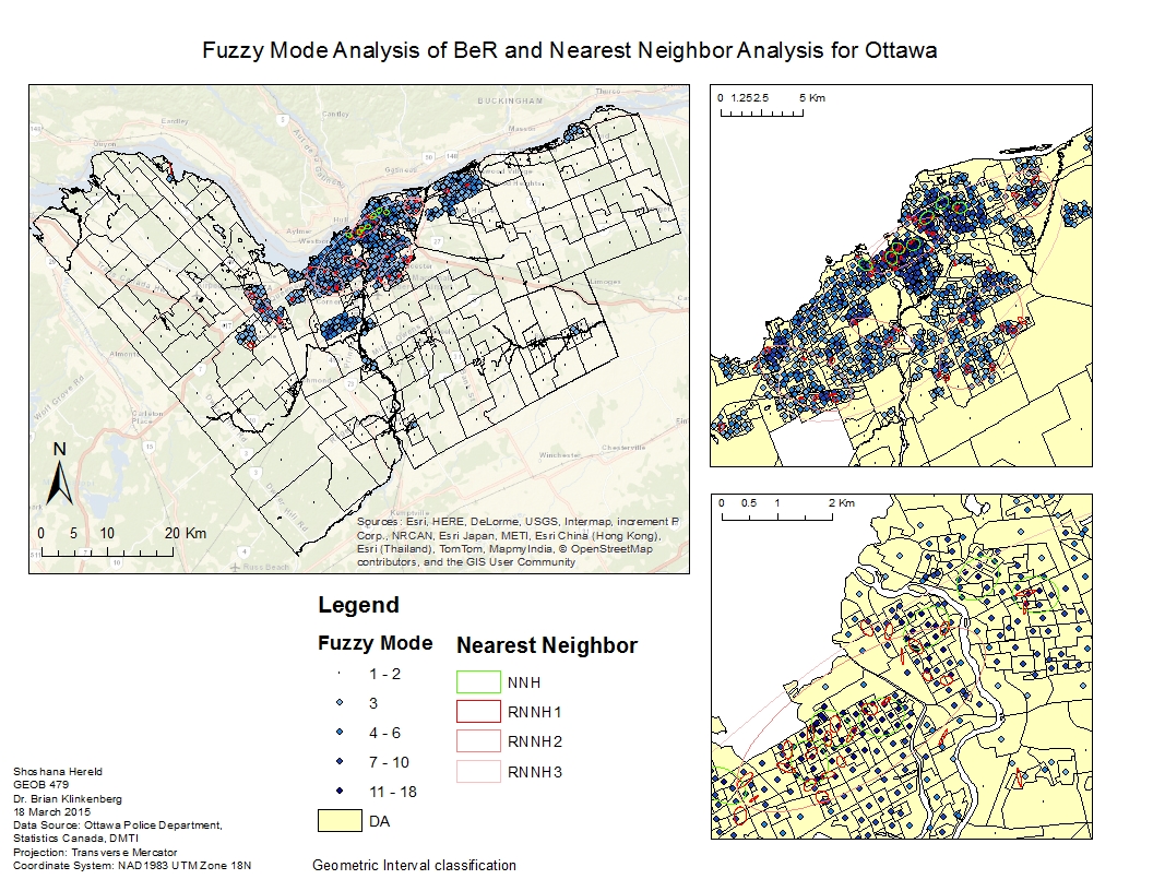
The next set of analyses identified clusters, or “hot spots” in the residential B & E data. The two tools I used were fuzzy mode analysis and nearest neighbor hierarchical clustering. Fuzzy mode clusters points which fall within a user-defined radius, while nearest neighbor compares uses statistical probability to define clusters. Nearest neighbor clustering not only produces one initial set of clusters for the data, but also looks at whether these clusters themselves form clusters. For this reason, the procedure is named “hierarchical clustering.”
I also performed risk-adjusted nearest neighbor hierarchical clustering, which took population into account in order to normalize the data. In areas with higher populations, one would assume there would be more crime. Normalizing for population therefore takes this phenomenon out of the results.
Fuzzy mode analysis and Nearest Neighbor Analysis
For the car theft data, I performed Knox index analysis. Knox index not only looks at spatial relationships, but also those of time. The program compares two points at a time, asking whether they are “close” or “not close” both spatially and temporally. Having performed this analysis for all of the points, the program then produces a Chi-square statistic to compare actual and expected values.
The final step was to perform kernel density analysis on the residential B & Es. I performed both single and dual kernel density. This technique randomly places seeds in the data and at each seed looks at how many points fall close enough. The program then produces a surface from the results of each seed. The user determines how large each kernel should be. The single kernel density procedure does not take population into account, but the dual procedure does, similar to risk-adjusted nearest neighbor hierarchical clustering.
Kernel Density Analysis
