
This was one of the most frustrating tasks I’ve completed! I started by carefully reading everything on the page, and it quickly made me realize how much we rely on familiar web conventions. My first instinct was to navigate the way I usually do, click the highlighted box when complete, select “consent” or “agree,” and move on, but this ‘Inyerface’ didn’t allow that.
Each section had different questions and answers and ways of navigating the page that weren’t conventional. For example, areas you’d normally click to close something instead enlarged it. There was a timer running constantly for no apparent reason. Numbers 1–4 on the opening page scrolled as highlights, giving the false impression that I needed to rush. When asked to click on circles, glasses, or other icons, the first row of checkboxes were initially hidden. I felt confused most of the time and was hesitant to provide any personal information because the interface felt so unusual.

While it makes sense that it tells you to ‘click HERE to GO,’ the line under ‘click’ usually indicates a link, the place you would normally click to move forward.
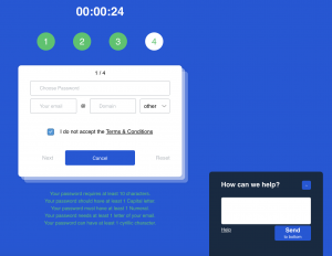
Some elements were especially frustrating. The age slider was finicky, you had to be overly precise, yet there were no number indicators to help pinpoint your age, choices weren’t highlighted when selected, the ‘Next’ button was faded, and the ‘Cancel’ button stood out more than you would normally expect.
 The timer was constantly running, and pop-ups kept appearing, telling me to ‘hurry up,’ even though there was no reason to rush. Just another annoyance! Normally, you would close a tab by clicking an ‘X’ in the upper right hand corner to dismiss it, but here it enlarged on the screen instead, and the close button didn’t look like a typical close button, adding to my frustration.
Overall, this task made me reflect on how web layouts influence user behaviour. We are preprogrammed to click in certain places and follow certain conventions, and when those conventions are disrupted, it can create confusion, frustration, and a heightened awareness of design choices.