I Failed.
This was impossible. I could not get past the first 3 pages, and I tried a total of 5 rounds. The prompts and buttons in this game are not user intuitive. The first page had flashing number buttons that did not have a function other than to distract the user. The usual parts I would use to complete an online form did not apply on this page. I could not use the tab button to move to the next box, and the box did not clear the prompts. I had to manually delete the box’s contents and fill in my information. My web browser’s function of auto-filling contents did not work on this game. Where a user is used to seeing a green button, meaning the next page, this game decided it would be “cancel, start over.” It was nice to have it on the bottom of the page prompts of password criteria, but the font was too small, and the font colour was soo close to eh background; it made it hard to identify. Further, a big red banner usually means an error on the page or the webpage is giving a warning, but in this game, it was about cookies. This was a distraction from my actual goal of the game.
When given a list of options to read and click through, the “select all” and “unselect all” buttons are usually separate from the list and probably at the end. The way this game laid it out made it hard to beat the time because “select all “and “unselect all” were blended within the list of choices to read. Why is there a “download picture” function when my goal is to upload?
On a webpage, when prompts are not placed and coloured in a user-intuitive way, it causes confusion and frustration, prolongs the time the user spends completing the task and increases the chances of the user quitting or stopping using the page.
I think I faced so many issues with this game because I scanned the page first, thinking that I was tech-savvy enough to navigate through the prompts until I started failing; that is when I started reading all the words on the page (Brignull, 2011). On a positive note, this game contained no critical information the user needed. As an internet consumer, I believe users should have all the necessary information laid out to easily understand before making a transaction, giving permission, or agreeing to policies.
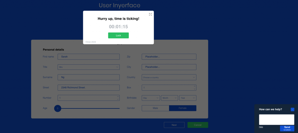
Although this game had no advertisements, I will pretend the Time Limit pop-up is an advert. The close button usually is on the top right of the box, but instead, it is an enlarge button. If this is an advert, the position of the pop-up is similar to the candy display near the checkout at a grocery store (Tufekci, 2017). It forces users to look, but as web users, we have gone beyond the pop-up advert phase; we can turn them off with the user functions (Tufekci, 2017). Our gut reaction is to close out the pop-up, but because the enlarge button replaces the close button, we, experienced web users, fail. In return, the advertisement gains a “popularity point” to help their business.
Web designers and future instructional designers, we need to be mindful of how the general public use the internet or online courses. Those learning in an online environment already have to focus on absorbing the learning material; the last thing they need is an interface that is not user intuitive. This will impede their learning and not make their learning experience as enjoyable as should be.
Reference:
Brignull, H. (2011). Dark patterns: Deception vs. honesty in UI design.Links to an external site. A List Apart, 338.
Tufekci, Z. (2017). We’re building a dystopia just to make people click on adsLinks to an external site. [Video]. TED.