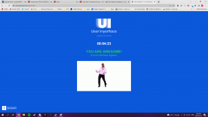
Completing this game took two formal attempts, numerous pauses and attention to detail I no longer abide by when surfing the web. User Inyerface presents as a counter-intuitive interactive experience, this is seen on the first screen when the largest button is ‘No’, and the continuation is hidden in the small unlocked text. From this, the game creates urgency when completing a more redundant and increasingly confusing set of contact information, by having flashing numerical icons, as well as a short countdown. Which, upon completion creates a popup, with the choice of ‘lock’ or ‘unlock’ with no real purpose, an expansion icon, and no obvious close button. Within my first ‘play through’ that was when I refreshed the page. On my second attempt, I noticed the more cryptic ‘close’ word, which included the copyright logo ‘©’ in place of the ‘c’; it is also interesting that the icon moved to the bottom left corner, typically the diagonal opposite of the now standard formatting choice. The ‘game’ continues to have a ‘humanity’ test, however, provides clues that are synonymous with words, and their likeness pictures, for example, ‘light’, meaning the weight or the illumination, and representative pictures of feathers or lightbulbs. Additionally, the game hides the click boxes through a scroll feature and a unified format design in which the position of the ‘click boxes’ typically is either within the prompt or under the prompt, not on top.
Overall, this game left me frustrated and in appreciation of the standardization UI systems have come to. Brignull’s (2011) table highlights the two significant deceptive tactics this site uses: “hiding key information”, such as the exit button, or the plethora of contact info they require for the short game; “benefit from mistakes” this site thrives on the confusion of the user, whether as a learning tool or for the traffic it holds, the ability to confuse or mislead increase the effectiveness of the site, as such having ‘highlighted’ options be the non-chosen option (for example, in the Male or Female) provides more clicks. Later in the game, you encounter “Double negatives” when asked to accept the terms and conditions, giving the user the click feedback option to “do not accept’ (Brignull, 2011).

This game reminds me fondly of the “Impossible Quiz Game ”, in which the prompts and puzzles relied on the user employing a more meta-cognitive creative critical thinking aspect. For example, if the prompt said ‘Click Here’, with a big red button below, you would have to click the word” here’ ‘ as opposed to the more obvious choice of the button. Please refer to this video to gain a more comprehensive understanding if required: Click Here. Additionally, many of their deceptive, or UI choices aim to create a “challenging” experience for the user, as stated in their first screen and name (User Inyerface,2022). UI now, for many, aims to create a more intimate experience, even if its route is deceptive, they want the user to enjoy the experience. DesignerTom (2022) has created a channel to help share UI decisions that are publicly appreciated or help create a seamless experience, many of his opinions focus around the idea of “Applied Honesty”, as a user should be in control and ‘in the know’ to help your product thrive for a long duration (Tiktok (2022), Brignull (2011)).
Dark patterns or deceptive UIs may thrive for short periods, however as social media, and a global rise in internet safety occurs, these sites do not last as long. However, the damage they can do in a short amount of time is incredible. User Inyerface is an astonishing tool for showering the importance of a cohesive and honest interface without having a large impact on its users.
References
Brignull, H. (2011). Dark Patterns: Deception vs. Honesty in UI Design. Interaction Design, Usability, 338.
DesignerTom. [@desingertom]. (n.d.). Design Decisions breaking the 4th wall on apps you use [TikTok profile]. TikTok. Retrieved August 26, 2022 from https://www.tiktok.com/@designertom?_t=8VASxJH86Rp&_r=1&fbclid=IwAR0V3Xmf3Yx8YXdbOYE6RaCiIAxQfI_jVgrR7YmAjcBPp9oNLSr_gA2SvZ0
Jordan, M. (2010). YouTube: The Impossible Test App Walkthrough. YouTube. Retrieved August 26, 2022, from https://www.youtube.com/watch?v=tyUM71lUPwk&t=52s&ab_channel=MeachealJordan.