Official Langara College iOS App

Background

  • First released in Aug 2010 as the first official iPhone app by a BC college
  • One-of-a-kind among other post-secondary/university iPhone apps because it strongly emphasized utility for current students, not simply as a prospective student marketing tool
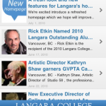
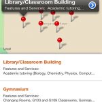
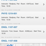
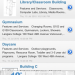
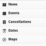
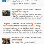
  • Cancelled classes, News and Events feeds, push notifications, geolocation campus maps, important dates, ontacts, and other important student information

Role

  • Led design and execution for iPhone and Android apps using AppMakr platform (2008)
  • Worked in collaboration with IT developers for Cancelled Classes feed
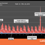
  • Worked in collaboration with Communications web team to develop, curate, and update validated XML/RSS feeds for News, Events, and Info Sessions
  • Migrated all content, assets, and functions from AppMakr platform to RedFoundry after College-wide transition to current orange brand (2011)

Awards and Achievements

???? GOLD – Nifty and Thrifty ($100 or under)
National Council for Marketing & Public Relations (NCMPR) 2012 Medallion Award
(Western colleges in US and Canada)

Conference Presentation –  (Edmonton, AB, Canada. Apr 2011)
Colleges and Institutes Canada (CICan), formerly Association of Canadian Career Colleges (ACCC)

https://appsto.re/ca/IetRw.i

“Tabata This!” Workout Timer

Project Description

The ‘Tabata This!’ workout timer was a passion project I helped my friend Eric with back in the summer of 2012. Tabata is a popular variant of high-intensity interval training (HIIT) exercise strategy. The Tabata regimen, as it’s called, consists of 8 sets of short but intense exercises, each 20 seconds in length, with 10 second recovery periods. The total length of each exercise is 4 minutes.

Eric asked me to help with the design of a workout timer app he wanted to create for himself and friends he hosts at his home gym. He enlisted two very bright iOS and Android developers from the gym to turn our mockups into a working shippable product.

Eric and I collaborated on a new design to:

  1. Make the user interface simpler and more intuitive
  2. Extend the user-experience with sharing tools, a hero screen, and countdown sounds
  3. Make the active countdown clock larger to make it clearer from a distance

Learnings

One of our earliest design insights was that the user would likely set down their devices several feet away and be focused on the exercise and not the clock. After our competitive analysis we noticed that many workout timers at the time were vertically oriented, which limited the size of the countdown numbers. The most popular ones relied on changing background colours to distinguish between workout and recovery periods.

In response to this visually, we decided the numbers should be as large and clear as possible. One of my recommendations included using the font FF DIN for the countdown clock font, which had its roots as a German road signage typeface. Not only was it tall, stark and maximized our vertical screen space, but typefaces of its kind was also very popular among exercise apps at the time (pre-iOS 7 Human Interface Guidelines).

Additionally, the app needed to provide the user with auditory cues through beeps, voices, and other sounds to indicate the start and end of workout and recovery periods. Intuitively, the user would barely be able look at their device screen depending on the exercise and especially after their muscles begin to fatigue over the course of the workout.

Results

  • Launched Fall 2012 as a paid app and later made free
  • iOS downloads: 4,500 free and 800 paid
  • Android downloads: 27,500

Role

  • User interface design
  • User experience recommendations
  • PSD mockups, PNG assets

Spam prevention powered by Akismet