Kababayan Academic Mentorship Program (KAMP) Visual Identity

Background

  • Visual identity package for Kababayan Academic Mentorship Program (KAMP): a VSB-sponsored, weekly, after-school program for newly-arrived, high school-aged Filipino students
  • Conducted a brand convictions exercise with KAMP co-founder to develop an overarching vision and concept
  • Volunteer as Marketing Co-lead

Role

  • Concept, design, and development of all visual identity materials:
    • KAMP Logo
    • WordPress website
    • Stand-up solo banners
    • Posters
    • Business card template
    • Stationery template
    • 1″ buttons
    • Summer KAMP sub-brand

https://www.kamp.education

Langara-branded Bookstore Apparel

Background

  • Langara Bookstore approached C&M for cool, new Langara-branded apparel and accessories
  • Each design was tested with physical focus groups and voted on in social media. Most popular design would be made and sold in the Langara Bookstore.

Role

  • Concept, production, and creative lead for all finished designs
  • Led a pop-up focus group in the college main foyer where students were invited to provide feedback on existing Bookstore apparel as well as name their favourite t-shirt brands and materials
  • Led social media campaign where Langara community could vote for their favourite design through Facebook and Instagram ‘Likes’. To encourage conversation, designs were tested against one another.

‘Game of Thrones: Sexy or Sexist?’ -Langara English Forum Displays

Background

  • Collaboration with Langara English Department to promote their new monthly, free drop-in ‘English Forum’ mini-lectures. Each month’s English Forum featured an interesting book or literary themes deemed too narrow of a topic to be offered as a full credit course. “Game of Thrones: Sexy or Sexist?” was the first English Forum lecture.
  • Department asked to see thematic variety in displays, which required a thorough design system
  • Each display consisted of multiple layers of paper or mounted foamcore to produce a ‘diorama’ look. Layers included:
    • Background image
    • English Forum logo
    • Forum title banner
    • Forum location, date, and time panel
    • Foreground featured characters
    • Cover artwork of featured book

Role

  • Designed and produced displays and all creative collateral materials leading up to event
  • Developed a thorough, modular design system for all print collateral including posters, brochures, and handouts
  • All mock ups and final print collateral designs made in Adobe Indesign, Photoshop, and/or Illustrator
  • Collaborated with clients and project lead to edit and massage content to ensure all print collateral was consistent and complete

‘This is Langara’ Campaign

Background

  • College-wide campaign to build up institutional pride through inspiring faculty, alumni, and successful student stories
  • Promote engagement among employees by finding and telling compelling stories about Langara
  • Stretch goal to design first responsive website for Langara College

Role

  • Concept, art direction, design, and production of all campaign items
  • Led team brainstorms about theme, strategies, and promotional tactics
  • Extended campaign look-and-feel in all mediums:
    • Print (Viewbook)
    • Web (responsive campaign microsite)
    • Signage (canvas street banners)
    • Physical displays (event booth displays using alloy autopoles)

2014-15 Viewbook (Domestic)

2015-16 Student Links (Domestic)

http://thisislangara.ca

IT Window Signs

Project Description

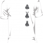
These are hanging window signs I made for the folks at the Langara IT Service Desk. The idea was to create out-facing signs that the service desk staff could change throughout the day as needed. Being IT, I thought it was a good opportunity to add some personality to the signs by using easily-recognizable operating system icons.

Materials

They are printed on 4-colour adhesive paper, which was then laminated and mounted on 1/8 inch black PVC Sintra sheets. The completed signs were then drilled at the top corners and hung on windows on the front doors using regular ol’ bathroom suction cup hooks from Home Depot.

Learnings

This is actually the second generation of the signs. The first set was mounted on foamcore, which ended up too light and delicate. In the winter, the wind would occasionally blow the foamcore backed signs right off the hook and over time the corners became so damaged that we had to replace them. Sintra is substantially heavier and more durable. So far, so good.

The icons are loving reproductions of the original Macintosh system icons by legendary user-interface artist Susan Kare. I admire the amount of love, care, and wit into the icons and you can read more about the folklore behind the original Macintosh icons through her BUZZ page. You can also purchase prints of her iconography at Kare Prints. I’ve had my eye on the ‘hello’ script print for years and might finally order one for my apartment.

Role

  • Concept development
  • Research
  • Client relations
  • Representation mockups (Photoshop)
  • Final design (InDesign)

Spam prevention powered by Akismet