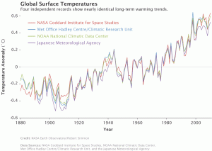
I was quite impressed by this week’s topic on the WISE platform; creating a dynamic and interactive platform with collaborative learning and authoring is no easy task. I chose to customize “What Impacts Global Climate Change?” from the WISE library. I chose this primarily because it is currently a very hot topic and the political climate surrounding it is quite stormy. Triple puns aside, Linn et al. (2003) defines inquiry as “engaging students in the intentional process of diagnosing problems, critiquing experiments, distinguishing alternatives, planning investigations, revising views, researching conjectures, searching for information, constructing models, debating with peers, communicating to diverse audiences, and forming coherent arguments” (p. 518). I suspect many of you would agree that inquiry is a desirable learning method in modern education, but the devil is the details so to speak. For instance, one change that I wanted to make was in the simulation Step 2.8 Add Gasses to the Model (click here), unfortunately I could not find a way to do that. As you click on the Drive! button, temperature increases exponentially; students not paying attention could easily miss the confusing scale at the bottom in thousands of years. In addition, there is only one car in the simulation putting out CO2. As this is created for students in grades 6-8, the simulation could be misinterpreted in any number of ways. As an educator, I feel it is necessary to be careful about how we display information, to be as accurate as possible, or else students will construct models and arguments that are not based on actual facts. Given the chance, I would change the image to be more representative (i.e. add more cars, even cows if we want to get technical), have a time scale at the bottom that would be more identifiable, and perhaps have an indicator of how much CO2 is being put in the air as the student presses the button. I would also ensure that the temperature increase is consistent with data from multiple sources (see below) and current statistical models.

Linn, M. C., Clark, D., & Slotta, J. D. (2003). WISE design for knowledge integration. Science education, 87(4), 517-538.
Hi Gordon,
I loved reading your post, as you did a great job at summarizing what WISE really offers to our students to enhance their learning.
I am 100% with you on making lessons inquiry-based. I also added a small inquiry task in the lesson that I edited on WISE. I believe that with inquiry-based tasks, we give students a chance to take ownership of their learning instead of us standing in front of the class and delivering content. I was wondering what would be a task after your students play around with this simulation as an inquiry task? Would ask them to summarize what they learned or you would take the lead for the rest of the lesson yourself? Just curious!
Great Post!
GK
Hi GK,
I would definitely want to know each student’s thinking process after doing the CO2 simulation. I could leave it as is and have them answer a couple probing questions; that would certainly be a simpler option. If the sky was the limit, I would follow the simple CO2 simulation with another 3D simulation where students could add and subtract a couple more variables (i.e. trees, livestock, people, factories) and see how it impacts temperature; they would also see the interplay of the different factors. For instance, students could put more trees, but then there would be less land for everything else. Finally students could build their ideal city and explain why they made certain decisions. What do you think might be a good follow-up after the CO2 simulation?
Cheers!
Gordon
Hi Gordon,
I liked that you picked out the importance of clarity in building and interpreting graphs, specifically as it relates to this topic (climate change). I can’t remember where I saw it but I remember watching one of the many debates around climate change and global warming a representative of the anti-CC side showed two graphs that he used to back up his assertion (I can’t remember exactly what it was but it was to the effect that there is no human impact). The scientist on the other side of the debate quickly pointed out that one of his graphs didn’t have a scale and the other had such an exaggerated scale that while sure the line pointed in the right direction to support his argument, the time scale did not. Essentially, the moral is that graphs CAN be manipulated to tell any story so understanding this and being able to illustrate data in a contextually meaningful way so as to not distort the message is a huge deal in the science community.
Many of the WISE activities that I viewed made nice links between an action and data so that students can make that connection, but I think expanding the lessons so that students can see how that data can be manipulated so that students can start to critically evaluate graphs or other quantitative illustrations would help promote the ‘life long learning’ framework that WISE aims to do!
In working with your activity do you see a logical way to use the simulation to show students how data can be manipulated? or would asking them to think about graph scales and how different scales will impact how the graph is interpreted suffice?
Cheers,
Kari
Fundamentally, the simulation by its very nature is misleading as there is a lack of quantification of the main variable, CO2 level, and how it relates to temperature change. Students may not identify the issue immediately in their responses. I believe our goal is not to force feed students, but to help help students think critically about the data they are exposed. Providing them with data displayed in different ways would be one way to help students find inconsistencies.