Creating Visual Hierarchy in Illustrator
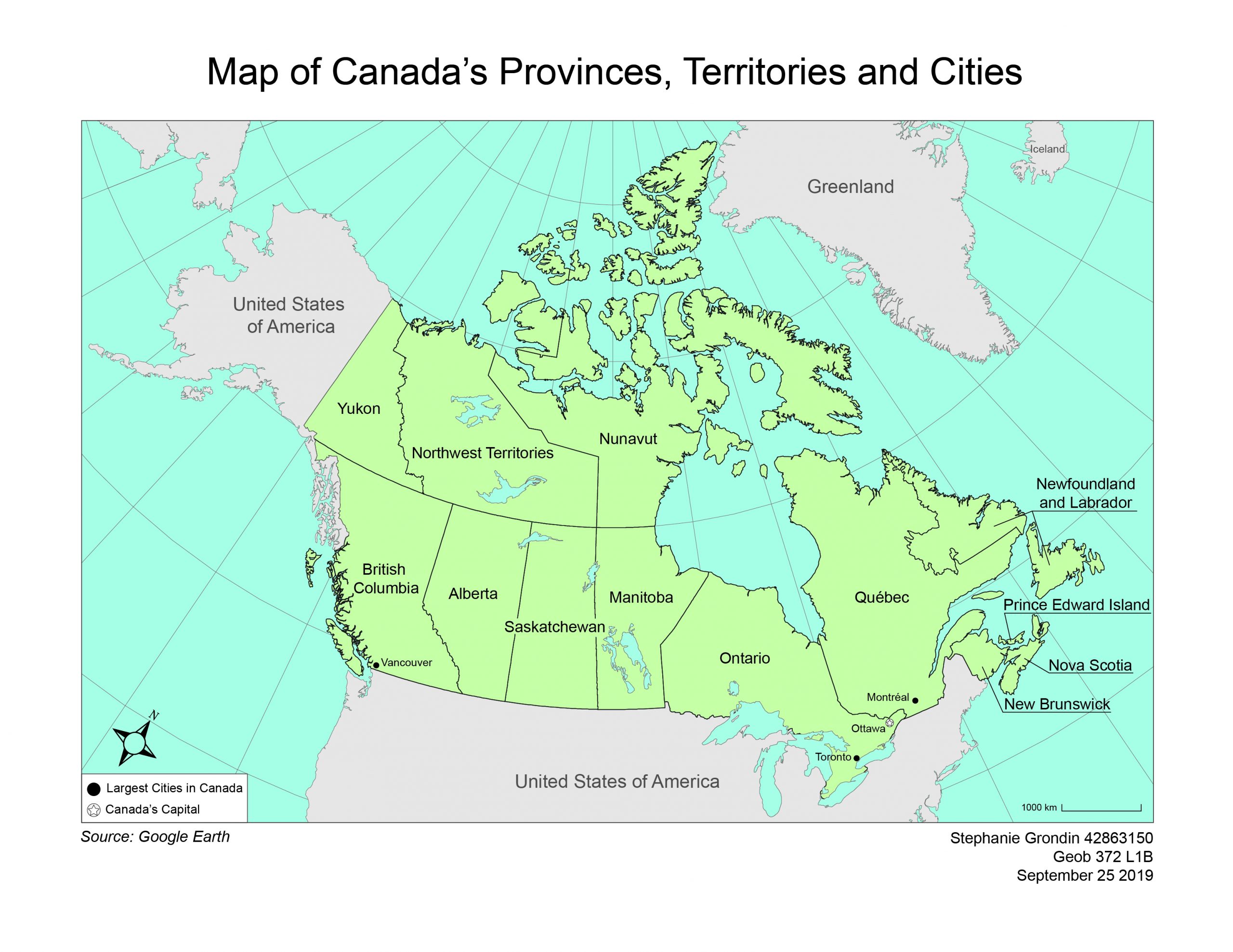
Map of Canada’s Provinces, Territories and Cities
Visual Hierarchy in Illustrator
For the second lab, I was tasked to create a coloured reference map of the provinces, territories and cities of Canada. The audience of the map is for a high school social studies textbook.
In order for the map to be effective, visual hierarchy must be used to emphasize certain important features using thick lines and dark or bright colours (ie. names of provinces, Canada’s land mass) and deemphasize background features using narrow lines and light shades of colour (ie. graticule lines, other countries).
What I learned:
- How to create Halo’s for text that crosses over features.
Improvements for the future (takeaways):
- Always add a title to the Legend (but don’t just call it Legend!)