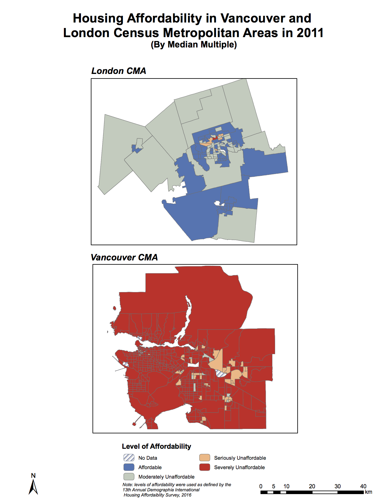
In this lab, I explored quantitative data classification to assemble a series of choropleth maps regarding housing affordability in two Canadian cities. The majority of Canadian cities are experiencing housing bubbles at the moment, but as the following maps demonstrate, the case of Vancouver is nothing short of astronomical.

What is affordability measuring, and why is it better than housing cost alone?
Affordability measuring normalizes housing cost by another variable, namely annual income. This measure has been particularly of interest to policymakers: the ‘median multiple’ index targets how affordable housing is for specifically middle class residents. It assesses affordability levels based on the ratio of a census division’s median housing cost to median household income. A median multiple of 3 means that the house price is 3 times the annual income of the designated area. The ‘median multiple’ is a better indicator than housing price because it considers the earnings of the population. Hypothetically, a city could have skyrocketing house prices but if all residents were millionaires, the houses would be affordable.
What are the housing affordability rating categories? Who determined them and are they to be ‘trusted’?
The median multiple is used to determine the categories: a multiple of 3.0 or under is considered affordable; 3.1 – 4.0 moderately unaffordable; 4.1 – 5.0 seriously unaffordable, and 5.1 and over severely unaffordable. The Annual Demographia International Housing Affordability Survey determined these categories, and they claim that it is the index of choice for the World Bank, the UN, the Economist, and Harvard University’s Joint Center for Housing Studies. The survey covers 406 metropolitan housing markets worldwide, and gives a well-rounded approach to determining housing affordability for middle incomes globally. Surprisingly, only 11 out of 406 housing markets were deemed ‘affordable’, and all were Rustbelt/Midwest American cities. The data used was from the 3rd quarter of 2016, and the survey can be trusted because it provides an open critique of metropolitan areas adopting ‘liveable city’ planning policies.
Is affordability a good indicator of a city’s liveability?
Good question. The polarization we see between the most ‘liveable’ cities (according to benchmarking reports like Mercer) and those deemed ‘non-liveable’ regarding housing affordability is unprecedented, and I think we should consider the rhetoric we use to characterize city planning policies. This lab showed me the disparity between London, Ontario and Vancouver: most census tracts in Vancouver are over 5.1, yet the classification method (natural breaks) used for the map masks the fact that most census tracts are closer to 18 on the index. So my reasoning runs similar to Steffen Wetzstein, in that liveable cities are affordable only for some. For more on this subject, please consult this assignment I completed for another course, GEOG 350.
Accomplishments:
- Developed working knowledge of Canadian Census data, accessing attribute data on income and housing cost to perform a cartographic assessment of housing affordability suitable for news articles, real estate agencies, and urban planning departments.
- Designed a series of maps comparing housing affordability in two Canadian cities, using four different classification schemes (natural breaks, manual breaks, equal interval, and standard deviation) to gain a deeper understanding of the ethical implications of selectively classifying and presenting spatial data.

 Follow


