Working with data such as the selections made in this assignment can be quite insightful. It can also be one-dimensional if you take the numbers at face value and use them to draw simple conclusions. Considering why selections are made, and examining reasons for the selections allow for greater depth of usefulness and findings. A simple look at numbers does not necessarily allow for proper interpretation as intentions and procedural steps are not considered. These additional factors make the data much more relevant and impactful.
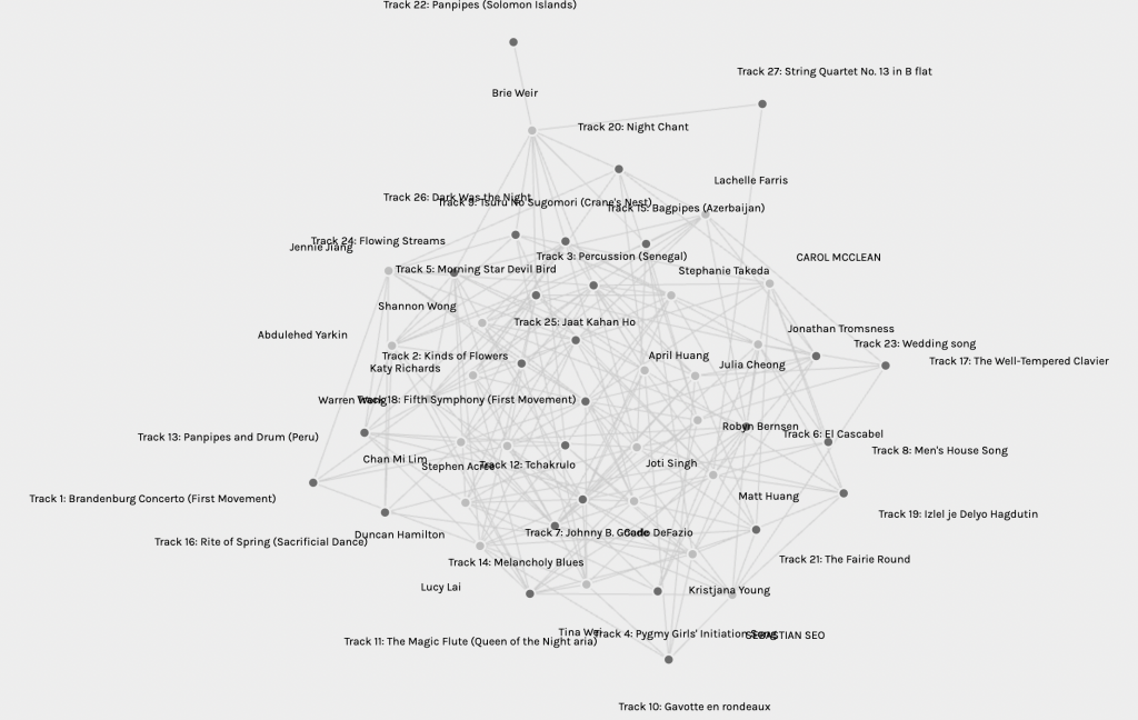
Examining the data in Palladio was quite interesting regardless of limitations. The cloud created with all the data was intriguing, if somewhat overwhelming, and admittedly it took me a while to realize that one could drag around the points for different looks. In the meantime I peered at the graph, noting which of my peers was closest to me, which ones I seemed to share selections with, and which ones were more divergent from my own selections. As I progressed, I began to manipulate the graph for alternative views.

First, I selected the first modularity. This graph limited the data to five individuals who, I presume, shared more characteristics. I could now pick out the individuals, and trace their musical selections, noting commonalities and differences. My own quiz results happened to place me in this group, which made the data more personal and interesting. With a little bit more tinkering, I could make it even more user-friendly.

By moving individuals to one side, and musical pieces to the other, I found myself more able to identify tracks, assess common selections, and take note of unique choices. I took the arrangement one step further.
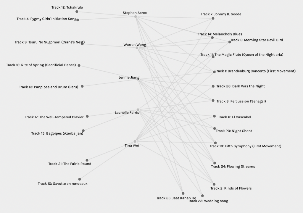
This arrangement was very informative. It allowed for an easy view of common selections and also allowed me to note which musical tracks were unique to individuals in this group. Individuals had 1-2 tracks that they alone selected, while they shared 8-9 tracks with individuals in this group. No track had all 5 individuals select it, which I found very interesting. I also found myself wondering if the unique selections had individuals choose them who were placed in other groups, or data sets. Indeed, when I looked at the data as a whole again, I found that my 2 unique tracks had 4 to 5 of my peers select them, however, they were placed into other groupings.
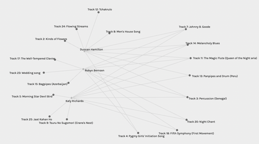
I wanted to consider Palladio graphs with different data, so I selected the fifth grouping. With only three individuals in the grouping, this data visualization is much easier on the eyes, and one can easily identify some differences from the other data group. In this grouping, individuals have 3 unique track selections, and 3 of the tracks have been selected by all of the individuals. I wonder why this is a different characteristic than I observed in the first group?
Conclusions:
It is easy to see the connections between individuals who are placed in the same groupings, or modularities. It would be much more helpful to be able to host an interview and explore both why selections were made, and why we did not select some of the tracks. I believed the Pygmy Girls Initiatl Song to be important, for instance, and that it helped create a widespread representation. So why did the individuals in my group not believe the same? Was it assumed to be unimportant because the Pygmies are not considered leaders in our modern world? This judgment and assumption of bias may not be true at all, yet a data set like this allows for these potential misinterpretations to be made.
While this data is fascinating and produces evidence of trends and differing values, it is simply incomplete without the valuation and insertion of the human element, and the reasons both for and against making certain selections.
References:
Stanford. (2014) Palladio. hdlab. https://hdlab.stanford.edu/palladio-app/#/upload