Avoiding Overload
I teach in an English language learning environment and every staff meeting, without fail, ends with a reminder not to overload our learners with too much English input. We are asked to be mindful of comprehensible input and to focus on capacity building. Excellent advice, but how can we accomplish this?
Micro-Learning to the Rescue
To avoid overload, I immediately thought, “think small”, which, consequently, brought micro-learning to mind. According to Bruck, Motiwalla, and Foerster (2012), micro-learning pedagogy focuses on short-term and informal learning activities when the learner needs the knowledge to solve a problem without information overload. Reading this, I wondered if Bruck et al. were sitting in the same staff meeting as me–micro-learning seemed like the ideal strategy for my context. Armed with an approach, it was time determine how to deliver.
Mobile Learning
The solution to delivering micro-learning at just the right time to my students was painfully obvious–I only had to look to what was essentially an extension of their hands–their mobile phones and tablets. But, what was the best way to leverage this resource? Designing for mobile is much different than designing a face-to-face lesson. So, I looked to Sharples, et al. (2009) and their description of the mobile learning experience and took the following five points to heart:
- People on the move cram learning into the gaps of daily life.
- Technology is moveable and transferable across devices.
- Learning topics and themes compete for a person’s attention.
- Learners perform in social spaces.
- Learning is cumulative and happens over time. (p. 235)
If I was going to make this work, I needed to design micro-learning that made use of the affordances of mobile learning while addressing some of the drawbacks. Thankfully, Sharples et al. (2009) anticipated that their readers would want to do this and shared Naismith and Corlett’s (2006) design suggestions, excerpted here:
- Create quick and simple interactions.
- Prepare flexible materials that can be accessed across contexts.
- Consider the affordances of mobile devices that may add to the user experience (p.237).
Infographics…For Mobile!
I thought about times when I needed micro-learning and the most recent example is when I had to convert ounces to mililitres. I grabbed my phone and put ounces to mL in the search bar and was immediately rewarded with an infographic that solved my problem in a matter of seconds. However, infographics, typically, have been designed for desktop viewing and are a pain on mobile, requiring the viewer to pinch, zoom, and scroll to view something not meant for a tiny screen. Determined that I was on the right track, I began to research ways to make infographics mobile-friendly to see if I could make use of them for mobile micro-learning in my classroom.
Combining Mobile & Micro-Learning
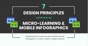
Bishop (2013), jokingly suggests that, to get into the micro-learning mindest, we should consider an index card and how much information you can fit on it. Considering the size of a smartphone screen is approximately that of an index card, it makes sense to design micro-learning for mobile use–but how do you capture the learner’s attention with bite-sized content while leveraging mobile technology affordances? It turns out that designing mobile friendly infographics and micro-learning deploy similar strategies. Don’t believe me? Take a look for yourself–I designed a mobile responsive infographic that outlines the similarities.
Final Thoughts
As a self-professed infographic fanatic, I have to admit that they may not accomplish everything that micro-learning requires. While mobile-friendly infographics can provide quick, accessible, and concise micro-content, they cannot always offer assessment before progressing. However, responsive infographics may provide avenues for assessment–for instance, Venngage allows the addition of polls and clickable links that could lead learners to assessment opportunities.
The combination of micro-learning design and mobile infographic design is something I will be trying in my classroom. How about you? If you give it a try, be sure to share your infographics here–I would love to see them.
-Meghan
References
Bachman, J. (2015, January 6). Designing infographics for mobile. [Blog post]. Retrieved from https://visual.ly/blog/designing-infographics-mobile/
Bishop, B. (2013, May 14). 4 steps to microlearning mastery. Retrieved from https://elearningindustry.com/4-steps-to-microlearning-mastery
Bruck, P.A., Motiwalla, L., & Foerster, F. (2012). Mobile learning with micro-content: A framework and evaluation. BLED 2012 Proceedings 2. Retrieved from http://aisel.aisnet.org/bled2012/2
E-Learning Infographics. (2015, May 9). How to master microlearning infographic. Retrieved from https://elearninginfographics.com/master-microlearning-infographic
Kar, S. (2014, November 11). Microlearning pros and cons. Retrieved from https://elearningindustry.com/microlearning-pros-and-cons
Kovachev, D., Cao, Y., Klamma, R., & Jarke, M. (2011) Learn-as-you-go: New ways of cloud-based micro-learning on the mobile web. Retrieved from https://ai2-s2-pdfs.s3.amazonaws.com/0bfa/06a01bddcf62152a8446e1790f054d151b6b.pdf
Tomassini, J. & Nguyet, V. (2016, March 16). How to build a memorable data snapshot. Retrieved from https://medium.com/digital-trends-index/how-to-build-a-memorable-data-snapshot-b4bcf6baa2e1
