What a frustrating and anxiety-inducing experience!
Upon starting the User Inyerface game, several annoying things immediately misdirect my attention. There is reference to filling out a form as quickly as possible, while there is no form on the page. The button looks clickable, but sends mixed messaging by having the word “no” printed on it. The text at the bottom of the page appears to have no hyperlink, even though it has underlined text as well as text with a hyperlink-esque colour change included. Welp! Quickly discovered that the NO button isn’t functional, and ended up spending quite a bit of time finding the hyperlink hidden within the capitalized word “HERE”. This directly ignores all of the ‘rules’ about the internet we’ve come to assume are commonplace across websites.
Immediately on the next page, flagged with a countdown and a red banner, I am struck with a wave of anxiety. I am concerned with being on a page that is using cookies, and I cannot get out of the scenario to adjust that! This is a great example of what Harris (2017) mentions in his Ted Talk about programming interruptions in attention in order to manipulate human emotions and behavior. I definitely have a leaning toward anxiety in generally, but definitely during any kind of countdown ( as an aside, I think this is pretty common, especially in scenarios related to timed testing). I’m sure it has roots back to those Mad Minutes that were so common in math classes during my generation’s upbringing. Both my attention and my emotions were meddled with here. This underscores the point that Dr. Tufekci (2017) touched on– that large corporations that are profiting off our data will use individual weaknesses and vulnerabilities in order to make us feel a certain way. Additionally, she mentioned that these corporations can even use data to predict when people who have bipolar disorder are going to enter a manic episode, and subsequently lean into the vulnerabilities of that in order to profit. Sickening, but not surprising.
Another alarming feature of the site that stuck with me is the profile image section. I had to upload an image from my computer to continue, but when I clicked the misplaced “download” button to upload the image, the website actually downloaded its own image to my computer! This is precisely the scenario that I have to warn my aging parents about all the time: do not click any download links from unfamiliar websites, because this is how you can very simply download a virus. The nefarious part about this part of the site is that it was labelled incorrectly, intentionally misdirecting users into its plan.
The last notably annoying feature that I’ll discuss is the image selection portion, in order to prove that you’re a human. This portion of the game asked for the user to identify all the glasses in the photos; meanwhile the pictures displayed varied between eye-glasses, panes of glass, and drinking glasses. There is no way for a user to know which homonym the site is asking for, leaving them confused and requiring them to spend time figuring it out through trial and error. Bringnull (2022) mentions that these kinds of trick questions or tasks are intended to confuse users into deception.
This whole experience drives home the point that we must be aware of the ways websites, algorithms, and companies manipulate our experiences online to get us to do what they want: spend more time on sites, make more of our data available, and spend more money, among other things. Our attention and emotions are easily manipulated if we are not mindful of the tactics of dark patterns.
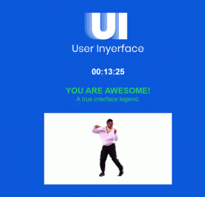
Despite the frustrating and alarming experience, I did end up making it to the end. Woohoo!
Brignull, H. (2011). Dark patterns: Deception vs. honesty in UI design.. A List Apart, 338.
Tufekci, Z. (2017). We’re building a dystopia just to make people click on ads. [Video]. TED.
Hi Lachelle,
You made some excellent points about the frustrating and manipulative aspects of the User Inyerface game. It’s clear that in moments of frustration, we can overlook our usual understanding of the internet, especially when faced with urgency and emotional manipulation. The countdown timer, for example, really amplifies anxiety.
I’m curious: are there any specific design elements or tactics you think could create a sense of urgency without causing undue stress? As someone who is already anxious, the countdown added to my frustration, and I can see how it might push someone over the edge.
I also appreciate your thoughts on digital literacy, especially when you mentioned your parents experience of navigating the internet. It makes me wonder if I’m falling behind on digital literacy myself and how new generations might be experiencing these challenges differently. What are your thoughts on this?