
The Challenge
Analyze a visualization that was created from data based on my classmate’s choices for the 10 music tracks that should be kept on the golden record that was sent out to space on the Voyager spacecraft.
My Analysis
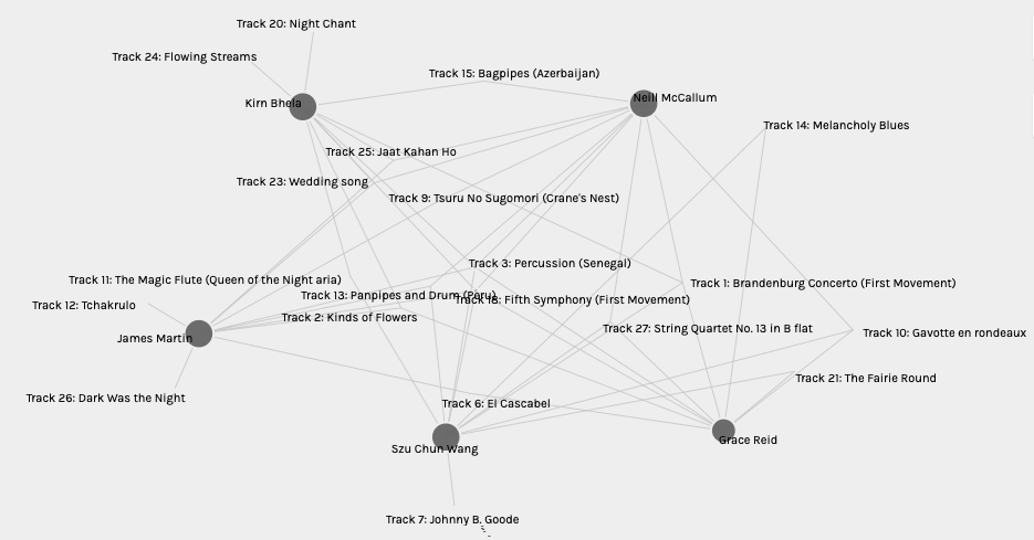
The visualization created by myself and my classmates in regards to the Golden Record Curation choices at first glance looked like a convoluted mess that did not seem to have any particular method to the madness. After interacting and zooming in on the data I believe I could understand a bit further. From my observations, it appears that the least popular music tracks appear on the edges of the visualization and are represented with smaller circles, such as Pygmy Girls’ Initiation Song or Men’s House Song seen in the image below. The more popular choices are closer to the center of the visualization and have larger circles and the dark circles represent my classmates.

Visualization of all classmates and their choices
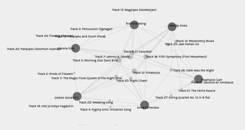
After looking at individual groups, and dragging around participants, the connections being made between the choices became more clear as I pulled the nodes apart and spread them out. Songs chosen within a group appear in the middle as they are being pulled in different directions by the classmates, while the least popular songs are again at the edge like Johnny B. Good in the image below for Group 0.
Visualization of one group of classmates and their choices (Group 0)
Group one
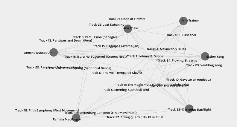
Group 2
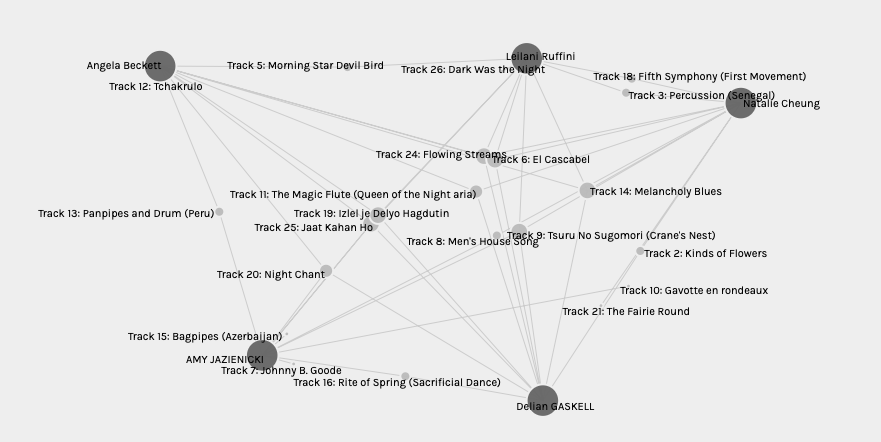
Group 3
I started to see patterns after comparing all four groups of visualizations individually. Classmates that had more unique choices (more choices that no one else chose) appeared to be in one group (songs that only one person chose stuck out of the classmates node on short branches that connected to no where else) while classmates with similar choices to others were in a separate group (song nodes that had more than one branch).
The most important data that is missing includes information about the classmates, such as age, nationality, and gender. The reasoning behind the choices, and the option to include tracks that were not on the list were also important aspects missing from the data.
As a similar assignment, I asked my grade 5, 6, and 7 students to create their own golden record playlist and it was quite interesting to see what music and sounds they chose outside of the original golden record list. Some students chose their favorite band or group despite my explanation that they should not hold a bias and chose sounds that best represent Earth and humankind. Others preferred to choose sounds of nature, such as animal calls, the ocean, and people talking.
It is possible that some connections could be made about the tracks that were not chosen, or least chosen when comparing the group,s but when looking at all groups at once it can be quite difficult. Perhaps the names of the classmates can identify some information about their background and then perhaps their choice. For example, it may be interpreted that females were more often to choose specific tracks over males, or vice versa, but this would still be difficult to hold up unless such information was provided during the quiz.
Final Thoughts
This was an interesting experiment to participate in and analyze but I feel that more data really could have been helpful. There appears to be a map feature of the Palladio website that could potentially be used to show the user’s location which could have added another level of analysis when looking at their track choices but this was not a consideration for the assignment.
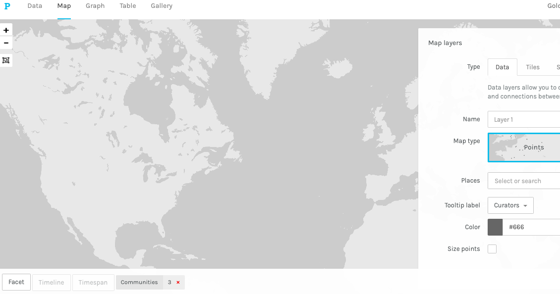
Map feature of Palladio
As mentioned in our module for this task, the internet is the network in which information is sent, while the web is the information itself. This is similar to how library branches are a network that is organized to hold and transfer information in the form of books and other text media such as CDs, DVDs, ebooks…etc. For the visualization, the nodes and branches that connect the information seem to represent their own form of internet and the names of my classmates and song choices are the content (the web).