Welcome back to my blog!
Disclaimer: Yes, this is yet another marketing post about photography, that’s just the way the blog functions!
But wait, don’t worry, this time I will not be advertising any brands/stores/cameras or people! Instead, this post will focus on a more technical aspect of commercial photography that is frequently used in marketing; the “The Rule of Thirds”. If any aspiring photographers are reading this, I hope this will be both a lesson in photography as well as an insight into marketing.
Rule of Thirds? What?
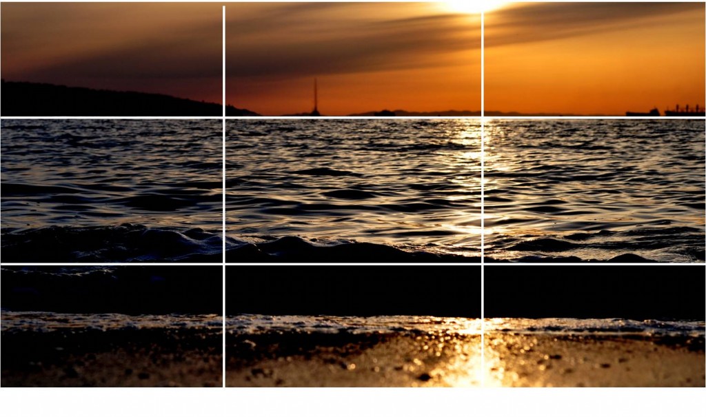
This rule is one of the first things that any photography course will teach you (I’ve never taken one, but I have watched ample online-lectures to know). The rule of thirds is essentially the number-1 guideline to succesful composition, the way in which the photograph is placed within the picture’s frame. The rule states that the photographer must place an ‘imaginary grid’ over their image. This grid should resemble the simple 4-lines structure of a Tic-Tac-Toe game, resulting in 9 equally-sized squares (hence splitting the image into thirds). From there, the subject of the picture should be placed on one of the 4 central intersections, or anywhere along one of the lines.
This composition method allows the viewer to navigate the photograph instead of quickly focusing on the centre of the image. The viewer is driven to explore the frame. Both mathematicians and psychologists have concluded that the human brain ‘appreciates’ images more when they are not centered. Some mathematicians have even gone so far to prove that the ‘golden ratio’ plays a role in this effect, the rule of thirds accentuates true beauty.
Now why should marketers pay attention to this? Simple: Posters, magazines, newspapers, pamphlets, website-backgrounds, promotional videos, tourist-portraits, lobby-wallpapers, name-tag designs, etc. I think you get the point: advertising is centered around visual displays, and visual displays require composition. Watch this:
The horizon is perfectly aligned with the lines; this photographer knew what he was doing. Need more proof? Here’s another one!

The butler seems to dominate the left third while the guests are placed in the right-third - Source: www.sandals.com/jamaica
The rule of thirds has helped marketers attract guests to resorts such as this one for many years. And it is really that complicated? No! This basic rule has enormous marketing effects! If a picture can draw the attention of the viewer, than that same picture has massive advertising potential.


