Categories
Uncategorized

Too many ads at the Spengler Cup?

If you watch North American Professional Hockey such as the NHL or AHL, you will see a wide variety of advertisements around the rink (both underneath the ice and on the side boards). These ads display many different companies and are arranged in a way where they are not cluttered.

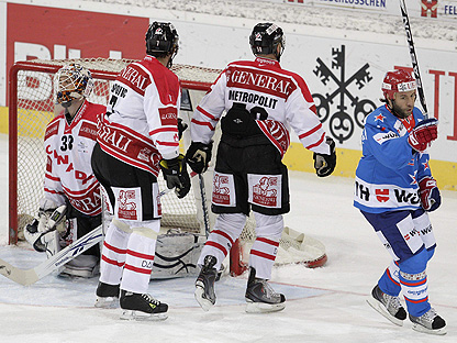
Over the christmas holidays, I started to watch the Spengler Cup, a hockey tournament played in Europe, featuring teams made up of “lower caliber players” compared to tournaments like the World Championships and the Olympics. I noticed that similar marketing methods are used, but unlike in North American Hockey, the players were skating around like billboards. It seemed like no matter where I looked there were ads. The thing that shocked me most was that the majority of the ads were only for a few different companies! I believe that all of these ads are over-kill. I know that many people watch hockey and other sports so it is a good means of advertising, but there such a thing as too many ads.
ctestp.ctv.ca
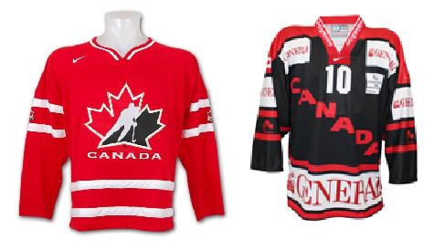
Canada's Olympic Jersey Vs Canada's Spengler Cup Jersey. http://davecunning.files.wordpress.com/2010/12/can-jerzs.jpg

In North America we use professional athletes to endorse and promote companies through off-ice campaigns rather then slapping ads all over them. While they play the only real on-ice promotion that players do is displaying the small manufacturer’s logos on the gear they are wearing. In the Spengler Cup I noticed that many of the manufacturer’s logos were covered up by these, mainly, “non hockey related ads”. I think that all the advertising during the Spengler Cup takes away from the game itself, and it makes the players look ridiculous.

sports.yahoo.com
Categories
Uncategorized

Starbucks is Feeling the Heat Over New Logos

http://www.gizmodiva.com

Entering its 40th year of service, Seattle based, Starbucks Coffee Corp. has decided that it is time for change. After having the same logo featured on their cups since 1992, with the exception of promotional cups, Starbucks has finally revamped it’s logo. Starbucks’ fourth logo of all time features the same old Mermaid, minus the words “Starbucks Coffee” that previously wrapped around the logo. Some Starbucks regulars believe this new cup looks cheap, some even say it looks like the cup you would receive a $2 latte in, not a $5 Starbucks Latte. Another Starbucks faithful said that he might stop drinking Starbucks all together because he dislikes the new logo so much. People believe that the removal of “Starbucks Coffee” from the cup is an ignorant move by Starbucks. I personally really like the modern look of the new logo, and yes it may be ignorant to have removed “Starbucks Coffee” from the cup, but honestly the majority of people know a Starbucks cup when they see one.


http://www.psfk.com

This new design has outraged many consumers, and for a company like Starbucks with a very loyal customer base, there is a little homework that Starbucks should have chosen to do before making these changes. They could have preformed surveys, or even logo design contests, to ensure that customers will like the new logo. Starbucks has to remember that they have developed an image that they need to live up to, and if customers are put off by this new design they will most likely go purchase their coffee, cheaper, elsewhere. But, in the end these are just cups, and when it comes down to it, it isn’t the cup, it is what is inside the cup that matters.

Spam prevention powered by Akismet