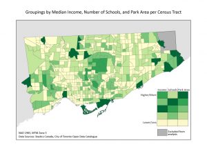
The map below shows the final product of the grouping analysis. The table in the bottom right corner can be used to interpret the results by identifying relatively which groups have higher income, more schools, and more park area. For example, the lightest green color has the lowest income, the fewest schools, and the least park area. The next lightest group has fairly low income but lots of schools and fairly little park area. Again, the table represents relative differences so the differences are not necessarily equal between groups, but it allows for a relative comparison.
There are many important patterns to notice from this grouping analysis. First, most of the map is covered the two groups with the least park area and the lowest income. There are much fewer census tracts in the groups with more park area. Also, the CTs in the group with the most park area are quite dispersed throughout the map. A note worthy group is the one shown in the second-lightest green, which has relatively low income and little park area, but the highest number of schools, which implies that there are a lot of children who come from lower-income homes that do not have much access to parks. The grouping analysis does not show a very strong relationship between the three qualities, which would require that the groups are ranked in the same order for each category, but it is somewhat close to that. Aside from the group in the second-lightest green in its ranking of schools and the middle group in its ranking of income, each category is ranked in the same order.