Categories
Tasks

Task 12: Speculative Futures

For this task, I decided to analyze Copilot’s rendition of this narrative. The LLM’s response is below:

Picture this: you’re wandering through the overgrown remnants of a city, where nature has woven itself into the bones of skyscrapers and highways. Vines drape over rusted cars, and wildflowers burst through cracks in the pavement. The world as we knew it has unraveled, but amid the quiet decay, there’s an unexpected serenity.

Suddenly, something catches your eye—a glint of iridescent light beneath a tangle of ivy. Curious, you pull back the leaves to reveal a sleek, oval device that fits snugly in your hands. It’s unlike any instrument you’ve seen before, a seamless blend of organic curves and metallic sheen. This is the Lumina, a relic from the days when technology teetered on the edge of wonder and caution.

Gently, you trace your fingers along its surface, and the Lumina comes alive. Soft, luminescent patterns ripple across it like the reflection of stars on water. Then, a melody begins to emanate—not from speakers, but as if the air itself is humming. The notes are ethereal, weaving together harmonies that resonate deep within you. It’s as if the instrument is reading your emotions, translating them into sound.

Here’s the magical part: the Lumina is powered by an AI designed to interpret biometric signals—heartbeat, body temperature, even subtle shifts in your mood. In the years before society’s great shift, engineers dreamed of technology that could create art in tandem with its user. The AI doesn’t just play music; it collaborates with you, turning your innermost feelings into a symphony of light and sound.

As you explore its capabilities, the music shifts from hauntingly beautiful to playfully uplifting, mirroring the delight blooming inside you. The Lumina becomes more than an instrument; it’s a companion, a bridge between isolation and expression in this fragmented world.

Others, drawn by the captivating sounds, begin to gather. Strangers become an impromptu audience, their faces softening as the melodies touch something universal within them. Someone laughs; another sheds a tear. The AI responds to the collective presence, enriching the music, creating layers that hadn’t been there before.

In this moment, the lines between human and machine blur in the most enchanting way. Artificial intelligence isn’t a harbinger of doom here—it’s a catalyst for connection, a reminder of the creativity and empathy that endure despite everything. The Lumina demonstrates that technology can have a soul, not in the literal sense, but in how it amplifies the best parts of us.

You can’t help but feel a swell of hope. If an instrument like this exists, what else might be out there? What other remnants of innovation and beauty are waiting to be rediscovered? The delight isn’t just in the music but in the rediscovery of possibility itself.

So you share the Lumina with those around you, each person adding their own essence to the evolving harmonies. The air fills with a tapestry of sounds—joyful, complex, alive. It’s a spontaneous celebration, a fleeting yet profound connection that seems to promise that this fractured society can find its way back to something whole.

Isn’t it incredible how, even in the aftermath of upheaval, we can find gems that ignite our capacity for wonder? Instruments like the Lumina aren’t just about advanced technology; they’re about reclaiming our innate desire to create, to feel, to connect. They show that artificial intelligence, when intertwined with human spirit, can lead to moments of pure, unadulterated delight.

(Microsoft, 2025)

Reflection

I was actually very impressed by the story that Copilot created in response to this prompt. I found myself drawn to the concept that it had invented, and was invested in the narrative. I was also surprised at how well it spoke about AI (considering that it is AI). The product also made me wonder about what kind of source material the AI may be drawing from to give this output. As most output from LLMs is not ‘original’, I wondered if this concept came from an existing story or post on the internet.

I also found it interesting that the LLM wrote to story in second person POV (e.g. you). It felt to me much more like a roleplay simulator than a story, but I also found it to be a compelling way to connect with the material being presented.

The ideas presented in the output are legitimately profound, and match the prompt well. The idea of this sort of instrument that is played with our emotions seems futuristic, but also perhaps something that could be a reality (in the style of s polygraph machine of sorts – using biological indicators to suggest mood). The writing is mostly smooth, and to me, does not heavily come off as AI writing – which I appreciated. I found the whole thing to be a bit scary, as AI seems to be getting better and better at writing as a human. This highlights the importance of technologies such as Synthid, which can help watermark AI text and make it more detectable for humans especially as AI continues to improve.

References

Lab, S. (n.d.). The Thing From The Future. Situation Lab. Retrieved December 14, 2022, from https://situationlab.org/project/the-thing-from-the-future/

Microsoft. (2025). Copilot [Large language model]. https://copilot.microsoft.com/chats/

Synthid. Google DeepMind. (n.d.). https://deepmind.google/technologies/synthid/
Categories
Tasks

Task 11: Text-to-Image

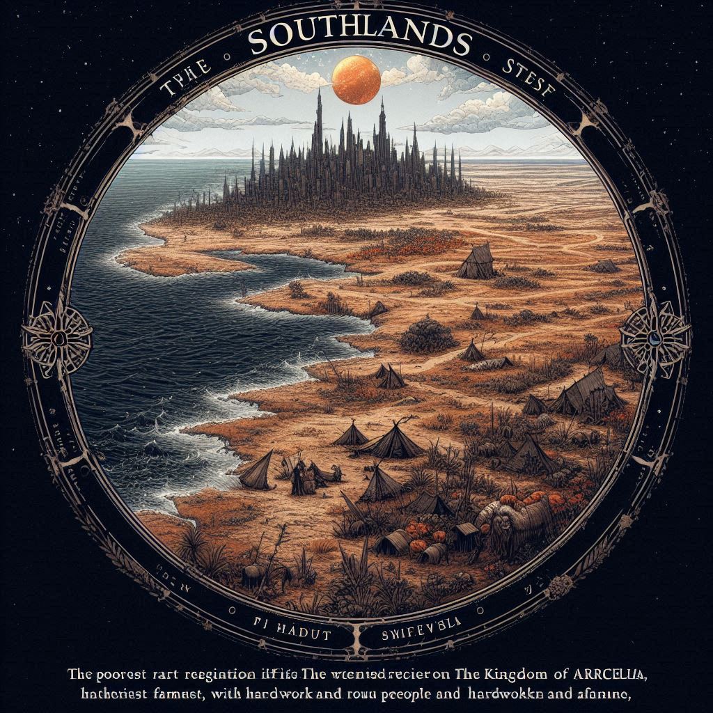
Note. Images generated using Microsoft Copilot

1st and 2nd attempts
Left image description below:

The Southlands is the poorest region of the kingdom of Arcelia, and it is often overlooked and ignored by the rest of the kingdom. Located in the southernmost part of the kingdom, the Southlands is a barren and harsh land, plagued by drought and famine. Despite its challenges, the people of the Southlands are a resilient and proud people, who have always made the best of what they have. They are hardworking and resourceful, and have managed to eke out a living in this difficult land.

3rd Attempt & Regeneration
Final Attempt
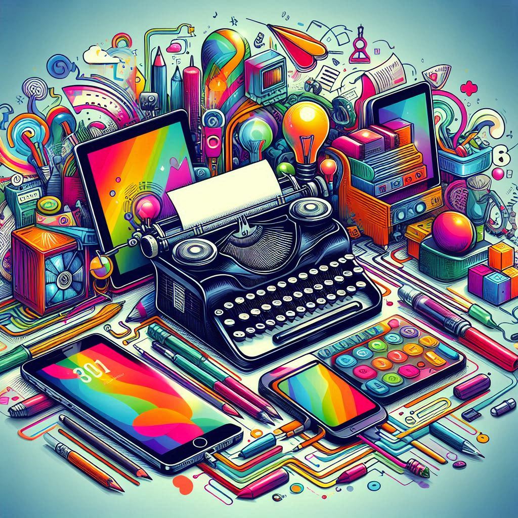
PROMPT: draw a representation of “text technologies”

Reflection

This week, I generated images using Copilot. This was only my 2nd or 3rd time ever using Copilot, but I was pleasantly surprised at how easy it was to use. The image generation was also a lot faster than I remembered. When I had tried to generate images previously it was an unengaging amount of time.

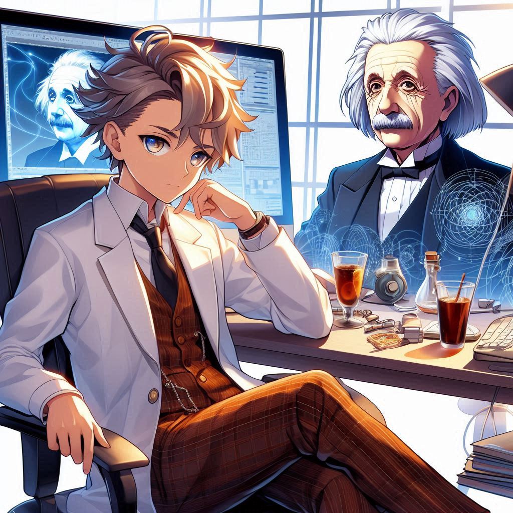
I asked for a wide variety of images in order to get a large sample size. Originally, I wrote more specific prompts as instructed by multiple guides (Research guides: Artificial intelligence for image research: Prompt engineering), however, I found that despite attempting to be specific, the images were often not what I expected. For example, I wanted a sweeping landscape digital art of a fantasy kingdom, but Copilot decided to put it on a black circle with broken text underneath. With the second image, I wanted to create an “anime-style” avatar of Albert Einstein, but instead I got a random character with Einstein in the back. I don’t think that the character that was generated was made to look like him at all.

It was hard for me to infer much about the process, as I didn’t really detect any patterns with the generation. Although this is probably more of a good thing, I found it frustrating that the results could very so widely when giving prompts, which made me unsure of how I might become a “power user” of this sort of technology (I generated many other images that I did not post here).

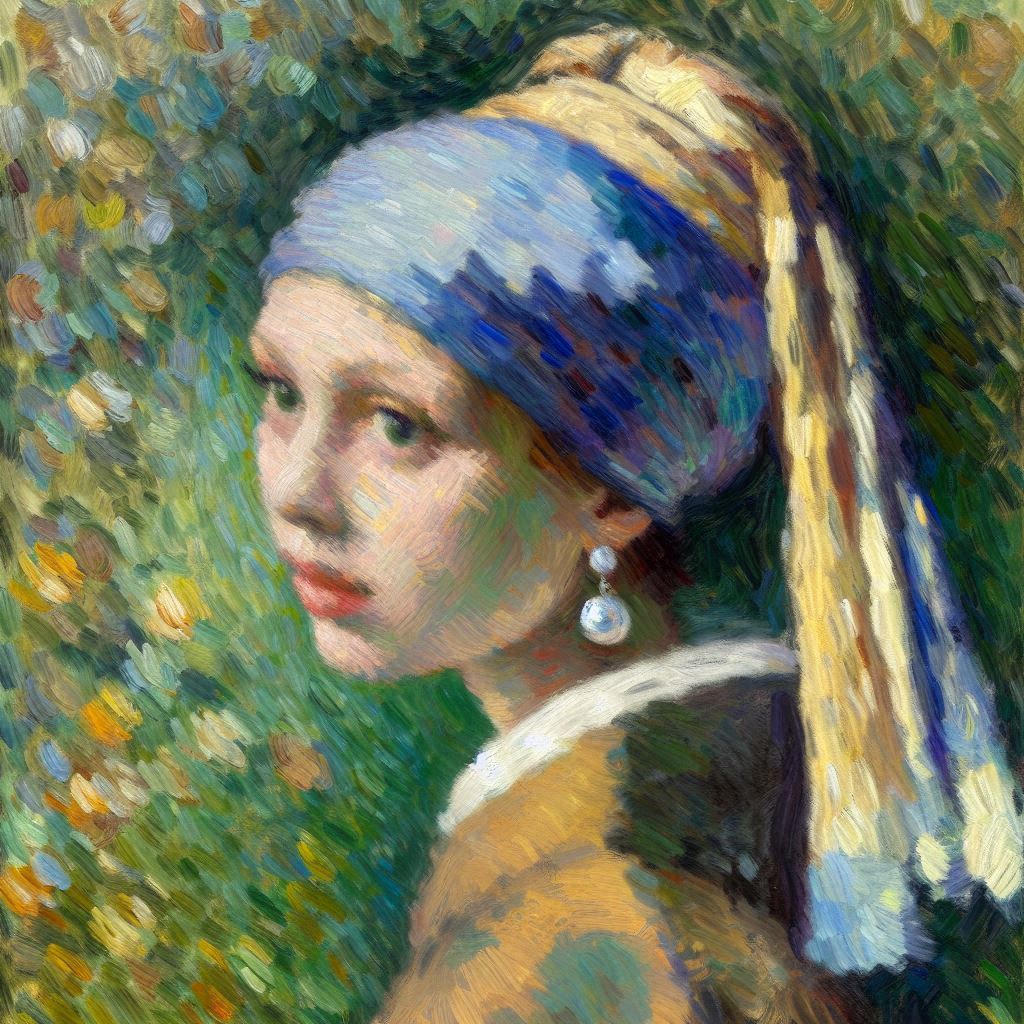
For my third attempt, I asked it to recreate a classic painting in the style of Monet (my favourite!). The result seemed heavily influenced by starry night and not so much Monet, so I attempted a new prompt, which I think was much more successful.

Finally, for the text technologies image, the output was very similar to many AI generated images I had seen before. This one seemed to be an homage to early training models with the bright colors and “burst-like” design. This one was the most open-ended and also ended up being one of the images I was most satisfied with. This may be a lesson that having low expectations is the best way to use this sort of tool. Still, I really enjoyed trying Copilot and seeing the possibilities.

References

How to use AI image prompts to generate art using dall‑e. Learn at Microsoft Create. (2024). https://create.microsoft.com/en-us/learn/articles/how-to-image-prompts-dall-e-ai

Research guides: Artificial intelligence for image research: Prompt engineering. Prompt Engineering – Artificial Intelligence for Image Research – Research Guides at University of Toronto. (n.d.). https://guides.library.utoronto.ca/image-gen-ai/prompt-engineering

Microsoft. (2025). Copilot [Large language model]. https://copilot.microsoft.com/chats/

Categories
Tasks

Task 10: Attention Economy

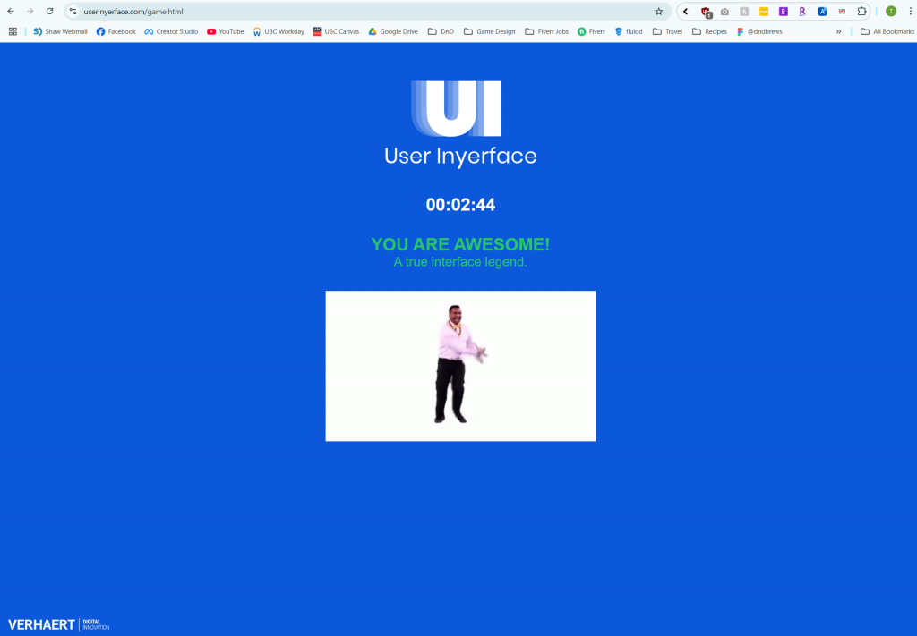
I did it!

The website is filled with many manipulative elements and dark patterns. I actually went through this website before when I was doing my Bachelor’s in Design. Still, I had forgotten how frustrating it was to complete.

Some of the main dark patterns I noticed were:

  • Hidden close buttons
  • Confusingly coloured toggles/confirm buttons
  • Misleading language

Other poorly designed UI elements included:

  • Opposing checkboxes
  • Misaligned or hidden objects
  • Placeholders that do not disappear

It was annoying to get through the website, and I got caught a few times by the intentionally bad design. It sort of made me think of older websites, at a time where websites were not so optimized – except on purpose.

In addition, it made me reflect on the state of the internet today. I often forget how the internet “truly” looks, since I have ad-blockers and many other extensions to enhance my browsing experience. When I see an older family member without adblock use the internet, I am shockingly reminded of how the internet looks to those users, and I am appalled. This website reminded me of the shock I experienced when seeing webpages full of popups and advertisements.

Dark patterns exploit gestalt principles, which are psychological guidelines that control how we perceive and interpret web-based design (Interaction Design Foundation – IxDF, 2016). Dark patterns are embedded in everyday life and many online applications. For example – McDonalds kiosks used to show sizes from large to small, assuming you might click the leftmost option. In addition, websites like Temu place countdown timers, stock indicators, and offer “limited time discounts” to pressure users into completing their purchases. These are unethical ways to get users to spend more money. fern (2024) discusses how the kiosks make more money than cash register purchases using bundling and creative psychology on consumers.

References

Bagaar. (2019). User Inyerface [web game]. 

Brignull, H. (2011). Dark patterns: Deception vs. honesty in UI design. A List Apart, 338.

fern. (2024, July 30). The $2.1 Billion McDonald’s Machine. YouTube. https://www.youtube.com/watch?v=BKX6EhDrgqQ

Interaction Design Foundation – IxDF. (2016, August 30). What are the Gestalt Principles?. Interaction Design Foundation – IxDF. https://www.interaction-design.org/literature/topics/gestalt-principles

Categories
Tasks

Task 9: Network Assignment

Largest Community – 50 Connections (contains me!)

I was very pleased and surprised to learn that I was part of the largest community when looking at the Palladio data. As someone who studied music for many years, I really enjoyed the previous task, and had spent considerable time deliberating which songs to keep in and out of the limited ten.

Through looking at the data, I also learned that I had “correctly” chosen 6 out of the most popular 10 songs. Despite this having no real value, it was interesting to reflect on the sense of accomplishment this made me feel, despite having no real meaning.

The largest community contained 5 people and 22 total songs. Of those songs, 8 of them were not shared amongst any of the 5 members. For reference, the remaining communities consisted of:

  • 4 people, 17 songs, and 6 solos
  • 3 people, 18 songs, and 9 solos
  • 3 people, 17 songs, and 8 solos
  • 3 people, 19 songs, and 12 solos
  • 2 people, 14 songs, and 11 solos

Despite the breadth of these statistics, the actual intention behind each persons’ decision remains unknown. Null choices can not be interpreted using this data, and even using the communities grouping can be misleading. For example, in my community, there were 8 songs that had “no connection” (they were displayed as solo nodes). Even though there were no connections in this community, some of these songs were in the top 10 most popular choices for the entire class, but by looking at just our community, you wouldn’t believe this to be the case.

If you read my notes on the curation assignment, you’d know that I had many considerations including: “country of origin, length, genre, and if the song was instrumental or vocal” (para 1, 2025). Sadly, this analysis is lost through this data, as it is for every member who participated.

Still, there are some data points that instill curiosity. For example, Jamie, Joan, and David all selected less than 10 songs. I wonder what their reasoning was for their decision making. Did they have a hard time deciding? Did they decide that they didn’t need 10 options to create a well-rounded set? We may never know.

Much like real life, these groupings show individuals with like interests, but also obscure much of the total picture. In one group, it may seem like a particular song was horribly unpopular, but if you explore other groups, that song may be very well-represented. Although looking at similarities can join us together, it can also create divide and alienation. It is important that we continue to challenge our assumptions about the communities we are in, and continue to seek outside information.

References

Wong, T. (2025). Task 8: Golden record curation assignment. ETEC 540 Tristan Wong. https://blogs.ubc.ca/twong540/task-8-golden-record-curation-assignment/

Spam prevention powered by Akismet