Spatial Autocorrelation:
Spatial Autocorrelation Report
| Variable | Moran’s I Index | Expected Index | Variance | Z-score | P-value | Clustered or Dispersed? |
| Education | 0.207465 | -0.008547 | 0.002007 | 4.822091 | 0.00001 | Very Clustered |
| Income | 0.099094 | -0.008547 | 0.002046 | 2.379780 | 0.017323 | Clustered |
| Population Density | 0.718851 | -0.008547 | 0.002092 | 15.901764 | 0.00000 | Very Clustered |
| Visible Minority | 0.070525 | -0.008547 | 0.002067 | 1.739335 | 0.081976 | Clustered |
Table 2: Table describing the Spatial Autocorrelation values of each variable
Our results from the Spatial Autocorrelation report indicate that all of the exploratory variables are spatially autocorrelated. This is demonstrated through the spatial distribution of Greenest City Projects in Vancouver with them being either clustered, random, or dispersed. The Spatial Autocorrelation (Global Moran’s I) tool is used to analyze our exploratory variables based on both feature locations and feature values simultaneously, while assessing how similar one object is to those around it (Esri ArcGIS Pro, 2019). When variables are attracted (or repellent) to one another, the observations are not independent. This contradicts a fundamental principle of statistics: data independence. Additionally, the Spatial Autocorrelation tool calculates the index value and expected index value with a comparison between one another. The tool computes a z-score and p-value based on the number of features in the dataset and the variance for the data values overall, indicating whether the difference is statistically significant (Esri ArcGIS Pro, 2019). Index values cannot be directly understood; they must be evaluated in light of the null hypothesis. In the context of our project, our null hypothesis states that there is no statistically significant relationship showing spatial distribution of Greenest City Projects between exploratory variables. Consequently, our alternative hypothesis states that there is a statistically significant relationship showing that the distribution of Greenest City Projects is dependent on our outlined exploratory variables.
Education: Based on the spatial autocorrelation report, education has a Moran’s I Index value of 0.207465. It indicates a positive spatial autocorrelation where similar values are very clustered together spatially on a map. Education’s z-score of 4.822091 demonstrates that there is a less than 1% likelihood that the clustered pattern evident in education could be the result of a random chance. The z-score indicates that the results lie by a standard deviation of 4.82 away from the mean, and are unlikely to be a result of random chance. The p-value of 0.00001 indicates that education data is highly statistically significant because the p-value is less than 0.05. As both z-scores and p-values are associated with the standard normal distribution, education’s high z-score and very small p-value are found in the tails of the normal distribution. With a confidence level of 99% (refer to Table 3), we can likely reject the null hypothesis as it would be unusual for the observed spatial pattern to be a result of random chance, and the p-value would be too small to reflect this.
Income: Similar to education, the spatial autocorrelation report states that the Moran’s I Index value of 0.099094 for income indicates a positive spatial autocorrelation. However, as income’s Moran’s I Index value is closer to 0 compared to education, it has a lower z-score of 2.379780. Given the z-score of 2.379780, there is less than a 5% likelihood that this clustered pattern could be the result of random chance. Hence, we are approximately 95% certain that the clustered pattern shown for income is not random. The p-value of 0.017323 indicates that income data is statistically significant as the p-value is also less than 0.05, similar to education. Also, Income does have a lower z-score and not as small of a p-value compared to education, but the data is still found in the tails of the normal distribution. When the p-value is rounded to 2 decimal places, it is 0.02 which tells us that with 95% confidence level, we can state that there is a 5% chance that the results from income data may be a result of random chance. Hence, we cannot confidently reject our null hypothesis.
Population Density: Out of all four exploratory variables, population density presents the highest Moran’s I Index value at 0.718851. As Moran’s I Index has values ranging between -1 to 1, it will be positive if the values in the dataset tend to cluster geographically, meaning that high values cluster near other high values; low values cluster near other low values. The Index will be negative when high values repel other high values and tend to be near low values. The Index will be near 0 if positive cross-product values balance negative cross-product values. Thus, as population density’s moran’s I index value is closest to +1, it is positively spatially autocorrelated with high degrees of spatial clustering. In other words, the data is very clustered into spatially homogeneous regions. The z-score of 15.901764 indicates the highest z-score compared to the other 3 explanatory variables, meaning that it is the most spatially autocorrelated. It indicates that there we are more than 99% certain that this clustered pattern is not the result of random chance. With a very small p-value of 0.00000 found in the tails of the distribution, this coincides with the high spatial autocorrelation. Therefore, our data for population density is highly statistically significant because it is unlikely that the observed spatial pattern reflects the theoretical random pattern represented by our null hypothesis.
Visible Minority: Conversely for visible minority, it states the lowest Moran’s I Index value of 0.070525 compared to the other 3 explanatory variables. With that being said, visible minority’s Moran’s I index value is much closer to 0 compared to the other 3 explanatory variables, indicating that even though it is still spatially autocorrelated, it is the least positively spatially autocorrelated compared to education, income and population density. The low z-score of 1.739335 also demonstrates that there is a less than 10% likelihood that this clustered pattern could be the result of random chance. This indicates that the results lie by a standard deviation of 1.74 away from the mean, and there might be a slightly higher chance of the results being due to random chance. Differing from the other 3 explanatory variables, the p-value for visible minority is 0.081976, meaning that the p-value is not less than 0.05. Hence, visible minority is not statistically significant. With a 90% confidence level, we can state that for visible minorities we will not be able to reject the null hypothesis because it is likely that the pattern exhibited could be the result of random spatial processes.
 Table 3: Table describing the Z-score and P-score values to Confidence Levels. Table is taken from: ArcGIS Pro. (2019). What is a z-score? What is a p-value? https://pro.arcgis.com/en/pro-app/2.7/tool-reference/spatial-statistics/what-is-a-z-score-what-is-a-p-value.htm.
Exploratory Regression Analysis:
Our results yielded the following Summaries to utilize in our analysis:
1 of 4 Summary (Table 4)
| Adjusted R2 | Akaike’s Information Criterion (AICc) | Jarques-Bera (JB) | Variance Inflation Factor (VIF) | Global Moran’s I p-value (SA) | Model: Variable & Significance |
| 0.10 | 737.55 | 0.00 | 1.00 | 0.83 | Education (0.01 significance) |
| 0.09 | 739.13 | 0.00 | 1.00 | 0.63 | Income (0.01 significance) |
| 0.08 | 740.15 | 0.00 | 1.00 | 0.50 | Visible Minority (0.01 significance) |
Summary of Variable Significance (Table 5)
| Variable | % Significant | % Negative | % Positive |
| Education | 25.00 | 0.00 | 100.00 |
| Income | 25.00 | 37.50 | 62.50 |
| Visible Minority | 25.00 | 62.50 | 37.50 |
| Population Density | 0.00 | 62.50 | 37.50 |
Summary of Multicollinearity (Table 6)
| Variable | Variance Inflation Factor (VIF) | Violations | Covariates |
| Education | 20.45 | 5 | Income (80.00), Visible Minority (60.00) |
| Income | 137.94 | 6 | Education (80.00), Visible Minority (80.00) |
| Visible Minority | 94.90 | 5 | Income (80.00), Education (60.00) |
| Population Density | 2.49 | 0 | — |
Out of our four summary tables, we will be focused on Summary 1 of 4 (Table 4), given that it contains the highest Adjusted R2 value, and therefore the best summary performance. The summary of the Variable Significance table (Table 5) provides information about variable relationships and how consistent they are. Looking at the values generated, it appears as though three out of the four variables: Education, Visible Minority, and Income show equal variable consistency (they are all consistent 25% of the time out of all tests). However, the variable, Population Density, had been an outlier with the lowest consistency of 0% out of all tests. This is further supported in the Summary of Multicollinearity, which describes the linear relationship between the variables. Education, Income, and Visible Minority, all show a strong correlation, with Population Density having no covariates. This indicates that the Population Density variable is likely to be independent of the other predictors.
Within Variable Significance, having a consistent negative or positive % indicates an ideal and stable relationship. This is demonstrated with Education in particular which appears to have the highest predictor of significance and a stable relationship, with a 100% positive significance as shown in Table 5. The p-values for the Jarques-Bera (JB) Summary are all 0.00, which indicates that we are far away from having normally distributed residuals (Table 4). Given that our summaries passed the JB test, we can make the assumption that we do not face the issue of model bias, and we likely have no non-linear relationships or data outliers. However, it must be noted that our highest adjusted R2 value (0.10), is still low in value, which indicates to us an unreliable correlation, and that the presence of unhelpful variables (such as population density) is likely reducing the score.
Generalized Weighted Regression Analysis:
The results of our Generalized Weighted Regression helped us better analyze the relationship between our variables and Greenest City projects, and allowed us to draw conclusions as to whether the coefficient changes depending on its spatial location.
Shown in Map 5 is a Standardized Residual classification of the GWR. Values indicate how far our results lie from accuracy and are indicated through the following color scheme:
- Purple Values: Negative Standard Deviations away from accuracy, under predictions
- White: General Accuracy
- Green: Positive Standard Deviations away from accuracy, over predictions
Results indicate that a majority of our Census Tracts are close to accuracy (white values), and Census Tracts that deviate are loosely clustered around the Mid-East region of Vancouver. Looking at the Residual Distribution (Chart 3), most deviations are in the -0.5 to -1.5 range, with no negative Standard Deviations past -1.4. Positive Deviations are fewer, but more distinct, with a maximum of up to 5.9 Standard Deviations away from accuracy. According to the ArcGIS Desktop Interpretations of GWR (ArcMap, 2018), clusterings of over- and/or under prediction on the Standard Residual map is evidence that a study is missing at least one key explanatory variable. Given this and the general clustering of green and purple values, we can make the assumption that such predictor gaps have not been filled. However, given a low R-Squared Value, we advise taking these results with caution.
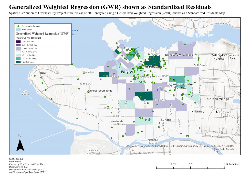 Map 5: Map displaying the Generalized Weighted Regression Analysis of our Variables Shown as Standardized Residuals. Map Units are in Standard Deviations.
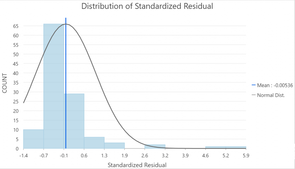
Chart 3: Chart displaying the Distribution of Standardized Residuals
Following the residual analysis, we viewed the results of our coefficient raster surfaces for each individual variable. Raster surface maps are indicated through the following color schemes:
- Blue: Positive Coefficients
- White: No Coefficients
- Red: Negative Coefficients
Education: Analyzing the raster surface map of Education to Greenest City projects (Map 6), it appears as though higher levels of educational attainment are associated with a negative relationship to the development of projects. This is shown in the dark red-colored regions near downtown, where the largest cluster of Greenest City projects are located. Additionally, the map indicates a stark divide between negative and positive relationship values vertically, with strictly negative values in the North, no specific relationship in mid-Vancouver, and followed with strictly positive values in the South. This is an indication that lower levels of education are correlated with a higher development level of projects. This poses a great area of interest, given that it could have been a purposeful action undertaken by the City of Vancouver.
 Map 6: Map Displaying the Education Variable as showing through a GWR Coefficient Raster Surface. Map Units show high values in Blue and low values in Red.
Visible Minority: The raster surface map of Visible Minority data to Greenest City projects (Map 7) shows a relationship that is similar to Income, in that the densest regions of both the positive and negative relations are not in direct relation to the cluster of Greenest City projects. Rather, there appears to be a strong negative relationship in the Kitsilano and West Point Grey region in the West, and a strong positive relationship near Sunset and Marine Drive in South-East Vancouver. Overall, there appears to be a slight positive correlation between the increased presence of visible minorities, and the development of Greenest City projects.
 Map 7: Map Displaying the Visible Minority Variable as showing through a GWR Coefficient Raster Surface. Map Units show high values in Blue and low values in Red.
Income: Observing the raster surface map of Income to Greenest City projects (Map 8), there appears to be a North-West to South-East divide between the positive and negative relationships. Results are divided around the regions of the West Point Grey, Dunar, and Kitsilano area which have a positive relationship from the general Sunset and Marine Drive region of the city which have a negative relationship. This shows interesting indications towards the nature of the income to project relationship, given that despite divides occurring between points, these two locations contain Greenest City projects that are quite sporadic. This differs from what might be originally predicted, in that distinct relationships would occur and change where higher concentrations of Greenest City projects arise. Because of this, we can predict that there is a distinct spatial difference between the two divided areas.
 Map 8: Map Displaying the Income Variable as showing through a GWR Coefficient Raster Surface. Map Units show high values in Blue and low values in Red.
Population Density: Analyzing the results of the raster surface map of Population Density to Greenest City projects (Map 9), there does not appear to be as much spatiality. However, there does appear to be a slight positive relationship between increased population density with project development as shown in the Downtown region. This is shown in contrast to the strong negative relationships that occur in the Southernmost regions of the city, which indicate a negative relationship where population density decreases in an area with lower Greenest City clustering.
 Map 9: Map Displaying the Population Density Variable as showing through a GWR Coefficient Raster Surface. Map Units show high values in Blue and low values in Red.
Discussion:
The results of our spatial analyses highlighted to us the ways in which spatially motivated decisions were made around Vancouver’s Greenest City Projects, and where our chosen variables came into these findings. Viewing the spatial distributions of Greenest City project, it appears as though they are relatively clustered in areas around Strathcona, Mount Pleasant, as well as East and West Downtown Neighbourhoods. While most variables were found to be spatially autocorrelated as shown through our Global Moran’s I values, the results of our Exploratory Regression Analysis indicate that Education and Income appear to have the most interesting relationship to Greenest City projects as shown through their high positive variable significance. This is especially true with the Education variable, with the highest Adjusted R-squared score (indicating the effect size of the variable), and the most consistent variable significance of a Positive 100% value. It must be important to note, however, that our highest Adjusted R-square value in our Exploratory Regression Analysis still remained relatively low. Therefore, caution must be taken when placing potential assumptions around the data results. Additionally, this regression analysis highlighted to us the existing multi-collinearity between three out of the four variables, Education, Income, and Visible Minorities, which all showed relationships to one another. Repeatedly, the Population density variable was shown to have zero multicollinearity with the other factors, and a low significance in its omission from the Exploratory best summary. This result indicates to us that population density may not be significant enough to be included in this particular analysis, and that future research may choose to replace it if necessary.
Looking at the results of our Generalized Weighted Regression, we have also been able to make conclusions on the relationships between our variables and the Greenest City projects. Most notably out of all factors, it appears as though Education yielded the clearest and most interesting results, with a definitive negative relationship with Greenest City projects. This highlights to us that targeting areas of lower Education was likely a factor in decision making, and we are able to focus on other marginalities when considering where to place new projects in the future. Viewing the results of other variables, results showed that Visible Minority and Income had slightly similar spatial distributions of negative and positive relationships, with reversed values. These two raster surface maps showed lighter relationships within the region of Greenest City clusterings, indicating that there may be other factors in its spatial distribution. Additionally, based on the visual clusterings of over and under predictions in the Standard Residual Map, our results show that we are likely missing key explanatory variables outside of our chosen four that explain where Greenest City projects are being constructed.
Shown below (Map 10) is an annotated urban planning map of our recommended future Greenest City Project locations. Our top 3 choices are based on the results of our spatial comparison, as well as based on where variables were lacking in regards to their correlation with Greenest City Projects in our Generalized Weighted Regression. Additionally, our Explanatory Regression Analysis indicated that it would be safe to assume that Education is accounted for in presently placed projects. Thus, Education was less of a factor in our proposal choices.
Our first choice (as shown in Map 10) is found in the Cambie and Oakridge region of the city. The reasoning behind choosing this area is based upon the relatively lower-income populations that reside in the area, as shown in our spatial comparison and GWR. We would highly recommend this region given the additional opportunity for raising sustainability awareness. This is due to the high concentration of educational institutions (Secondary and Post-secondary schools) in the general vicinity, which could benefit from greater environmental education. One point to note, however, would be to consider how transportation further affects access to these projects, and whether that would be a concern regarding its implementation. Shown below (Map 11) is Vancouver’s official transit map containing all routes to consider.
Our second choice (Map 10) is found in the Champlain Heights and Killarney region. Our reasoning for choosing this area is due to the higher rates of visible minority populations in this region, as shown in our spatial comparison. Additionally, it is found in our GWR that there is a negative relationship between Greenest City projects and income. Despite this region having relatively higher income, we still find that there is a large enough gap of projects in this region to justify greater implementation.
Our final choice (Map 10) is found in the Hastings Sunrise and Renfrew region of the city. The reasoning behind this choice is due to a high rate of visible minority populations and population density as shown in our spatial comparison. Additionally, despite our GWR surface rasters showing that this area has a negative relationship to population density (with less education being correlated with higher greenest city projects), this region still seems to lack an adequate number of project implementations (Map 6).
Our hopes in identifying these areas that may benefit from sustainable projects on the basis of marginalization are to help bridge the gap in disproportionate climate change effects and those who receive the greatest access and assistance. Additionally, we hope that pushing for such developments in these overlooked areas can give a rise to urban bioregionalism (a greater knowledge and care for urban environments), and provide the stepping stones to a brighter, greener future.
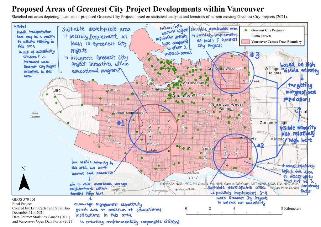 Map 10: Annotated Map displaying the Proposed Locations for Future Greenest City Projects based on Spatial Analyses.
![]() Map 11: Official Translink Map displaying all transportation routes within the city of Vancouver. Map was taken from: TransLink. (n.d.). Retrieved December 16, 2021, from https://www.translink.ca/schedules-and-maps/transit-system-maps .
Map 11: Official Translink Map displaying all transportation routes within the city of Vancouver. Map was taken from: TransLink. (n.d.). Retrieved December 16, 2021, from https://www.translink.ca/schedules-and-maps/transit-system-maps .