For task #6 (Emoji Story), I’ve chosen to link to Alexandra Scott’s Task 6: An Emoji Story task. I found Alexandra’s emoji story refreshing. Not only did she use a different WordPress theme I’ve not seen before, but Alexandra also chose to wait to share her emoji story until her reader finished reading her description first. I’d not thought of flipping my narrative around in order to save the emoji story until the end/bottom. I think this was a clever tactic on Alexandra’s part not only because it encourages readers to actually read through her descriptive text, but also because her movie was (for me) an easy guess. (Partly because I’m only now starting to emerge from watching all-Disney-all-the-time, but also because I’ve always been a fan of Disney movies).
Alexandra’s discussion surrounding image use in text-based narratives reflects my own in that we both do not believe that literacy has reached a point where we’re capable of using images (emoji) to exclusively convey the meaning of our messages. Perhaps we have forgotten how to interpret image-only stories (such as those that might’ve been painted on the inside of a cave wall). Nevertheless, it seems that Alexandra and I both feel that text still has a main role to play in storytelling and communicating.
Web Authoring Tool
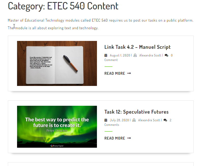
At first I thought Alexandra’s blog was built using a completely different CMS than WordPress, but after spending more time on her site, I realized Alexandra was using a different theme than those I’ve used in the past. Placing each task or assignment on a different “card” (see image below), was super helpful when trying to navigate the site. I find it much more inviting than the theme I’ve chosen on my own site and am considering finding a way to incorporate more image-based navigation on my own site (if time permits). The multimodality of Alexandra’s site is appealing because it allows users to navigate either through more traditional text-based means (by clicking on the menus at the top) or by clicking on the image cards. Cool.
ETEC 540 Content page organization on Alexandra’s blog site.
The main drawback I experienced, however, was the lack of granularity in terms of navigating through the different components of the “ETEC 540 Content” link. Having sub-menus or a drop down menu from which to select one task over the other (rather than having to scroll through all the image cards and/or clicking to another page by selecting the page number on the bottom of the page), might make navigation easier for many users. Of course, since I’m also currently taking ETEC 565, I am also looking at the site through an accessibility lens and wonder if the image cards used in this particular WordPress theme would work with screen readers (or not).
Theoretical Underpinnings
As we’ve progressed through ETEC 540, we’ve followed the evolution of ‘text’ (in its different forms) through time. A consistent theme that emerges is a sense of fear that new technology will replace the old and that new forms of communication will render previous, older forms obsolete.
For Task 6, both Alexandra and I situated our emoji stories on Bolter’s (2001) Chapter 4, “The Breakout of the Visual” and his “fear that the cultural significance of printed books and of writing itself is threatened” (Bolter, 2001, p. 48). And that, through digital media, “[v]erbal text will be further marginalized in the quest for immediacy” (Bolter, 2001, p. 74). While I believe both Alexandra and I acknowledge some of the changes Bolter predicated with respect to text’s evolution through readers’/viewers’ need for information RIGHT NOW, we (also) both recognize that text is still just as important now as it has been since the Monks spent their days toiling in misery to copy texts under candlelight. That is, we do recognize that society now uses image far more often to convey messages (and to grab our attention immediately), however, we still heavily rely on text to tell the whole story.
Emoji Reflections
Task 6 encouraged us to recognize the increased importance image plays in our day-to-day communication with one another. Has text been relegated to a secondary role in comparison to image? Not necessarily. Image and text still seem to go hand-in-hand. Both Alexandra and I discuss whether these changes are good or bad, but perhaps that’s not the correct way to reflect on changes in modes or means of communication? Perhaps it’s neither bad nor good, it’s just….change. We adapt, we change; text and image ebb and flow in response to our changing needs as technology also changes and advances.
Reference
Chapter 4.Bolter, J. D. (2001). Writing space: Computers, hypertext, and the remediation of print (2nd ed.). Mahwah, N.J: Lawrence Erlbaum Associates. doi:10.4324/9781410600110
For this task I tried something very different (different to me, anyway): sonification.
Keeping Task 7 in mind as I read the New London Group’s A Pedagogy of Multiliteracies: Designing Social Futures, the following passage caught my attention: “The Redesigned is founded on historically and culturally received patterns of meaning. At the same time, it is the unique product of human agency: a transformed meaning” (New London Group, 1996, p. 76; emphasis added). I wanted to transform the meaning of Task 1, but I was also interested in retaining the original text and story within Task 1 as well. How could I do both? I decided to use the New London Group’s idea of metalanguage in order to describe Task 1 “….in various realms. These include the textual and the visual, as well as the multimodal relations between the different meaning-making processes that are now so critical in media texts and the tests of electronic media” (New London Group, 1996, p. 77).
Hello Google!
I started Googling various combinations of: “text”, “analysis”, “tools”, “visualization”, “open source”, “music”, and “audio” (among others). The first tool I came across that looked promising, was Voyant Tools (https://voyant-tools.org/). It’s pretty interesting and I highly recommend it if you’d like to visualize your text.
Voyant Tools
I copied and pasted the text component of Task 1 into Voyant Tools to see what would happen. It turns out, there is quite a lot of information to be gained by visualizing one’s text. It was pretty neat: the interactive chart (below) is from Voyant Tools. I noticed that the original text was cut into 10 equal-sized pieces with the most frequent terms from Task 1 plotted, showing the trend in discourse from the start to the end of the original blog post.
This was an interesting way to visual my text, but it had nothing to do with sound. Though I learned a lot about the text I’d written weeks ago, I still hadn’t integrated sound…yet.
Sonification
Enter: sonification. Again, Google was my go-to tool as I tried to figure out how to turn my data into sound or music or something audio-based. That’s where I came across “sonification”. I’d heard of the term before, but never really explored the concept. My Google search for sonification yielded two interesting results: TwoTone Data Sonification (https://twotone.io/, a free web-based app that turns your data into sound/music) and programminghistorian.org (more on this later).
TwoTone
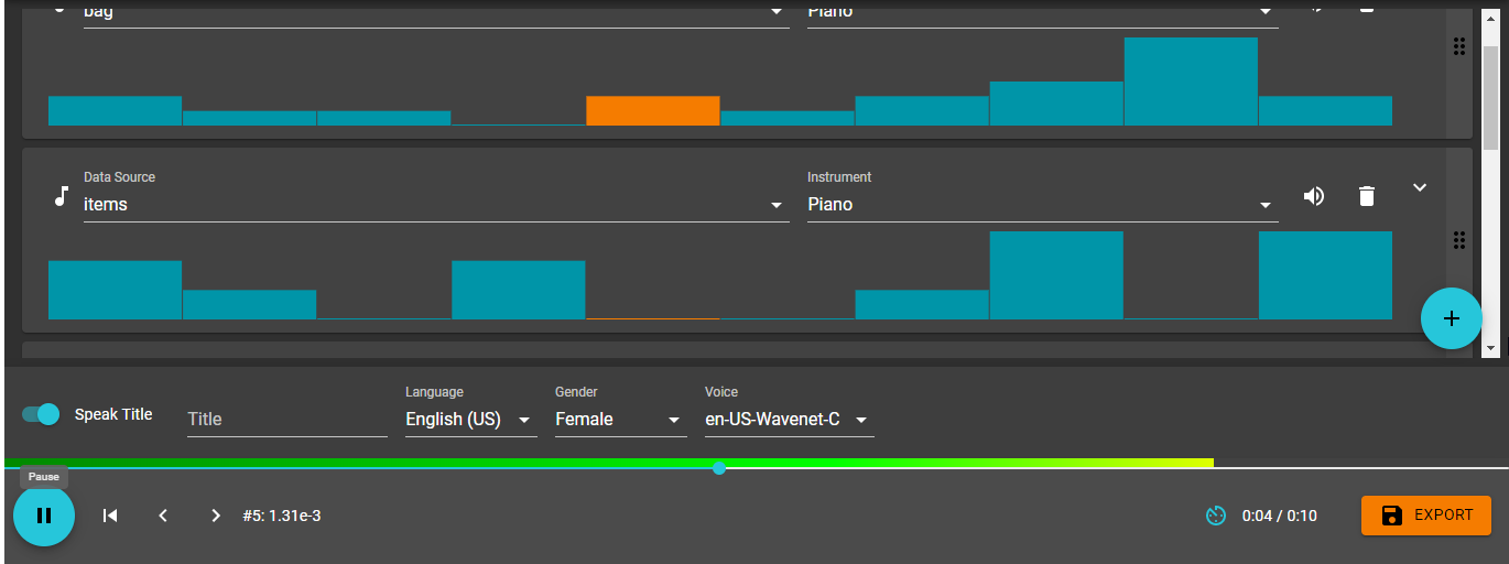
I exported the data from Voyant Tools and placed it into an Excel sheet. The exported data was divided into the same ten pieces shown in the graph/chart (above) indicating the trends of the words I’d used most frequently in the description of my image in Task 1. I then pasted the Excel data into TwoTone to see what would happen: the results were really cool! The text I’d written describing the photo of my bag had been sonified: I was now listeningto my text! Check it out below:
Reflection
In preparing for this task, I was hoping to not only produce something that satisfied the audio requirement, but I also wanted to move beyond Audio and Linguistic Designs toward a more multimodal process (New London Group, 1996).
The first step in the process toward sonifying my text was to visualize the text (Visual Design). Using Voyant Tools, I was able to see my text as a word cloud (not included in this post), as a series of knots (which can also be used to sonify the text), and the graph I included above. Using the graph, I could see the five words I repeated most often in the written piece: bag, bags, items, kids, and text. I was also able to use the graph to view the trends of my word-use throughout Task 1 and view each word spatially (Spatial Design) in comparison to other words: the graph indicated where, in Task 1, I focused my attention on a particular word, and when that focus drifted toward another word (compare “kids” earlier in the written piece versus “bag” closer to the end).
When I transferred my data to TwoTone, I could also see the different “voices” representing the five most common words repeated in Task 1; as the music plays, different columns light up across the screen. (The image below displays the progress of the words “bag” and “items” during the 10 second sonification: note the yellow/orange coloured blocks indicating the notes being played).
The lighter ‘columns’ or blocks represent the notes being played; darker (blue/green) blocks indicate notes/words that are not being played
When I listen to my sonification, I can hear the repetition of certain notes that are pleasing to the ear. This repetition of sound suggests that in my writing, I return to common themes, thoughts and ideas (or that I’m quite repetitive…). The rhythmic nature of the notes suggests an interconnectedness between the ten pieces of the chart I created in Voyant Tools (above). The rhythm also allows the listener to hear how different words ebb and flow as the story progresses.
….teachers need to develop ways in which the students can demonstrate how they can design and carry out, in a reflective manner, new practices embedded in their own goals and values. They should be able to show that they can implement understandings acquired through Overt Instruction and Critical Framing in practices that help them simultaneously to apply and revise what they have learned. (New London Group, 1996, p. 87)
This task encourages students to take what we produced in Task 1 and, through reflecting on course material, stretch our learning by applying new knowledge to an “old” task in order to create something completely new. Sounds pretty transformative to me!
I found this resource when I was trying to figure out how to analyze my text and convert it to an audio format. Though it’s beyond the scope of this course (and I don’t have time to read it all), I found Graham’s description of sonification quite helpful.