For task #6 (Emoji Story), I’ve chosen to link to Alexandra Scott’s Task 6: An Emoji Story task. I found Alexandra’s emoji story refreshing. Not only did she use a different WordPress theme I’ve not seen before, but Alexandra also chose to wait to share her emoji story until her reader finished reading her description first. I’d not thought of flipping my narrative around in order to save the emoji story until the end/bottom. I think this was a clever tactic on Alexandra’s part not only because it encourages readers to actually read through her descriptive text, but also because her movie was (for me) an easy guess. (Partly because I’m only now starting to emerge from watching all-Disney-all-the-time, but also because I’ve always been a fan of Disney movies).
Alexandra’s discussion surrounding image use in text-based narratives reflects my own in that we both do not believe that literacy has reached a point where we’re capable of using images (emoji) to exclusively convey the meaning of our messages. Perhaps we have forgotten how to interpret image-only stories (such as those that might’ve been painted on the inside of a cave wall). Nevertheless, it seems that Alexandra and I both feel that text still has a main role to play in storytelling and communicating.
Web Authoring Tool
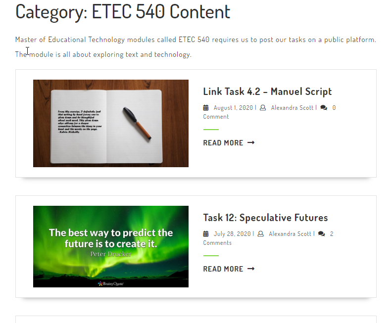
At first I thought Alexandra’s blog was built using a completely different CMS than WordPress, but after spending more time on her site, I realized Alexandra was using a different theme than those I’ve used in the past. Placing each task or assignment on a different “card” (see image below), was super helpful when trying to navigate the site. I find it much more inviting than the theme I’ve chosen on my own site and am considering finding a way to incorporate more image-based navigation on my own site (if time permits). The multimodality of Alexandra’s site is appealing because it allows users to navigate either through more traditional text-based means (by clicking on the menus at the top) or by clicking on the image cards. Cool.
ETEC 540 Content page organization on Alexandra’s blog site.
The main drawback I experienced, however, was the lack of granularity in terms of navigating through the different components of the “ETEC 540 Content” link. Having sub-menus or a drop down menu from which to select one task over the other (rather than having to scroll through all the image cards and/or clicking to another page by selecting the page number on the bottom of the page), might make navigation easier for many users. Of course, since I’m also currently taking ETEC 565, I am also looking at the site through an accessibility lens and wonder if the image cards used in this particular WordPress theme would work with screen readers (or not).
Theoretical Underpinnings
As we’ve progressed through ETEC 540, we’ve followed the evolution of ‘text’ (in its different forms) through time. A consistent theme that emerges is a sense of fear that new technology will replace the old and that new forms of communication will render previous, older forms obsolete.
For Task 6, both Alexandra and I situated our emoji stories on Bolter’s (2001) Chapter 4, “The Breakout of the Visual” and his “fear that the cultural significance of printed books and of writing itself is threatened” (Bolter, 2001, p. 48). And that, through digital media, “[v]erbal text will be further marginalized in the quest for immediacy” (Bolter, 2001, p. 74). While I believe both Alexandra and I acknowledge some of the changes Bolter predicated with respect to text’s evolution through readers’/viewers’ need for information RIGHT NOW, we (also) both recognize that text is still just as important now as it has been since the Monks spent their days toiling in misery to copy texts under candlelight. That is, we do recognize that society now uses image far more often to convey messages (and to grab our attention immediately), however, we still heavily rely on text to tell the whole story.
Emoji Reflections
Task 6 encouraged us to recognize the increased importance image plays in our day-to-day communication with one another. Has text been relegated to a secondary role in comparison to image? Not necessarily. Image and text still seem to go hand-in-hand. Both Alexandra and I discuss whether these changes are good or bad, but perhaps that’s not the correct way to reflect on changes in modes or means of communication? Perhaps it’s neither bad nor good, it’s just….change. We adapt, we change; text and image ebb and flow in response to our changing needs as technology also changes and advances.
Reference
Chapter 4.Bolter, J. D. (2001). Writing space: Computers, hypertext, and the remediation of print (2nd ed.). Mahwah, N.J: Lawrence Erlbaum Associates. doi:10.4324/9781410600110
For Task #5 (Twine Task), I’ve chosen to link to Norah Smith’s, Wedding Bells’ task. I must admit, I thought my journey through Norah’s task was going to be something along the lines of following a bride-to-be on her journey of becoming engaged, planning her wedding, and the actual ceremony. Ha! Instead, despite my best efforts, I always ended up in Florida celebrating the wedding with the bride and groom. At one point, I’m placed at a table with all the other outcasts at the wedding, but apparently the bartender and I have a great time. I take a trip to Vegas, then Muskoka; I choose to take shrooms (or not) and somehow manage to always end up in Florida. (Which for some reason has now become synonymous in my mind with Trump….).
Norah’s simple Wedding Bells Twine pokes fun at all the stereotypical nuisances associated with weddings. (I’ve certainly been privileged to have been a part of many, many weddings….). I laughed at the fact that I ultimately always ended up in Florida (even though I kept clicking on “NO”!). Like Norah, this was also my first attempt at using Twine so I’m still learning all of its ins and outs, but though I felt I learned an awful lot, I wasn’t able to figure out how to add the ‘go back’ option Norah added to hers. That was pretty helpful and awfully kind…it allowed me to keep making terrible decisions and encouraged me to try all possible paths to increase the likelihood that THIS time, I could make my life even MORE miserable. 😉
Norah’s Twine design was quite clean and simple: white text on a black background, blue links for the options. It was super easy to navigate and had a more or less predictable narrative structure. Though there weren’t any images included in her Twine, I didn’t necessarily think this was a shortcoming. I suppose possibly including some tacky images of Florida or Vegas might’ve added more humour, but I don’t think it was necessary. I think her Twine game did well as a simple, straightforward experience.
WordPress
In terms of Norah’s WordPress design, it was fairly easy to navigate though I found the menu a bit challenging to work with. (Perhaps it was Firefox causing the issue). Additionally, I am not a huge fan of having to click on links to download documents from websites; I would rather those links load a different page/tab of the website within my browser rather than downloading PDFs to my computer. That’s a personal preference, but I did find it a bit cumbersome when reading through her linking assignment responses. Not a big deal I suppose because my main emphasis when I dropped by her site were her tasks rather than her linking assignment responses, however, I thought it important to dive into and examine the site as a whole. I think I would prefer a more seamless, cleaner WordPress theme that displays content in chronological easy-to-navigate ‘image cards’ rather than what I experienced when first visiting the site. But again, this all comes down to personal preference (and I could be showing my age!): I was still able to find everything I was looking for so overall, my experience on Norah’s blog site was ok!
Twine Context
When I arrived at Norah’s Twine task on her blog site, I was looking for the context in which she’d situated her task (such as Bush’s Memex thought experiment), but I only managed to find the link to her Twine .zip file. I think Norah might’ve missed an opportunity to compare and contrast her chosen theme/story for Twine with just how far we’ve come since Bush first published his Memex ideas in the mid 20th century. In fact, I think, given her chosen topic, she might’ve been able to add a lot of humour if she’d added a bit of a description to her task and prepped her audience a bit. Providing context wouldn’t have given anything away, rather I think it might have strengthened the overall user experience and made it more engaging and informative.
So, why did I choose to compare and contrast Norah’s Twine task with mine? Because they were quite different, really. My task was meandering and (intentionally) contained a few false starts; I tried to push the task to the limits given the time constraints I had during that particular week, whereas, Norah kept her task clean, simple, and miserable (wonderful!). 😉 I deliberately chose someone whose blog site and Twine task differed from mine to determine whether I can improve my site and Twine game the next time ’round. Overall, I’m pretty satisfied with what I came up with (it was quite silly though), but I think there is merit to simplicity as well-especially when you are learning a new tool for the first time. Additionally, Norah chose a different WordPress theme than me and it gave me a few insights into my preferences for specific components of UX and site design. After completing the User Inyerface activity later in the course, I can honestly say I have started to pay closer attention to site design and am really beginning to notice the bits and pieces that trip me up on a website.