
Making Connections
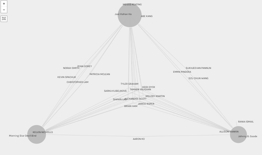
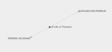
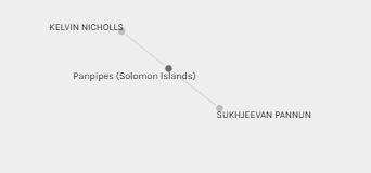
When I examined the data in Paladio, it was clear that there were a few winning musical pieces selected by most of us (Jaat Kahan Ho, Johhny B. Goode, and Morning Star Devil Bird, for example) and some not-so-popular selections as well (Kinds of Flowers, Panpipes (Solomon Islands), and String Quartet No. 13).
I chose songs based on the presence of human voices (humanity). My thinking was, if we wanted to share humanity with other life forms, perhaps we should share the diversity of our voices and the unique sounds from across the planet. But, what do my song selections have in common (if anything) with others? What was it about the three most popular choices that drew most of us to these songs?
Why Can’t We Determine the Reasons Behind Our Choices?
Connecting the Unconnected
Implications of Visualizations
I read an interesting article this week about Big Data and the commercial use of our personal data (Bauer et al.’s 2017 article, Ethical perspectives on recommending digital technology for patients with mental illness). The article discusses the potential dangers of Google, Facebook, and others having access to our personal data because of the potential misrepresentation of our information and the scary implications associated with selling our misinterpreted data to third parties (such as insurance companies) (Bauer et al., 2017).
Task 9 put into practice what Bauer et al.’s (2017) article suggested in theory: the danger of making connections and assumptions using incomplete or misinterpreted data. For example, Bauer et al. discuss third party acquisition of searches performed by Google users and what those searches may (incorrectly) imply. For example, if a Google user searches for the word depression repeatedly, one might assume they are struggling with mental health issues or that they’ve been recently diagnosed with depression. Without context, we do not know the whole/complete story though: we can only guess why the Google user is performing a particular search, but we can’t know for sure. Someone might research depression for any number of reasons! Could a family member or friend be suffering from depression? Could the user be working on a school project? Without providing the entire search context, insurance companies who are privy to such private searches may make erroneous assumptions based on clients’ search history on Google (which could have massive implications on clients’ insurance costs and coverage).
Thus, when grouping data and creating connections based on an incomplete picture lacking context, the resulting associations and story will be prone to error and depending on the potential use of information, could be quite damaging.
Next Steps
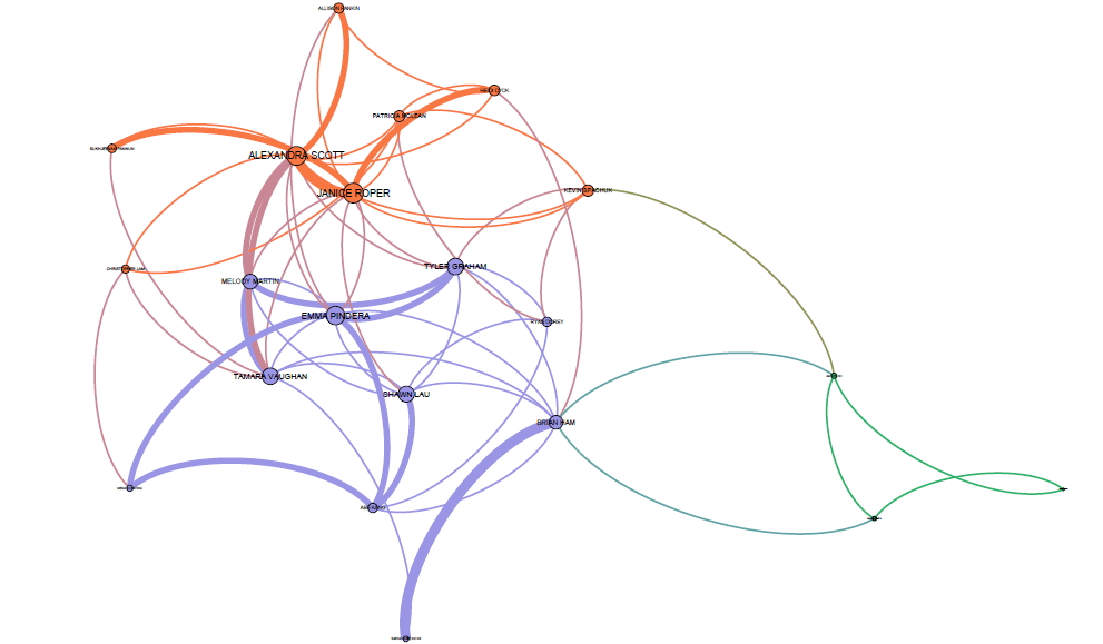
I wanted to know more about data visualization and I was interested to see if I could better understand the connections between the data we analyzed this week. Through Paladio we were able to see the song selections everyone made, who else selected those songs and which songs were the most and least popular. However, I was interested in determining whether I could tease out any connections between students based on our song choice. I am just beginning to learn about data analysis and visualization so I asked a friend to take our .json file and help me upload it to Gephi and see what connections we could make. From there we were able to ‘play’ with the data a bit and create a different network graph.
The graph below represents the connections between students based on our song selections. The three distinct colours (orange, blue and green) indicate three separate groupings of students based on our song selections. In the center you’ll see a series of pinkish lines indicating where the orange and blue groups intersect (note that the green group is the outlier and only barely connects with the blue group). This suggests that members in these three groups have more commonalities than they do differences (their song selections are more similar to one another than they are different).
This visualization also indicates that there is something common between the orange and blue groups and that Alexandra, Emma and Janice appear to be at the “center”. Since I can move the nodes around the page Alexandra, Emma and Janice are not the geographic center, rather, the size of their nodes suggests their song selections best represent or connect with the entire class’ overall song choices versus Kevin, for example who is the last node on the right in the green ‘group’ who least represents the class’ overall song selections.
The thickness of the lines (edges) indicate the number of selected songs shared by two people. For example, Alexandra and Janice’s song selections must be quite similar and Tyler and Šárka must also have selected similar songs because the edges connecting them are thicker than the edges connecting other classmates to one another. Of note as well, the song selections belonging to Melody and I seem to cross over between the blue and orange groups so I imagine we must share some common songs (and song criteria) between both groups.
To answer my earlier question about whether Sukhjeevan, Kevin and I have anything in common, based on the graph below, Sukhjeevan and I have one shared song in common and we are in two different groups (Sukhjeevan in orange, me in blue), however we are both connected to Alexandra so perhaps there is something about our song choices that, though not necessarily similar to one another, perhaps compliment each other? Kevin does not appear to share any grouping nor commonality with either Sukhjeevan nor I (other than Panpipes).
Thus, in taking the data one step further, I was able to visualize our class’ groupings a bit better and understand how we connect (or not!) through examining edge thickness, group colour and node size as well.
Reference