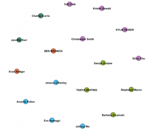
The first image indicates general groupings of individuals, characterized by each person’s choice of songs. Coloured groupings are reflective of song choice similarities. I am unsure about whether or not the placement of each group in the larger circle is also indicative of its similarities to other groups, based on their proximity to each other. For instance, does the dark green group on the upper left likely share more in common with the red group below it than it does with the light green group in the lower right? Based on reading some other peers’ reflections, I thought this might be the case. After analyzing the second image though, I am beginning to think that might not be the case.
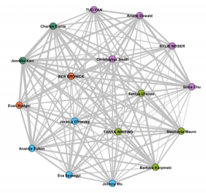
The second image, as shown below, expands on the first by illustrating the connections (or same song choices) made between individuals, and providing some quantitative data. One can decipher from this graph how many connections are made with others, yet it cannot show what that connection is, or which songs were chosen. It looks quite symmetrical, in that each person has multiple lines stemming from their vertex; this indicates that individuals have made at least one same song choice with every other person that is included in the illustration – this is not unlikely, as 10 out of 25 song choices allows for an extremely high probably that any two individuals will choose at least one of the same songs. With closer inspection, you can also see that the lines vary in thickness, also representing the strength of each connection between two individuals – the thicker the line, the more song choices were shared.
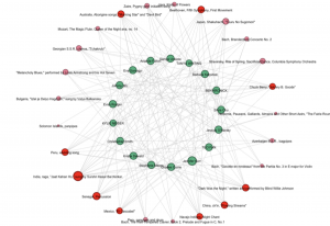
The last image is a visualization of which songs from the Golden Record were chosen, and by which individuals. It also indicates how many times each song was chosen. It provides the most specific set of information, down to each person’s individual choices.
The images presented provide a simple way for one to analyze the song choices made by a small group of people. It does not, however, provide a way for null choices (or songs that were not picked) to be analyzed, as it is a visual representation of only the data that exists. In the case of our song selections, no song was not picked. This type of data analysis can be useful in distributing populations based on similarities, but it does not take into account null preferences, which, in other arenas, such as politics, might be more significant than they are here.