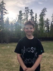
For this task I recruited Wyatt, my nine-year old son, who jumps at the chance to do something artsy. I started by asking him to read the task aloud (homeschool reading…check!). Then we had a little back and forth brainstorm about some things he loves (hockey, WWE, baseball, basketball, drawing). He narrowed it down to two five-letter words: donut and ghost, but because the five-letter version is not the Canadian version ‘doughnut’, he chose ghost. Wyatt loves all things Halloween and has been questioning us lately about what will happen if there is no COVID vaccine by October.
Then he told me that he wanted his print on a t-shirt. Say what? I was taken aback because I just assumed we would print it on paper where he saw it as an open task where the medium was up to choice. This resonated with a quote I read this week for ETEC 580, “Imagination is a talent that atrophies when it is not used enough. A recent study shows that 98% of four-year olds could be classified as divergent thinkers. By age 12, however, this percentage dwindles to 10%. Daily opportunities to use ‘creative muscles’ result in exciting learning experiences, individualized expression and self-directed learning.” (Ontario Library Association, 2010). So, off to Walmart we went to buy a shirt and paint. And to exercise my old creative muscles!
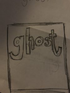
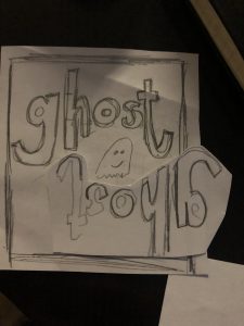
Continuing on the design process, I sketched a draft of what I wanted it to look like and created a prototype.
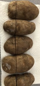
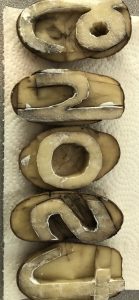
Next, I cut the potatoes (which was surprisingly easier than I imagined and took about ten minutes) and tested the stamps on construction paper. I made knife marks on the top of the potatoes to align the stamps to try to be consistent in making the curved shape of the word.
 .
.
Challenges/insights in this process were:
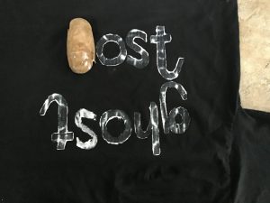
- Consistency of amount of paint (seeped through the back of the shirt, some letters and letter outlines were bolder than others)
- Consistent replication of spacing and alignment
- Letter heights: when I taught K we talked about ‘worm’ letters like g, j, y and letters that touch the ‘skyline’ like k, h, b, d and ones that stay between the ‘plane’ line and ‘grass’ line like o, e, a. Aligning all the letters so they are in the correct position was hard with 5 letters, so I could imagine a bigger passage would be quite challenging.
- Rogue paint splatters (annoying!)
Connections to week four readings/videos:
- I can see how creators might have preferred straight-edged letters since curves were hard to make, but taking a close look at the Gutenberg Bible, the letters are far from square and primitive. Makes it even more impressive.
- Use of vises and locks to make sure letter spacing and position stay consistent.
- Content vs. Aesthetics especially in early days of handwritten books; time-consuming production makes the value of aesthetics increase.
 Overall, Wyatt is happy with his new shirt and I am pleased with the hands-on experience that provided meaning-making to the videos and information about letterpress and printing presses. I knew little about the mechanization of writing, so Module 4 was enlightening. I am much more aware of the process that goes into writing production and appreciate the centuries of advancement for the spread of knowledge and education.
Ontario School Library Association. (2010). Together for learning: school libraries and the emergence of the learning commons. Retrieved from: http://www.accessola.org/web/Documents/OLA/Divisions/OSLA/TogetherforLearning.pdf
Hi Valerie,
Your prints look amazing! I didn’t do the potato printing task, but I had only imagined it using uppercase letters.
In terms of your observations about the printing, I wonder how this might turn out if all the potatoes were cut into the same size and then aligned with a ruler. I’ve briefly played with the stamps at MUJI (a Japanese stationery store) where you can decorate notebooks that you buy from them. They have a ruler with little bumps at specific increments so that you can slide and “lock” your stamps in place.
I ‘locked’ them in place with a big knife. Given my history with chopping, that was a bag idea 🙂 The locking mechanism at MUJI sounds way safer! I haven’t heard of that store before. Where is it?
Jeez, I hope there’s not a run on potatoes . . . I’m waiting to do my project tomorrow . . . love the Hallowe’en story . . .
Megs K.
Hi there,
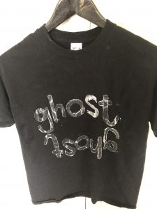
I love the fact that this became a collaborative activity, and the typography you created is AWESOME! What made you aware that you would need to reverse the letters before printing? I learned this the hard way, I’m afraid.
I also think it’s really cool that you decided to work on a different medium. Do you think that it was harder or easier because of it? I wonder if seeping would have occurred through paper as well or if the more porous nature of fabric was to blame… Uses of vices and locks was also something that stood out to me in this, but that I found a little harder. I tried to uniform them by restricting the height of my potato letters, but trying to lock to print straight definitely didn’t work out 😀
All in all, a great lot of fun though!
I am not a risk-taker and tend to plan/overthink. I knew to reverse the letters because of this! The initial plan was my son wanted something circular so he could paint a ghost in the middle, so that it how we came up with the mirror-image idea. Once the two words were on the shirt, he decided he liked it better as it was. The seeping happened because I was worried that I didn’t use enough paint….jokes on me 🙂 I sure did!
Thank you for commenting on my blog post, Jamie.
Hi Valerie,
It is wonderful that you were able to tap into your son’s creative thinking and collaborate. Your final product looks fantastic! The inconsistencies in the paint distribution in the letters adds a ghostlike effect; I would have guessed that it was intentional. The intentional upside printing looks great too; I did this but by accident on a letter “a” and thought I had not cut a reversed the image. I also considered “locking’ the printing blocks to get consistency of prints- maybe 2 kebob skewers. This would be a fun activity to try again on a lasting canvas like a t-shirt (thanks to the idea!) or with students in an English class: I do a one word to describe yourself, then a one paragraph at the start of the year. This would be a great addition! Thanks for sharing your awesome project!
Thanks for the kind comments, Rebecca. I didn’t even think about it for a class, but you are right, it would make a great class project. Thanks for the idea!
I love how the shirt turned out…this has given me another idea to use this in the classroom! Thanks!
I thought that as I was doing it. As teachers, we always seem to be scanning our environment for ideas and connections to use in our classrooms. I know I do 🙂
Oh I know! I hope you don’t mind but I showed my grade teaching partner your potato print idea 😉
Awesome!! Hope it goes well 🙂