
This game could be renamed ‘Bedtime with Toddlers’ or ‘Telephone Fun with Air Canada’
Today I came across a very timely Twitter post by John Spencer with my morning coffee.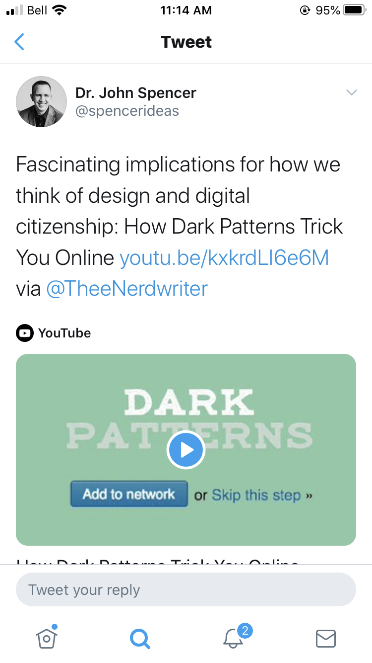
The link he mentions is created by @TheeNerdWriter and about dark patterns and the psychology of ‘guiding’ (tricking) users into certain pathways and cleverly hiding others that could be detrimental to motives of the business or platform. After my morning Twitter updates, I decided to start Module 10, Attention Economies and task ten. Only then did I realize how fitting it was.
Here are a few notes from my experience with User Inyerface:
- Immediately notice the timed aspect that creates a sense of urgency and FOMO.
- Text boxes did not immediately delete when clicked on resulting in more time being taken; quickly realized that everything in this ‘game’ is designed tongue-in-cheek to take more time than necessary.
- Help box: send it to bottom works super slow and if you try to ask for help there is a line up of 458 people; typing in the box results in absurd autofill (Hello is…. became hypothesis atromathematics).
- The ‘time is ticking’ pop-up is probably one of the most annoying features and it took me a while to see where the ‘close’ was hiding; this reminds me of the Dark Pattern video and hiding ‘unsubscribe’ buttons.
- Also similar to the Dark Pattern video mentioned above is the use of colours. Green tends to be thought of as the button to click for ‘go/proceed’, but this game would use a blue button and have green as a cancel requiring the user to start again.
- My vote for the most annoying feature was clicking on the ‘Terms & Conditions’ section. Big mistake! The ‘accept’ button only becomes activated when you read the bottom of the page and the slide bar is not easy or quick to manipulate, especially using a track pad.
- Password conditions. I admit, I had to look up what a ‘Cyrillic character’ is, which takes more time and adds to frustration.
- I live in a place with really crappy internet, so I am used to the ‘wheel of wait’ for uploading the profile pic!
- Having a background as a social studies teacher, I was thrilled to see that choosing your country was by flag and that it only gave a coloured option when hovered over.
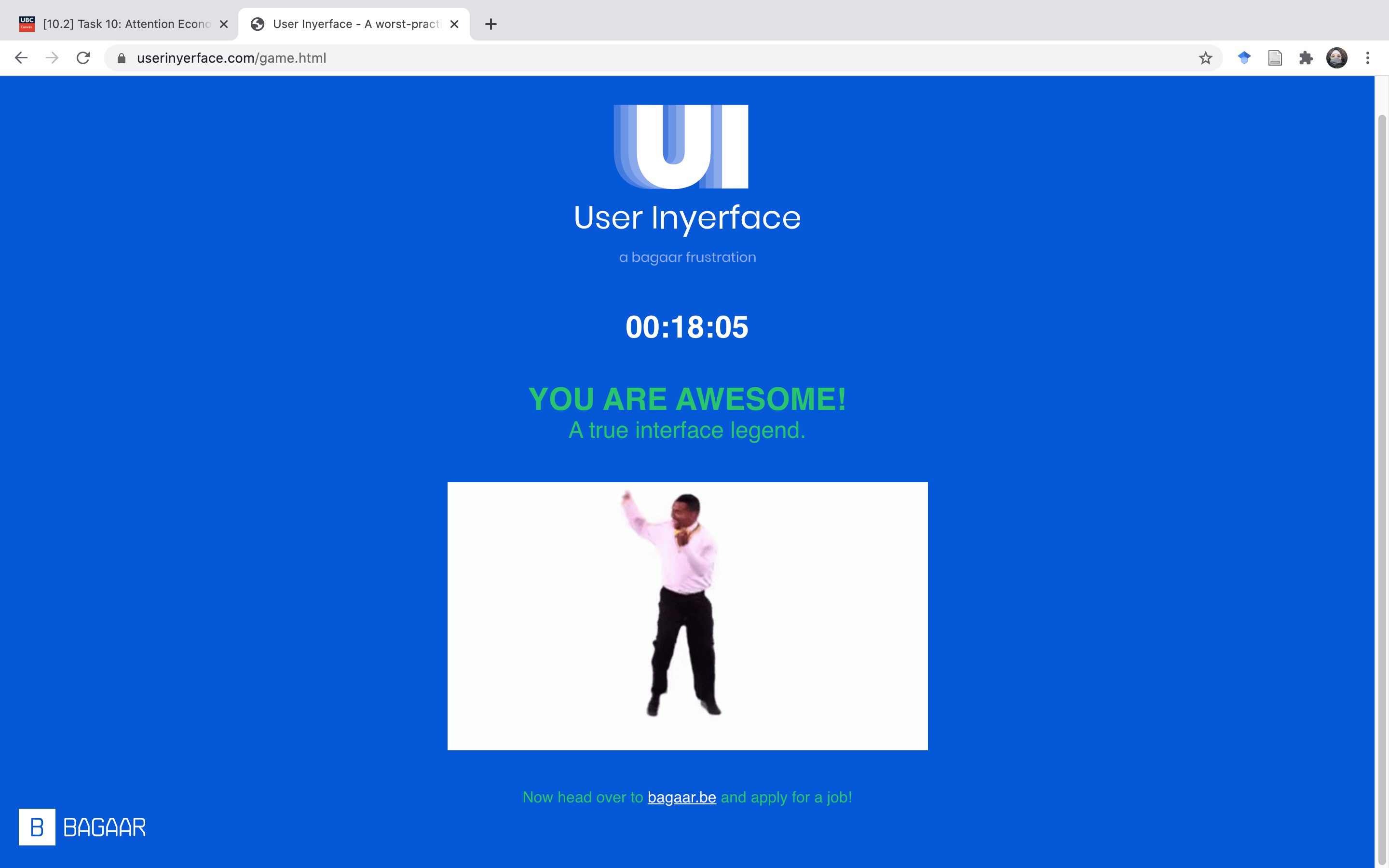
By the time I reached the fourth task, I was ready for the game to be over. The misaligned Captcha boxes of the fourth task to prove that I was indeed human were over the top. By this point I just kept clicking ‘validate’ until it was done. Message had been received about design for UX! However, this exaggerated exercise provided a practical exploration of attention economy and the psychology and analytics of new media. I can see how knowing this information could be valuable as both consumer (avoiding pitfalls and being sucked in) and producer (tricking and controlling users). As a teacher, I can see how I could use this information and game to further educate students about digital citizenship through the lens of design.
Hahahaha! Valerie I love the new names for the game! How about ‘The mosquito in my tent’?
Good one! How is it that one mosquito can sound so loud at 2AM 🙂