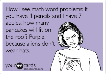

I chose to reflect on Jamie Ashton’s post ‘Network, Nodes and Nulls’ from task 9. I found it highly insightful in what proved to be an already entertaining and educational task of Golden Record Curation. I think that Jamie and I had a similar joy in manipulating data to find patterns, almost like a detective setting out to solve and explain a complex task. She was wise to explore quantitative and qualitative overviews of the task to look at the data in two different lights (almost like a rigid, number analysis and a ‘soft skills’ subjective angle). In this separation, Jamie was able to come up with diverse theories and conclusions of how information was organized and make statements about number data for songs and people. Her node size based on weight to show most and least popular songs was clever and showed her diligence to dig deeper into Palladio to get data that met her curiosity needs and told a clear story of the curation task. I think that qualitative analysis is much more difficult in this task because the subjective nature of selection of songs, however, Jamie gave a good run and trying to find patterns using the grouping feature. In this way, you could easily see shared interests and selections that were not shared (to show commonality). I mentioned in my post as well that going to the blogs and doing some more formal quantitative analysis would be the only way to track the motivation and reasoning behind selections. Even then, peers could have picked using a random or arbitrary way (i.e.: only even numbered songs or songs that have more than three words in the title or titles that begin with vowels). Reading Jamie’s post refreshed many core concepts presented in ETEC 500 about methodology and she states, ‘There is often a lot of valuable information inferred from the quantitative information drawn from data visualisations, but without explicit inclusion of qualitative data to offer context, there are various things that cannot be reflected/interpreted in the data’. I think there are many situations across various professions where we could come up with examples to prove Jamie’s statement as correct. However, it got me thinking of this meme:
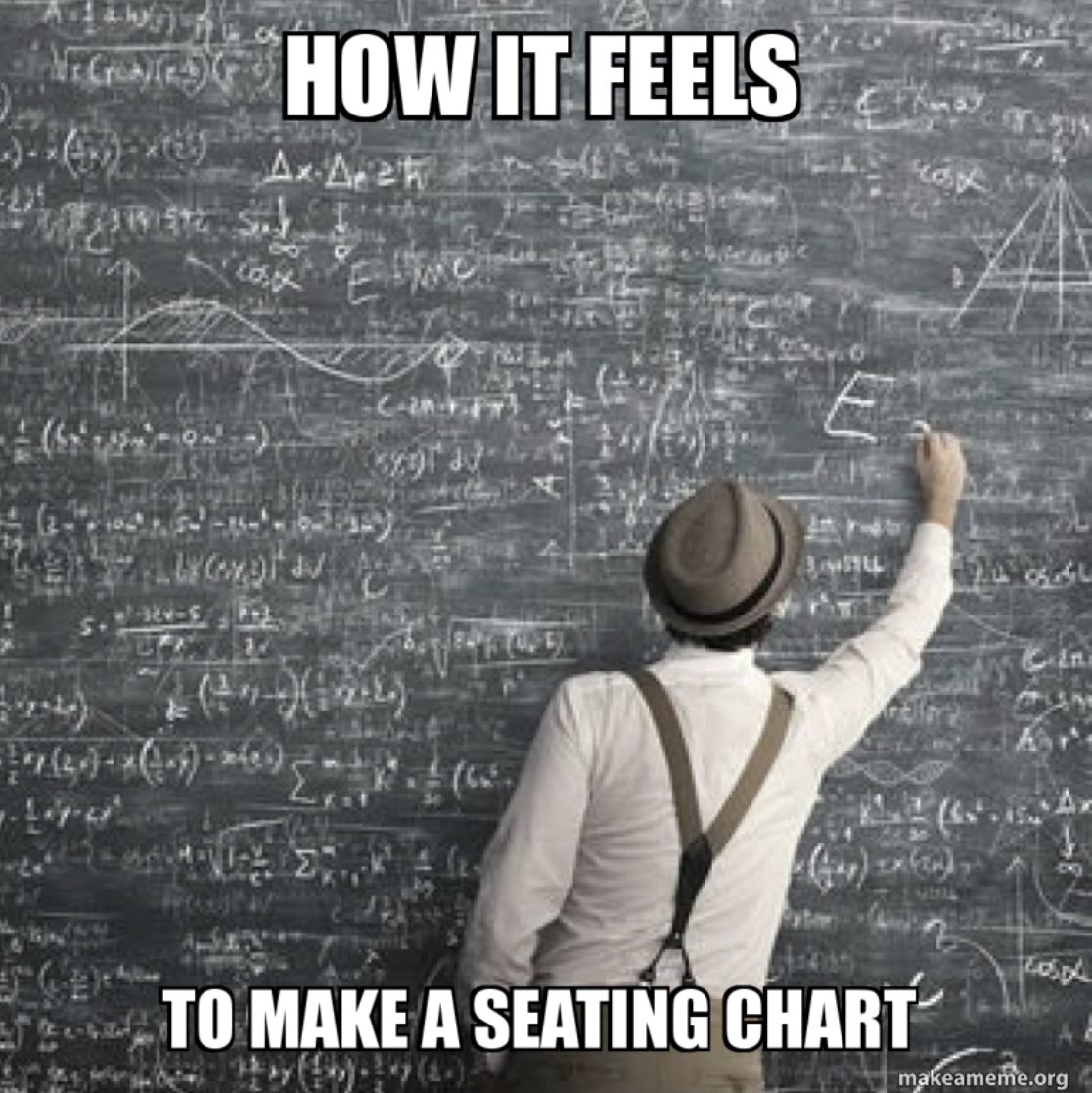
I taught grade four in a very small classroom about 5 years ago with a phenomenal group of students who were bright, easy to get along with, and super fun to be around. Luckily, I taught most of the same kids for Kindergarten; two amazing years of teaching. But, being in a small room with 24 vibrant kids did pose a problem when it came to arranging them. This meme shows how I felt most of the year. Flexible seating was not possible since I had so many extroverts and a few serious introverts that it wouldn’t have been fair to everyone. Not to mention loud….that year, it was always loud with learning! Some students did math together, some writing, some reading, some art. Desks were always moving and social dynamics changing. In order to meet their needs (and mine!), making a seating plan was difficult. I needed to consider the qualitative and quantitative consequences of my choices: quantitative in that some seating arrangements led to lower performance (‘grades’ – gasp….is that a bad word nowadays!), yet the qualitative data shows that the same seating arrangement is a benefit to that child socially or emotionally.
Jamie eloquently states that, ‘data visualized cannot always be considered as objective or as a full representation of the reality it is trying to reflect.’ I think this is so true of data, but also can make a metaphor for life. You never really know what is going on in someone’s head or life to make them act or make choices in certain ways. Data information does give information, but also comes with hidden bias or informed by personal experiences and motivations.
One thing that I did NOT connect with Jamie’s post is her statement that ‘Statistics is Fun!”….Sorry, no can do!