Categories
ENVIRONMENTAL ECONOMICS & POLICY FRE525 Uncategorized

Cape Town Densification Policy

GOAL:

To improve Cape Town’s sustainability and improve the quality of the environment

To achieve a minimum average gross base density of 25 du/ha in the next 2-3 decades, and increase gross base density thereafter[2]

Background

Cape Town, South Africa

Cape Town is the leading city in Western Cape, Africa’s most popular tourist destination, and the second most populated city in South Africa. It is also the capital city[1]. Cape Town’s population density has been increasing since 1904, and as of 2011, it has a population of approximately 3.74M, and population density of 1,500km2.

What is Densification ?

Densification is defined as to both horizontally and vertically increasing space usages of the existing areas and new developments, accompanied by an increased number of units and population thresholds[2]. Forms of densifications include single detached tower block building, attached row housings, and open spaced or perimeter blocks in a courtyard. Densification in urban areas is encouraged to

  1. reduce valuable and non renewable resource consumptions
  2. provide a more efficient public transport system
  3. make the city more equitable[2]
  4. provide economic opportunities
  5. increase available house type options and patterns
  6. improve safety

The measure of densification is usually Du/ha, number of dwelling units per hectare[2].

Political Origin, Goals & How the Policy Works

Over the past decade, the South Africa government has prepared several strategy and policy documents to promote urban densification within the country. For example, the Constitution of The Republic of South Africa of 1996 was created in support of densification to provide a built environment that enhances environmental sustainability, and economic and social development. Also, The Cape Town Spatial Development Framework in 2011 was proposed to support densification across the city focusing on specific locations. The current Cape Town Densification Policy was approved in 2012; it uses a framework that is modified from outdated plans consisted of inconsistent and conflicting objectives. The policy has a number of specific objectives such as ensuring optimal and efficient use of infrastructure, services, facilities and land, providing support to the development of an efficient transport system, providing homeowners and property investors with certainty regarding areas that are targeted for densification, protecting and managing the natural and built environment. As well as the cultural landscapes, catering for decreased household sizes, contributing for the development of attractive and safe urban environments, and supporting the development of mixed land uses, etc.[2].

The spatial plan and policy is built like a hierarchy, focusing on different purposes depending on the level of the hierarchy it’s at; levels included are the CTSDF, district-level SDPs and local spatial plans, density plans and urban design policy [2]. Several steps are carried out for the implementation and evaluating of the policy. An information session is organized for relevant staff, councilors, and built environment professionals to ensure consistency in decision making across the city. Also, existing and future density plans are made sure to be in alliance with the Densification Policy to ensure consistency [2]. The regulatory mechanisms used must also be incorporated into the Densification Policy and other relevant City policies to ensure consistency and enhance efficiency in application assessment. Moreover, support and promotions of densifications are recommended in density priority zones (DPZ) and urban civic upgrade areas. For examples, necessary management arrangements can be put in place, and density marketing strategy can be prepared, etc. Quality built environments is also important, and it is dependent on the appropriate application of architectural design principles [2]. Furthermore, investigations must be done on densification support mechanisms that are appropriate to subsidized housings. Finally, a monitoring and evaluation is conducted to keep updated with the progress, identify the strength and weakness of the policy, and making modifications where needed.

Types of mechanisms adopted for the policy include regulatory and zoning measures, community facilities, open space standards and parking policy, development containment, increasing incentives by increasing developer levies, lobbying the government to withdraw or amend legislation, and communication strategies [3].

Coverage of the Policy

The citywide policy is applied in all areas; however, a “one size fits all” approach is not adapted, and different density guidelines are used depending on the location. For example, in the affordable housing area, 80 – 300 du/ha, and single to 4 storeys are required. Under development route, near transport intersections, 75- 175 du/ha and 3-7 storeys are the standard based on the guidelines.

Some areas require more prioritized than others. In the upcoming five years, the density priority zones (DPZ) are areas adjacent to development routes, activity routes, and streets, especially around social institutions, and mixed use areas. Areas with zone rights correlate with general residential zones, community zones, local or general business zones, mixed zones, or correlated with areas where electricity and water capacity exist. Infill sites are also considered as DPZ; the optimal infill areas are ones that are close to economic opportunities, and IRT routes[2]. Greenfields developments near the existing urban development are also prioritized.

Discussion and Analysis

At the starting stage of the policy implementation, it is currently too early to examine the effectiveness of the policy. Considering the known background of the city, certain forecast regarding the potential challenges Cape Town might encounter can be made. Densification is proposed to increase productivity, and increase positive externalities. More producers, consumers, suppliers and competitors will be mounted in one area, which enhances flexibility, and fosters innovation. This indicates that if properly done, densification will provide Cape Town the opportunity to potentially expand education, research and professional service, as well as support services with higher value and functions. Increasing densification is also known to decrease the amount of land consumed, and in turn slow down the usage of agricultural and mineral resources; it also reduces the level of car dependency. This benefits the middle to high income groups the most; this group works in the city, but would otherwise choose to live in the outer suburb [3]. They gain by cutting car usage, and spending less on land. They are likely to look for spaces with luxurious schools, health centers and shopping malls, etc. Higher population density also enhances social integration. People in the labour market, with lower social status, could move in and increase their chance of finding employment and training opportunities. They also save the cost of long distance commuting. This implies that space and design standard, and maintenance of the built environment are different for lower and higher income residents. Affordability is clearly the key for low income group to live in the central city, where it is generally costly to live in. Even with the government’s plan on building 20% affordable housing, other costs, such as service costs, and property rent are nevertheless too high for the lower income group to afford. As a result, despite the effort the government is putting into the policy to accommodate the poor as well as the rich, it is rather difficult for the poor to fully benefit from the policy; at least their benefit comes at a high cost. To be noted that existing residents in higher density development areas are given municipal tax rebates.

With the Densification Policy, approximately 100,000 additional residents are expected to move into the central city [3]. Implementers have limited information regarding the age, and household income of the new and existing residents. For the current residents, there is no information on the trade off they are willing to make between space, location and access to jobs [3]. This is an inevitable issue to density planning. Change in demand for service results in substantial additional investments, and could also encounter public resource constraints. Furthermore, politicians will have trouble justifying the additional subsidies required for multi-storey housing, and new public services for the additional future residents[3]. This also reduces the subsidies provided to the poorer communities across the city. Also, with 20% of the overall housing built as affordable housing, developers forced to pay for affording housing will have decreased amount to pay for the infrastructure cost [3]. Another obstacle that Cape Town faces is high level of social inequality and cultural, age and family type differences. Converting the existing buildings into new buildings under the Densification Policy contains both design and funding issues, and social inequality becomes a barrier for imagination. Although different cultural allows social integration, more flexibility is necessary to accommodate everyone, and this leads to the requirement for more resources, higher quality design, better management, and higher subsidies.

Conclusion

There are a number of factors tightly associated with the implementation of the Densification Policy. It is impossible to accurately measure the effectiveness of the policy while having these factors overlooked. With the divergent in demand from lower and higher income groups, both resources and budget become serious obstacles for the government to overcome. To achieve the goal of quality environment, Cape Town must first consider social inequality. The plan could fall apart without further change in policy and practice, for developers and financiers generally prefer to develop in sites with no excess burdens. This indicates an ongoing monitoring and evaluating the system is necessary for the succeeding of the policy.

To conclude, the number of challenges Cape Town faces to increase their population density is well beyond the technical issues involved in the building and renovating of the homes. To successfully implement the policy, it is essential to clarify the purpose of densification, and set priorities straight.


For More Information on the Framework of the Policy,

City Space Planning: Cape Town Densification Strategy Technical Report (August 2009 Draft)

http://www.capetown.gov.za/en/sdf/Documents/Densification_Strategy_web.pdf

Cape Town Densification Policy (2012 Approved)

http://www.capetownpartnership.co.za/wp-content/uploads/2012/10/City_of_Cape_Town_Densification_Policy.pdf

Reference

[1]Cape Town Wikipedia: http://en.wikipedia.org/wiki/Cape_Town

[2]Cape Town Densification Policy(2012): http://www.capetownpartnership.co.za/wp-content/uploads/2012/10/City_of_Cape_Town_Densification_Policy.pdf

[3]Deconstructing Density: Strategic Dilemmas Confronting the Post-Apartheid City: http://eprints.gla.ac.uk/40917/1/40917.pdf

Map of Cape Town: http://www.cape-venues.co.za/elements/peninsula.gif

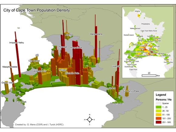
Cape Town Population Density (Source: the State of South African Cities Report, 2011): http://globalurbanist.com/media/galleries/3360/Cape%20Town%20Density%20Map-580-435.jpg


Categories
ENVIRONMENTAL ECONOMICS & POLICY FRE525 Uncategorized

London Congestion Charge

GOAL: To reduce traffic congestion, improve transport services and journey time reliability for drivers, and to efficiently distribute goods and services in London.

Background

The London Congestion Charge was officially implemented in February, 2003. The city of London initially became aware of the traffic congestion problem in the 1990s, when the average travelling speed in central London decreased drastically. In 1995, The London Congestion Charge Research Program, created by the Transport of London (TfL), reported that a congestion charge would not only reduce congestion, but generate net revenue and additional economic benefits as well. They suggested a fare of £4.00 be charged on all vehicles that enter the center London area. In response to this proposal, another group wrote “Review of Charge Options of London”, and argued that an area license scheme would be more efficient at reducing congestion than a fare. After debating and analyzing the scheme for 18 months, Ken Livingstone, first Mayor of London, officially proposed the area licensing scheme to central London on February 17th, 2003. Since then, the congestion charge has been modified nine times to improve the operation and service of the scheme. Under constant review, the rules were last modified in April 2012.

Operation of the London Congestion Charge

Monitored by TfL, and operated by IBM, the congestion fee is charged on non-exemptible vehicles that travel within the Congestion Charge Zone (CCZ) between 7am and 6pm on weekdays in central London. The charge is not effective on weekdays, between 6pm to 7am, on public holidays, and anytime during Christmas Day and New Years’ Day. All payments can be made online or using auto pay, by phone or automated phone service, at a shop, by post, or by text messaging. All vehicles are required to pay the charge once every day regardless of how frequently they drive in and out of the CCZ. The standard daily congestion charge is £10.00, which is reduced to £9.00 if paid with auto pay, and increased to £12.00 if paid by the end of the second day of travelling. Drivers are allowed to pay either on the day of travel, or in advance of up to 90 days; however they will be notified with penalty charges if the payments are not made by midnight of the travelling day. Failure to pay results in a penalty charge ranging from £60 to £187.00- the standard £120.00 penalty charge is cut to £60.00 if paid within 14 service days, but raised to £187.00 if not paid within 28 service days. All rules and charges were updated in April 2012.

The London Congestion Charge Zone (CCZ)

Above is a map of the London Congestion Charge Zone provided by TfL. Cameras are set up at entrances, exits and sections of the Congestion Charge Zone to read and match vehicles’ number plates with database to check if the charge has been paid, or if the vehicles are exemptible or discounted from the charge[1].

Discounts and Exemption

Exemption

All vehicles must pay for the congestion charge unless they’re registered under Driver and Vehicle Licensing Agency as National Health Service vehicles, two wheeled motorbikes and sidecars, emergency vehicles (i.e. Ambulance or Fire engine), vehicles used by one or more disabled people or vehicles that have a “disabled” taxation class. Licensed taxi or minicab is also excluded from the charge. Also, certain vehicles, such as registered buses, are also exempted from the congestion charge, under the condition that they must be registered with TfL to qualify. These vehicles include automobiles that belong with Her Majesty’s Coastguard and Port Authorities, the Royal Parks Agency, or the armed forces. As well as selected operational vehicles from the London boroughs and Breakdown Organizations.

Discounts

Residents who live in the area of the charging zone are allowed to register for the 90% residents’ discount; though a registration fee of £10 is required. Also, vehicles that meet required conditions are eligible to apply for the 100% congestion charge discount. Examples include the Greener Vehicles which emit 100g/km or less of carbon dioxide, vehicles with nine or more seats, and motor tricycles that are no wider than one meter, and no longer than two meters, etc.  People with Blue Badges are also allowed to register for the 100% discount.

Distribution Effect and Impact of the Policy

Public Transport

One of the purposes of the congestion charge was to reallocate the road space from private vehicles to public transportations. After introducing the congestion charge in 2003, bus waiting time was decreased by 30% in the CCZ, and dropped by another 18% in 2004.

It was initially estimated that public transport would increase the entering rate into London by 3%, and travelling within CCZ by 4%[2]. Surprisingly the rise in the number of people entering London by bus doubled the initial estimation as a result of high cost of congestion charge. This increase in passengers further reduces traffic delays, and increases transport providers’ revenue by decreasing average cost per passenger, which allows the public transit to improve their service levels (i.e. lower bus fares). Improved service encourages more passengers to switch from driving to taking the public transit, which further reduces congestion and increases transport providers’ revenue.

Local Business

The effects of the congestion charge varies across businesses; reduced congestion and travel time could be beneficial to some businesses, but a decrease in car trips is likely to have negative impact on retailers. The survey conducted in 2004 showed that most firms felt the overall effect of the congestion charge on London’s economy was neutral, with positive and negative effects being approximately equal[2].

Residents

Considering the survey conducted on the residents of the CCZ, majority of the residents reported that the congestion charge has either benefited or had no effect on them at all.

Social Costs and Benefit Analysis

When calculating the benefits of the charge, time saving and increasing in reliability of buses and car transportation are two of the most important components accounted for; expectedly there have been evidential improvements in both components. The operation cost of the policy appears to be twice as high as expected, and it represents more than 2/3 of the benefits gained. While the net benefits clearly appears to be positive, the gain is less than most anticipated as the costs represent a substantial fraction of the total revenue[2].

Effectiveness of the Policy

The London congestion charge has been successful both in reducing congestion, and gaining popularity among the people in London. In general, traffic delays in the CCZ has reduced by approximately 30%, with 15% congestion time reduction in traffic circulating and 18% drop in entering the zone during charging hours[2]. Journey time reliability has also increased by about 30%. Despite the historical political resistances British faced in attempt to introduce road pricing in the past, political opposition has been minimal[2]. In fact, the success of the London congestion charge has led the government into considering the possibility of introducing a national road pricing. The Department of Transport estimated that if the London congestion charge was applied to all urban and interurban roads, the charge would be responsible for over 80% of the congestion reduction.

Conclusion

While the studies did not exclusively analyze the effect of the charge on the poor and rich, I personally think that the congestion charge benefits the poor greatly. Since the poor can’t afford to own a private vehicle, they travel by public transport regardless of the existence of the congestion charge. As mentioned, with the charge implemented, more people switch to the public transit, which increases their service levels such as decreasing fare, decreasing waiting time, and increasing bus frequencies, etc. All of these are to the poor’s advantage. Even though the change in traffic composition benefits the poor as well as the rich, the effect of the congestion charge is more complicated on the rich. For millionaires who do not care for the congestion charge would choose the comfort of their private vehicle over public transport. However, successful businessmen might put a high value on time and feel that the time wasted on traffic is not worth them using their own vehicles; though if one hires a private driver, and has the habit of working in the car, the issue with time wasted in congestion does not exist. Hence, there is clearly room for argument in terms of how and to what extent the charge fee affects the rich, as well as how each individual chooses to deal with it. Generally speaking, the amount of rich that chooses to forfeit their private vehicle for public transportation is relatively low. Fortunately only a minority of the population belong to the “truly wealthy” category, that their decisions would not have a big affect the results of the congestion charge.

The London congestion charge has definitely met its stated goals; in fact the amount of reduction in congestion has exceeded the initial predictions, and these reductions were sustained in subsequent periods. As the success story of the London congestion charge wide spreads, and potentially convert into a large scale project. Nations that are trying to imitate London must not neglect that some of the characteristics that London contains are crucial to the successful operation of the congestion charge scheme. London has a well developed and fully functional public transport system, which offers a number of alternatives to the residents. Also, London’s geography allows the city to use the “ring road” around inner London as a suitable boundary for the charge. Not all cities or regions have these characteristics; potential problems could arise when the same congestion charge is applied.

Reference

[2]The London Congestion Charge: http://classes.igpa.uiuc.edu/jgiertz/London-congestion.pdf

Transport for London Official Website: http://www.tfl.gov.uk/roadusers/congestioncharging/default.aspx

http://www.tfl.gov.uk/tfl/roadusers/congestioncharge/whereandwhen/

http://www.tfl.gov.uk/roadusers/congestioncharging/17098.aspx

http://www.tfl.gov.uk/tfl/roadusers/congestioncharge/whereandwhen/assets/DetailMapECCZ.pdf

http://www.tfl.gov.uk/roadusers/congestioncharging/6714.aspx

[1]http://www.tfl.gov.uk/roadusers/congestioncharging/6718.aspx

Central London Congestion Charging Scheme Impacts Monitoring Summary Review: January 2005 http://www.tfl.gov.uk/assets/downloads/impacts-monitoring-report-january-2005.pdf


Categories
ENVIRONMENTAL ECONOMICS & POLICY FRE525 Uncategorized

The United Kingdom Landfill Tax

GOAL:

To properly price the disposal of waste by landfill: the cost of landfill in the UK was low compared to other European countries, and failed to internalize the social cost of environmental impacts

To encourage efforts to minimize the waste produced, and the use of non landfill waste management options, such as re-using, recycling, and composting.

Background

In 1996, the Conservative government of the United Kingdom published a strategy to develop plans for sustainable waste management, and promised to achieve a 25% recycling rate for household waste. The UK Landfill Tax was a part of this strategy; it was brought into existence by the Finance Act 1996 and officially began on October 1st, 1996. The UK Landfill Tax was hailed by the UK government as its first environmental tax.

What is Landfill and Landfill Tax?

Landfills are solid waste disposal sites, where waste is deposited, compacted, and periodically covered over a layer of soil. There are two types of waste – active and inactive (inert). Inert is classified under inactive waste, which includes a broader variety of classifications of waste.  Inactive waste covers most materials used in a building fabric, and most forms of concrete, glass, and soil, etc. Active waste covers all other forms of wastes, such as wood, and plastics.

Landfill Tax is an environmental weight based tax on the waste disposal to landfill paid by the local companies, authorities or organizations. All landfill site operators with license or permit for landfill sites are liable to pay the tax. However, they will pass the tax onto the local businesses by charging a cost on top of normal landfill fees.

Tax Coverage

Unless it is specifically exempted, landfill tax applies to all material disposed of as waste.

Exemption

Waste removed from inland waterways and harbours via dredging and disposed of to landfill is exempted from landfill tax. Any naturally occurring substances which result from extraction of sand, gravel or other materials from the seabed as part of commercial operations, qualify for the exemption. Since 2007, the exemption has been extended to apply to waste disposals where additives that contain dehydrating properties are added to ensure it’s not in liquid state. Additionally, waste produced from mining and quarrying operations is also excluded. Burials of dead pets are not taxable, even though pet cemeteries are allowed to be treated as landfill sites under the environmental law.

Landfill Tax Rate

In general, the environmental taxation rate is usually established in one of two ways. The rate is set to:

  1. charge for the social cost of the negative externality per unit of taxation
  2. achieve particular targets such as to reduction in landfill demand by increasing the landfill cost

It is common to have the tax escalation over time until the desired objectives are achieved.

UK Landfill Tax Rate

In the UK, an escalator approach to taxation has been adapted since the landfill tax analysts suggested that the impact of the externality based tax was small. The alternative method was recommended to achieve environmental targets in 1998.

The amount of tax levied is calculated according to the weight of the waste disposed of, at two different rates depending on whether the material is active or inactive waste. The lower rate applies to the inactive waste, which pollutes less waste, and the standard higher rate applies to all other taxable active waste.

When both standard and lower rated materials are contained in the waste, the rate used is determined by the form of material that dominates the waste. For example, an incidental amount of standard rated waste is disregarded, if the mixture is composed mainly of lower rated materials, and the whole load is taxed at the lower rate.  Also, all materials are taxed only once. For instance, if 80% of the materials are new, and 20% of the waste has been taxed before, tax is only due on the 80% of the new waste.

The government Emergency Budget 2010 announced that the standard landfill tax rate will increase by £8.00/tonne annually from April 2011 until at least 2014. There will be a price floor which prevents the rate to drop below £80.00/tonne from 2014/2015 to 2019/2020.

Appropriate?

Assuming the reduction in waste production and the landfill prevention are tightly associated, the marginal social benefits of avoided landfill are undoubtedly very high. Extended externalities analyses have proven rational for a much higher taxation rate.

Tax Revenue

The revenue raised from the landfill tax is strictly used for environmental related expenditures, and reduce other taxes. The tax revenue is hypothecated back to the tax payer through reduction in the national insurance paid by businesses. The Landfill Tax Credit Scheme (LTCS) allows the landfill operators to receive tax rebates by making contributions in projects (i.e. maintenance or improvement of a public park in the area near a landfill site) approved by Environmental Body (EB).

What is Landfill Tax Credit Scheme (LTCS) and How does it work?

The LTCS, introduced as a part of the Landfill Tax regulation, was designed to distribute funds generated from the UK Landfill Tax. It was used to mitigate the effect of the landfill tax in local communities, encourage partnerships between landfill operators, local communities, and the public sectors and create environmental benefits and jobs through projects that improve the lives conditions near landfill sites.

With the LTCS in place, land operators with contribution record are allowed to contribute up to 20% of their annual landfill tax liability to EB, who disperse the money through project funding. The land operators are then allowed to reclaim 90% of these funds; in other words, the LTCS hypothecates 20% of landfill tax revenue.

Effectiveness of the Policy

The landfill tax has a relatively low impact on the disposal and production of waste in the UK. There is an apparent increasing in recycling and reuse, but the gradual increase is offset by the rapid growth in municipal waste. There are three main reasons explaining the ineffectiveness of the tax:

  1. The tax on municipal waste is insignificant, that the waste producers have no financial incentive to recycle,
  2. The growing transport cost is an additional cost to the overall land-filling waste,
  3. Alternative disposal options are taking large quantities of waste.

In addition, many products seem to have reached a plateau caused by market constraints.

As a major stakeholder, and responsible for 40% of the tax raised, the local authorities had little voice on the operation of the tax; majority of them felt that they had no choice but to pay the tax. Furthermore, the tax has been ineffective in changing the behavior of most potential producers of polluting waste: domestic households, and small and medium enterprises. Integrated with the other taxes, the landfill tax is charged at a flat rate for the households, and gives them no incentive to reduce waste production. Concerning businesses, the tax is too small of a cost to enforce change in behavior that is directly linked to waste production. Moreover, the landfill operators have little interest in funding recycling, as they do not directly benefit from the LTCS.

While the LTCS is currently the main environmental benefit resulting from the tax, the EBs are not dominating it with projects that promote sustainable waste management and achieve the overall objective of the landfill tax. To conclude, the landfill tax is at present ineffective, and it has made limited contribution to environmental sustainability.

Conclusion

Weighting the cost and effectiveness of the UK landfill tax, I personally do not think the tax is revenue neutral. The overall input is clearly outweighing the output, and the marginal damage created by the waste is not in equilibrium with the benefit generated from the tax. While the LTCS did generate some environmental benefit, the change in behavior of the waste producers and reduction in the waste produced generated directly from the tax have not been significant. Majority of the landfill tax was blended in with the other taxes, and left little financial incentive for the domestic and commercial waste producers to reduce their waste production. While tax payers feel the additional burden from the landfill tax, the money collected is not put into best use, and the potential effect of the tax are not maximized. In my opinion, the tax needs to be reallocated, and redesigned, and a higher landfill tax has to be charged to increase the effectiveness of the tax, as well as the awareness by taxpayers.

In conclusion, by simply raising the landfill cost via tax, and expecting the producers to turn to other waste management methods without providing additional financial support is clearly not enough to achieve sustainable waste management goals. In the case of the UK landfill tax, the relevant parties have not done what they proposed to do, and the goal of the tax has not been met at present.


Reference

http://customs.hmrc.gov.uk/channelsPortalWebApp/channelsPortalWebApp.portal?_nfpb=true&_pageLabel=pageExcise_ShowContent&propertyType=document&id=HMCE_CL_000509#P198_9153

http://ec.europa.eu/environment/enveco/taxation/pdf/ch15_uk_landfill.pdf

http://economicinstruments.com/index.php/component/zine/article/223

http://web.ebscohost.com/ehost/detail?sid=41d15560-fe77-4852-811c-ba51a4c69af2%40sessionmgr113&vid=5&hid=126

http://www.economicinstruments.com/index.php/solid-waste/charges-and-taxes-/article/222-

http://www.entrust.org.uk/

http://www.politics.co.uk/reference/landfill-tax

http://www.tandfonline.com/doi/pdf/10.1111/1467-9302.00224


Categories
ENVIRONMENTAL ECONOMICS & POLICY FRE525 Uncategorized

Australia’s Carbon Pricing Mechanism

In approximately 1000 -1200 words, describe the carbon policy for a jurisdiction of your choice. Including..

1) The coverage of the carbon policy. Discuss the sectors/fuels covered. Discuss, what sectors/ carbon equivalent emissions are exempted. How does the policy implement over time? Use the information about the policy’s coverage to inform an evaluation of the cost-effectiveness of the policy.
2) Discuss distributional effects of the policy. One of the primary concerns around a carbon policy is that by raising the price of energy it disproportionately impacts the poor. How do these policies address such distributional concerns?

GOAL: The Australian government has set a national target of 5% greenhouse gas (GHG) reduction from 2000 levels by the year 2020, and 80% reduction of GHG by the year 2050.

Policy Origin, Goals and How It Works

The Australian Senate formally approved to the government’s Clean Energy future plan, which is designed to reduce greenhouse gas emissions and transition Australia to a clean energy economy on November 8th, 2011. The plan consisted of four main components: renewable energy, energy efficiency, land management and most importantly, carbon pricing, which is also the core of the plan. The purpose of carbon pricing is to provide long term certainty and encourage business investment in clean energy activities.

The carbon pricing mechanism officially began on July 1st, 2012, and it covers approximately 60% of the emissions in Australia. The pricing mechanism is implemented as an Emission Trading Scheme (ETS) rather than a carbon tax, and a cap- and- trade model will be used to set the numbers of permits allowed for greenhouse gas emission. The mechanism is divided into two stages; a fixed price phase followed by a flexible carbon price phase.

Two Pricing Phases – Fixed and Flexible

The scheme starts out with a fixed carbon price for the first three years. In year one, emitted carbon is paid at a cost of $23.00 per tonne, increases by 5% to $24.15 in year two, and finally raises with inflation to $25.40 in year three. There will be no cap during the fixed price phrase, which means an unlimited amount of permits are issued by the government at those fixed prices. The use of temporarily fixed carbon price scheme allows a better management of introduction to carbon pricing to liable entities.

At the end of the fixed price phase, the carbon pricing mechanism will automatically move to the flexible price emission trading phase on July 1st, 2015. The price cap scheme will be used to set the supply of permits, while the market will determine demand and price. For the first three years of the flexible period, a price floor and ceiling will be implemented to avoid price fluctuations. The price floor is set at $15.00 in the first year (2015-2016), increases to $16.00 in the second year (2016 – 2017), and further raises to $17.05 in the third year (2017 – 2018). The price ceiling, which will be determined by May 31st, 2014, is going to be set at $20.00 above the expected international carbon price in year one, and raises in real terms by 5% each year for the last two years. The price floor is used to avoid hasty price falls, whereas the price ceiling is to eliminate rapid price spikes. In general, both price floor and ceiling are designed to ensure price stability during the first three years of the flexible price phase.

Although there is no binding global agreement, New Zealand, 10 U.S. states, and 31 European countries all have emission trading schemes implemented already. By July 2015, after Australia carbon price mechanism enters the flexible phase, it will be linked to the international carbon market. As a result, Australia’s carbon price will follow the global price more.

Permit

Carbon permits are considered as personal properties. Each emission permit allows the owner to emit one tonne of carbon. Since there is no cap on emission during the first period, unlimited number of permits will be issued by the government at the fixed price each year. Carbon units for the flexible period will be auctioned in advance during the fixed price period. Permits obtained during the fixed price period cannot be traded, sold or banked, but they are allowed during the flexible price phrase. A number of free carbon units will be given to the businesses engaged in emissions intensive trade exposed activities.

Coverage of the Carbon Pricing Scheme

There are six main greenhouse gases that influence atmospheric temperatures, and the carbon pricing scheme only applies to four of the six: carbon dioxide (CO2), methane (CH4), nitrous oxide (N2O), and perfluorocarbons (PFC); the last two gases, sulphur hexafluoride (SF6) and hydroflurocarbons (HFC) are not covered. The carbon pricing scheme only includes direct emissions of the applied greenhouse gases.

The government identifies the sectors and businesses that are the biggest direct polluters to pay for their pollution under the carbon pricing mechanism. Sectors covered by the scheme are stationary energy, industrial process, waste, fugitive emission, emissions from non legacy waste, transport fuel, and heavy on road transport. Businesses within these sector that emit more than 25,000 tonnes of carbon will be included in the scheme, and an estimation of about 500 businesses meet the emission threshold to pay a price for their carbon emissions. Agriculture sectors, fisheries, and forestry lands are not covered by the mechanism. Emissions from sectors that are not covered by the mechanism are indirectly addressed through existing taxes and levies. Also, politically sensitive sectors are left out of the pricing mechanism.

Cost Effectiveness of the Policy

Implementation of the plan is expected to cost the Australian government AUS 4.3 billion over a four year period, and the cost is going to exceed the amount of revenue generated. Most businesses have to apply carbon lens across all activities, which means that they will have to thoroughly understand the new risks, volatilities and uncertainties that arise from carbon pricing, and approach them in a thoughtful manner. In addition, the carbon price the businesses have to pay will be passed onto the consumers. The Australian Treasury model has modeled an increase in household cost of $9.90 per week. As well, the carbon price mechanism will add 0.7% to the consumer price index in year one. It’s also predicted that with carbon pricing, annual gross domestic product growth will be 0.1% slower than without carbon pricing through to 2050. Hence, opposition politicians see the mechanism as complex, and costly. According to some, it will drive up prices, threaten jobs, and result in little environmental change.

Nonetheless, the treasury modeling still shows a strong growing economy with the carbon price in place. A household assistance package is set up by the government to lower the impact on households. In fact, over half of the revenue created from the carbon price will be returned to low income households through tax relief and better family benefits payments. Moreover, assistance will also be given to different sectors in order to assist them with the impact of carbon pricing, and to increase job opportunities in exposed sectors.

To conclude, I think it is prominent that the carbon pricing mechanism is worth its price, despite the high cost both the government and the liable entities have to pay, the benefit will eventually exceed the cost in the long run.


Reference

http://www.bakermckenzie.com/files/Uploads/Documents/qrg_australia_proposedcarbonpricing_sep11.pdf

http://www.c2es.org/docUploads/Australia_Pricing_Mechanism.pdf

http://www.cleanenergyregulator.gov.au/Carbon-Pricing-Mechanism/About-the-Mechanism/Pages/default.aspx

http://www.growcom.com.au/_uploads/42952AH11019_Final_Report.pdf

http://www.kpmg.com/AU/en/IssuesAndInsights/ArticlesPublications/Documents/Australias-Climate-Change-Plan-v3.pdf

Categories
ENVIRONMENTAL ECONOMICS & POLICY FRE525 Uncategorized

Soot Pollution 101

Soot (also known as Black Carbon): “ a type of particle pollution called PM2.5, which is approximately 1/30 of the size of a human hair. It is comprised of a variety of pollutants, including chemicals, acids, metals and dusts, etc. It results from the incomplete combustion of hydrocarbons.”

The Journal of Geophysical Research: Atmospheres recently released a report stating that soot is twice as damaging for the climate as most have previously expected. According to the UNEP study results, soot is the second most damaging greenhouse agent after carbon dioxide. Soot currently has a global warming effect of approximately 1.1 watts per meter square, which is only 0.6 watts per meter square lower than carbon dioxide. Furthermore, black carbon causes more harm to cold and frozen regions; for the amount of light, and heat absorbed is increased when soot falls on snow or ice. This means that the effect of soot is more apparent in the high latitudes areas such as northern Canada, and Alaska, etc.  However, experts claim that the biggest impact of black carbon is on health rather than on the climate, as it causes tremendous harms to the human body, such as lung and other diseases.  Study results show that controlling black carbon emission could save up to 2.5 millions of lives a year.

While the new study results show that black carbon is the main cause to several environmental and health problems, it is still easier to reduce soot than carbon dioxide. First of all, as an inevitable by product of fossil fuel, carbon dioxide is long lasting, whereas black carbon only stays in the atmosphere for a few weeks. As long as new soot is not emitted, the existing soot will eventually dissipate. Hence, it is cheaper to cut soot than carbon dioxide. Also, global agreement is not needed for abating black carbon, and it mainly benefits the locals, free riders do not exist in this case. The author of the study argues that if people did their best at reducing soot emission, global warming would be slowed down significantly.

Personally, I still see carbon dioxide emission as the leading cause to the acceleration of global warming. Indeed, the study has found useful results regarding the negative effects of soot emission, and it is clear that reducing black carbon emission improves human health, and reduces environmental damages. However, from the environmental perspective, a larger proportion of effort and time should be put into cutting carbon dioxide reduction when the goal is to decelerate global warming.


Reference:

http://www.americanprogress.org/issues/green/news/2012/08/10/12007/soot-pollution-101/

http://www.economist.com/news/science-and-technology/21569686-soot-even-worse-climate-was-previously-thought-new-black


Categories
TRADING GAME Uncategorized

WEEK 10 (Part 1): The Went Right/Wrong

This is probably the first time since the beginning of this trading game that I didn’t make any new transactions. After last Friday (Nov 9th)’s major stumble, soybean futures prices further tumbled on Monday (Nov. 12th) by another 3%, and reached its 5 months low. This was largely due to USDA’s estimation for a bigger U.S. soybean crop. Soybean future prices were pressured by speculators selling future contracts to offset their previously LONG contracts. As a result of the hasty price drop, I received a margin call on all 5 soybean LONG contract, and had a potential loss of -$5950.00 – $5400.00 – $5400-$5000-$2675 = -$24425 on Monday (Nov. 12th). This caught me completely off guard; while knowing that the chance of the soybean prices to rebound to above $1500.00 was less than 0.10%, I did not want to offset the contracts right away. I decided to wait for the soybean prices to rebound, to minimize my loss as much as possible. Fortunately, soybean future prices did increase slightly on Tuesday (Nov. 13th), and Wednesday (Nov.14th) as expected. However, the price spike was so insignificant compared to the drastic price drop. The November 2012 Soybean contract liquidated on Wednesday (Nov. 14th), and led to a loss of 5000 bushels*($1427.00 – $1464.50) = -$1876.00. Soybean future prices further weakened on Thursday (Nov.15th) and Friday (Nov.16th) as a result of the increase in global supply due to South American crops’ positive outlooks, as well as China’s cancellation on previous orders for U.S. soybeans.

To conclude this peaceful-in-terms-of-making-transactions, but dramatic-in-terms-of-losses week, I was traumatized at the beginning of the week, and for the following few days, I simply did not want to accept the losses by refusing to offset the remaining of the LONG soybean contracts. For as long as the contracts were not offset, my losses remained “potential”. This denial of false judgment in soybean futures prices, which led to a major loss, also meant that I couldn’t move on from this soybean failure, and bid on a new contract. This insight hit me on Friday (Nov.16th) morning, after seeing the soybean prices further dropped again. At the realization of this, I have decided to offset all 4 LONG soybean contract early next week, and have a fresh, new start on the trading game.

End of Week 10 Balance:$20017.88


Reference

http://www.agriculture.com/markets/analysis/soybeans/soybes-slip-on-wear-ccelled-ders_10-ar27583

http://www.albertafarmexpress.ca/news/u-s-soybeans-dip-on-renewed-supply-pressure/1001859813/

http://online.wsj.com/article/SB10001424127887324439804578114913699779162.html


Categories
TRADING GAME Uncategorized

WEEK 10 (Part 2): The Road Ahead

Wheat

Wheat futures prices pressured consecutively this past week, as a result of USDA’s updated crop stocks report. On the other note, despite the perfect conditions for good harvest, Ukraine news recently reported that Ukraine may temporarily limit wheat export at the end of November. Wheat exporting from Russia is also slowing, as high domestic prices are making exporting less profitable. Furthermore, Russian prime minister said that they need more time to determine forecasts. He explained that the current harvest forecast is unclear, and that they need another two weeks or three to see whether or not they can expect good winter crops, and decide if they are going to expend their wheat sales.

In general, I predict the wheat future prices to increase slightly, but remain moderately low in the coming week.

Corn

Corn future prices remained low during the week, but spiked on Friday (Nov.16th) due to the U.S. Environmental Protection Agency (EPA) declined the request to relax its requirement on corn ethanol use in gasoline. Officials said that although it’s recognized that earlier drought has made the current situation difficult, particularly for livestock producers, analysis shows that the requirements for a waiver have not been met, and a suspension is unlikely to have an impact on corn, food or fuel prices. This rejection results in a steep decline in the U.S.’ corn production, and corn future prices are likely to remain high for the next while. On the other hand, China, the world’s largest corn consumer, is expecting to harvest 201 million tons of corn this year, which is 4.1% higher compared to last year. This could mean a decrease in importing demand from China.

Looking at the analytical chart pattern, corn future prices are highly likely to drop to offset the rapid price spike from Friday (Nov 16th). However, I doubt that the prices are going to drop to as low as $712.00 as I anticipate the corn future prices to stay relatives high for the upcoming week.

Soybean

Soybean future prices spiked briefly for 2 days last week, but prices further dropped for the most part. Soybean future prices are currently at 5 months low, largely due to China’s cancelled orders on the U.S. soybean, and South American crops’ positive outlooks. China is the world’s largest soybean consumer and importer, and the nation has recently cancelled approximately 600,000 tons of U.S. soybean orders as a result of low domestic demand and recent price drop, which had made the soybeans unprofitable.

Looking at the trend from technical analysis’ aspect, there appears to be a flag pattern that started on Thursday (Nov.15th), and ended on Friday (Nov. 16th). Flags usually result in an upward price trend that spikes above the upper trend line, which means an increase in soybean prices. However, if I identified it correctly, the last candlestick shows a hanging man, which signals an increase in selling pressure. To further justify this, the price briefly spiked in between the flag and hanging man patterns, as shown on the graph above. This could be the result of the flag pattern, which caused the prices to increase. If this was true, soybean future prices are likely to decrease at the opening of the market on Monday (Nov. 19th).

Overall, I anticipate soybean future prices to fluctuate throughout next week. Future prices are likely to stay low, and given the available global soybean supplies, and the futures price patterns, I do not foresee a sharp increase in soybean future prices.


Reference

http://www.agriculture.com/markets/analysis/soybeans/soybes-slip-on-wear-ccelled-ders_10-ar27583

http://www.businessweek.com/news/2012-11-14/soybeans-advance-on-rising-demand-from-china-and-u-dot-s-dot-crushers

http://www.brecorder.com/agriculture-a-allied/183/1259144/

http://www.ft.com/cms/s/0/55626020-3009-11e2-a040-00144feabdc0.html?ftcamp=published_links%2Frss%2Fmarkets%2Ffeed%2F%2Fproduct#axzz2CSMZMG1b

http://futures.tradingcharts.com/intraday/ZS/13

http://www.investopedia.com/university/technical/techanalysis8.asp#axzz2CRtOz7W0

http://www.mysinchew.com/node/79886?tid=37

http://stockcharts.com/school/doku.php?id=chart_school:chart_analysis:introduction_to_candlesticks

http://uk.reuters.com/article/2012/11/16/markets-commodities-idUKL1E8MGCUR20121116


Categories
TRADING GAME Uncategorized

WEEK 10 (Part 3): Cool Source of Information

Website: http://www.investopedia.com/ (Technical Analysis)

I have been depending heavily on Investopedia for information, and resource on technical analysis for the past 2 weeks. As a technical analysis amateur, I browsed through a number of different websites that give “introduction lessons on technical analysis”, and I found Investopedia to be the most user-friendly website.  While not the entire website is designed to teach technical analysis, they do have a section that’s dedicated to it. According to the table of content that’s given, the section on technical analysis is divided into 12 different sections: Introduction, The Basic Assumption, Fundamental Vs. Technical Analysis, The Use of Trend, Support and Resistance, The Importance of Volume, What is a Chart?, Chart Types, Chart Patterns, Moving Averages, Indicators and Oscillators, and Conclusion. Compared to other “technical analysis 101“ websites, Investopedia provides clear labeled diagrams, along with the corresponding definitions, as well as the relevant explanations on the specific pattern or chart that’s being discussed. Further elaboration and examples on each of the patterns and charts examined are also provided. For example, specific examples are often given on how to identify the specific pattern when the price pattern is slightly altered.

Out of all 12 different “lessons” that Investopedia has, personally, I find the Chart Patterns section to be the most useful section, and below is the url to this section:

Technical Analysis: Chart Patterns: http://www.investopedia.com/university/technical/techanalysis8.asp#axzz2Bndk8H5K

Other sections of the investopedia website are not directly relevant to FRE501’s trading game, however, they do provide interesting information on financial information, both in terms of academia and everyday knowledge. In general, Investopedia is a very resourceful website for all economic and financial students, as it allows them to decipher between the various technical analysis patterns and charts.

Categories
TRADING GAME Uncategorized

WEEK 9 (Part 1): The Went Right/Wrong

After seeing the drastic decrease in price at the end of last week, and the analytical charts for corn and soybean, I was certain that the future commodity prices for both would increase this week. Therefore, I went long on 3 soybean contracts, and 3 corn contracts. Along with the March 2013 soybean contract (S3H) that I had left from last week, I had a total of 7 soybean and corn contracts going LONG in the market on Monday (Nov 5th) morning.

Unfortunately, my prediction for soybean was totally off this week, and as I was so confident about my prediction on soybean future prices increasing, I decided to wait until soybean prices increase back up again before offsetting the LONG contracts. I thought that even if soybean future prices kept on dropping, they would eventually spike up after they hit limit down. However, soybean prices never rebounded, and the prices dropped hastily for almost the whole week. Even when they did spike slightly on Tuesday (Nov 6th), the increase was not substantial enough to go above my “price ins” by much. Also, I failed to recognize this spike on Tuesday (Nov. 6th) morning; and since I never anticipated such a drastic price drop on Wednesday, Thursday and, especially not Friday, I didn’t even think of offsetting the soybean contracts at the time. Furthermore, I was expecting Wednesday (Nov. 7th)’s U.S. election to dramatically affect the commodity prices. My prophecy was that all commodity prices should increase if Obama won, and the reverse would occur if Romney was elected. However, it clearly didn’t happen, as Obama did end up winning the election, but soybean future prices continued to drop on Thursday (Nov.8th).

January 2013 Soybean Contract (as of Thursday, Nov. 8th, 2012)

March 2013 Soybean Contract (as of Thursday, Nov. 8th, 2012)

I was traumatized when I saw soybean future prices drop by another 20 cents on Friday morning. Instead of rushing to offset all 4 LONG soybean contracts, however, I decided to offset all the LONG corn contracts, which I ended up gaining a small amount from($699.00 + $74.00 + $686.50 = $1459.50), while the prices were still increasing. I also decided to go LONG on one more soybean contract (S2X), because my stubborn self still believed that soybean future prices would increase at anytime, after dropping so hastily and utterly for the whole week.  Also, soybean future prices dropped so low, that I was almost certain that the system would just liquidate all the LONG soybean contracts by the end of Friday (Nov. 9th). Hence, despite the major loss I was incurring from pressured soybean future prices, I offset 3 LONG corn contracts, and left 5 LONG soybean contracts in the market on Friday (Nov.9th) morning.

When I checked the commodity prices again on Friday (Nov.9th) afternoon after the market closed, I was literally staggered at the numbers that I saw – soybean future prices fell by another 47 cents. Surprisingly though, none of the soybeans contracts were liquidated, and most of them had a margin call. My potential loss on soybean from Friday (Nov. 9th) came to a total of – $3525.00 – $3087.50 – $3087.50 – $2575.00 -$625.00 = -$12900

The sharp fall of soybean future prices could be explained by USDA’s crop forecast, which was released on Friday (Nov 9th). Soybean future prices declined immediately after USDA predicted that soybean production would be 2.97 billion bushels, which was 4% higher than October’s estimation. Wheat and corn future prices also fell, but the decline in price was not nearly as dramatic compared to that of soybean. As for my contracts that are currently losing in the market, I am going to keep the LONG soybean contracts until soybean future prices rebounds again next week. I highly doubt the prices are going to spike up to above $1500/bushel again, my strategy is to reduce as much loss as possible on the 5 LONG soybean contracts.

January 2013 Soybean Contract (as of Friday, Nov. 9th, 2012)

End of Week 9 Balance: $34918.29


Reference

http://futures.tradingcharts.com/intraday/ZSX2?anticache=1351922666

http://futures.tradingcharts.com/intraday/ZSF3?anticache=1352436983

http://futures.tradingcharts.com/intraday/ZSH3?anticache=1352436985

http://www.businessweek.com/ap/2012-11-09/soybean-prices-fall-sharply-on-crop-forecast


Categories
TRADING GAME Uncategorized

WEEK 9 (Part 2): The Road Ahead (Technical Analysis)

Wheat

Even though the drop was not as drastic as soybean’s, wheat future prices also dropped after the release of the USDA crop report on Friday (Nov. 9th).

If I identified it correctly, the candle stick diagram shows a hammer, which indicates a potential trend reversal that is present at the end of the chart. December 2012 wheat price is likely to spike early next week. However, from the area graph, I spotted an oblivious head and shoulder pattern, which is currently unfinished. It appears to be in the middle of forming the second shoulder, and if this is true, wheat future prices is unlikely to rebound pass the “head” spike, which means that wheat future prices spike is not going to go above $900.00 / bushel next week.

December 2012 Wheat Contract (Candle Stick)

December 2012 Wheat Contract (Area)

Corn

Corn future prices have stayed relatively stable compared to other commodity future prices, but prices did drop slightly at the release of the USDA crop report. I found recent corn future prices rather hard to predict, because there have been a lot of small price fluctuations occurring. From the candle stick chart, I believe that there are blending candles forming at the end Friday (Nov.9th), since the last one (red) is much longer than the previous green candle. I predict that the next candle is going to be a hammer, and future prices are going to continue decreasing slightly, and rebound.

December 2012 Corn Contract (1 week Period)

Looking at the 2 months period analytical chart for corn, I spot the formation of a descending triangle, which is a signal for selling. The descending triangle means there has been a downtrend prior to the triangle, and future prices are anticipated to drop. Therefore, I anticipate corn prices to decrease within the next couple of months. Since the candle chart used is for December 2012 corn contract, which is going to deliver before 2013, corn price can be expected to drop further before the expiry day.

December 2012 Corn Contract (2 Month Period)

Soybean

Soybean future prices plunged on Friday (Nov.9th) due to the release of the USDA crop report; future prices dropped by over 40 cents within just a few hours. The contract that expires in November 2012 fell 47.25%, the lowest since June 22, 2012. By observing the trading charts for November 2012, and January 2013 contracts, if I spotted them correctly, I see hammer at the end of the graphs for both contracts. Hammers are reversal patterns that usually form after a decline. Hammers also mark support, or “limit down” levels. Since there are hammers for both November 2012 contract, and January 2012 contract, I predict there to be a price rebound for soybean at the beginning of next week, right after the market opens. Thus, I’m going to keep all 5 LONG soybean contracts in the market, until soybean future prices spikes, to minimize my loss from Friday (Nov.9th)’s sharp drop in soybean prices.

November 2012 Soybean Contract

January 2013 Soybean Contract

Looking slightly further into the future, assuming I identified the head and shoulders patterns properly, I foresee a decrease in soybean prices for the next couple of months. As indicated in the charts below (see labels), there appears to be a head and shoulders pattern in both November 2012, and January 2013 soybean contracts. Also, neither of these head and shoulder patterns are inversed, indicating that the prices should decline for the next few months.

January 2013 Soybean Contract

November 2012 Soybean Contract


Reference

http://www.barchart.com/chart.php?sym=ZCZ12&style=technical&template=&p=DO&d=L&sd=&ed=&size=M&log=0&t=CANDLE&v=2&g=1&evnt=1&late=1&o1=&o2=&o3=&sh=100&indicators=&addindicator=&submitted=1&fpage=&txtDate

http://www.barchart.com/chart.php?sym=ZSX12&t=AREA&size=M&v=2&g=1&p=D&d=X&qb=1&style=technical&template

http://www.barchart.com/chart.php?sym=ZSF13&style=technical&template=&p=DO&d=M&sd=&ed=&size=M&log=0&t=AREA&v=2&g=1&evnt=1&late=1&o1=&o2=&o3=&sh=100&indicators=&addindicator=&submitted=1&fpage=&txtDate

http://www.barchart.com/chart.php?sym=ZWZ12&t=AREA&size=M&v=2&g=1&p=I:30&d=X&qb=1&style=technical&template

http://futures.tradingcharts.com/intraday/ZCZ2?anticache=1352568978

http://futures.tradingcharts.com/intraday/ZSF3?anticache=1352535382

http://futures.tradingcharts.com/intraday/ZSX2?anticache=1352536711

http://futures.tradingcharts.com/intraday/ZWZ2?anticache=1352567597

http://www.investopedia.com/university/technical/techanalysis8.asp#axzz2Bndk8H5K

http://online.wsj.com/article/SB10001424127887324894104578108870189617926.html

http://stockcharts.com/school/doku.php?id=chart_school:chart_analysis:introduction_to_candlesticks


Spam prevention powered by Akismet