
This is a one challenging task/assignment/responsibility I have ever entitled to. The scope and the overall conduct were rather advanced and much more extensive than before, as we were assigned to work from scratch on the road to the final product: acquiring all the data, processing them, making analysis, and producing the result maps. Anyways, as the title suggested, this week’s lab was on housing affordability in a comparison between Vancouver, BC and London, ON. The assignment had two major aspects: one is on the quantitative data classification, while the other is about the housing affordability.
Quantitative Data Classification
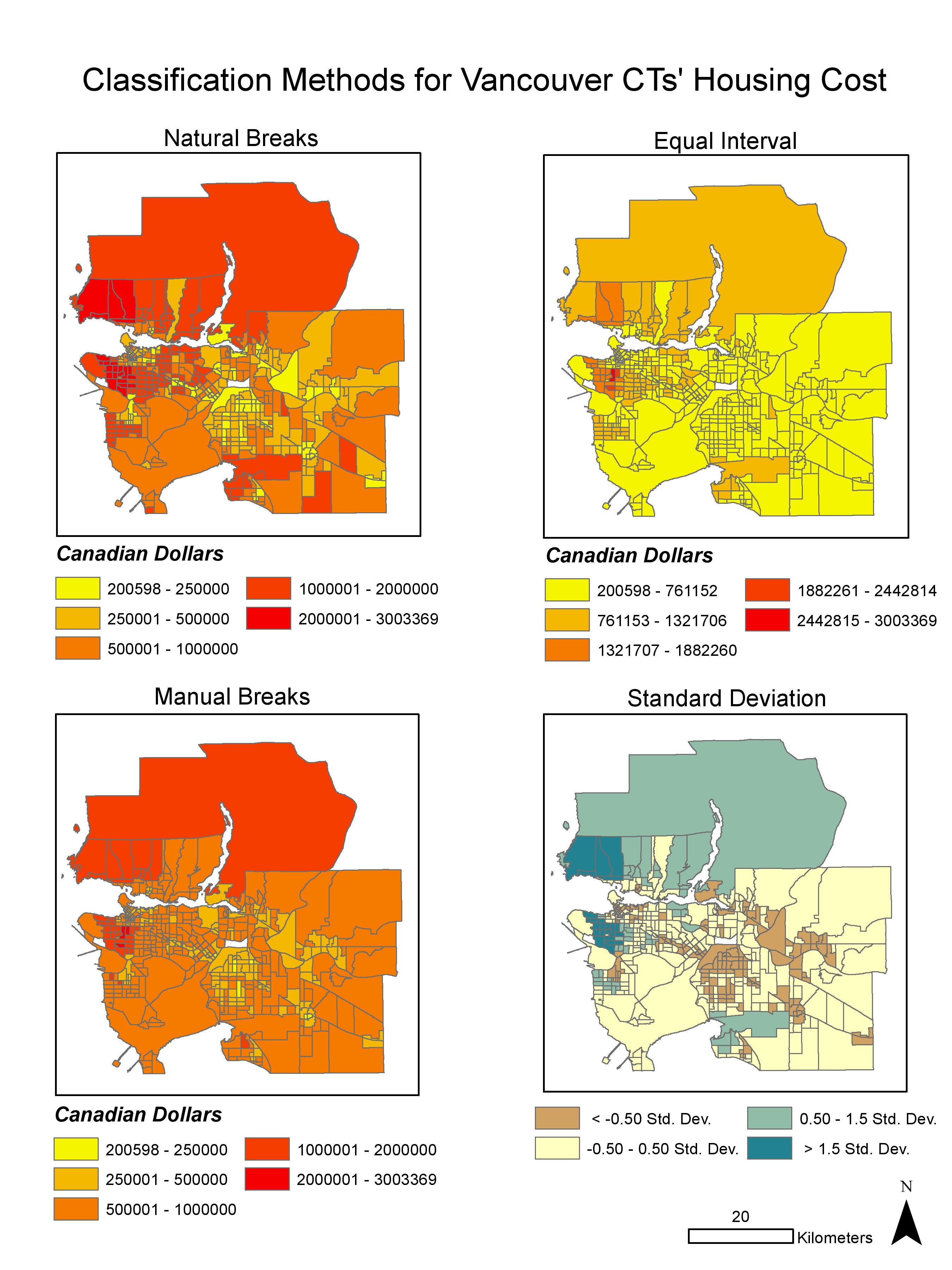
Map1: Classification methods for Vancouver’s housing cost
The classification methods used in this assignment were natural breaks, equal interval, standard deviation, and manual breaks (More at Data Classification). Each has its own characteristics, however if I am to act as (i) a journalist and (ii) a real estate agent, the decision on the choice of the preferred method will be as following:
(i) As a journalist, Natural Breaks (NB) would be the selected method to classify breaks in visualizing the housing cost in Vancouver because it is computer-generated, natural groupings inherent in the data. By doing so, any ethical complication would be at its least concern since the classification proceeds according solely to the data distribution.
(ii) In my position as a real estate agent, Equal Interval (EI) would be chosen in a presentation to the prospective home buyers. This is because EI visualization of property near UBC is in the least ‘concerning’ colour comparing to other classifications which illustrate in colour ranges of highest or second-highest housing cost. The selection would be highly questionable on the ground of its ethical implication since its intention is to maximize the persuasion toward the buyer using this particular visual aid.
Overall, since this data is from 2011 and now is 2017, it is surely not the ideal source to be referring to. However, it is of a legitimate one, as this is the available data from a trustable source (Statistic Canada) and is ready to use when taking into account that the current census (2017) is still on its way to be published.
Housing affordability
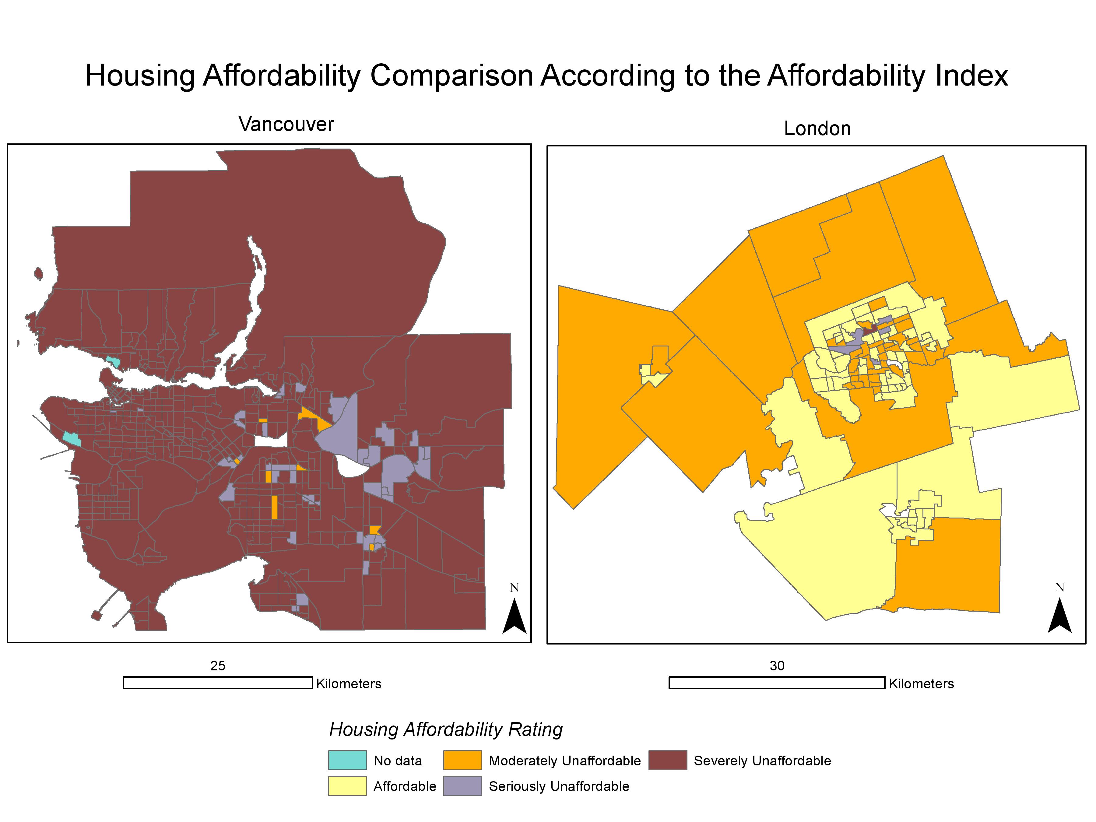
Map2: Housing affordability comparison between Vancouver and London, CA
The map above was a result from a comparison of housing affordability between Vancouver and London based on the Demographia International Housing Affordability Survey, a report on international metropolitan housing affordability conducted in 2016 (More at Demographia International Housing Affordability Survey’s report). This housing affordability approach takes into account the ration of the median house price to the median household income, then categorizes by the following ratings: 3.0 and under as affordable, 3.1-4.0 as moderately unaffordable, 4.1-5.0 as seriously unaffordable, lastly 5.1 and over as severely unaffordable. This makes such indicator more thorough, hence better, than using the housing cost alone. But does affordability a good indicator of a city’s ‘livability’? The relation between these two seems to be rather of association, than a mere causation. Take the example of Vancouver. The city has been praised by many, of its goodness and greatness, to be one of the top livable city in the world, however also holds a title among the least affordable city. So, do keep in mind that association ≠ causation!
×W’s picked-up skills×
- experienced inquiring and acquiring the necessary data in order to make an analysis and maps.
- joint tabular data to spatial layers as a base procedure to apply other analytical tools on
- made comparison using classification methods to create visual aids for the analysis of the housing cost within a city, and the housing affordability between two cities