GEOB270

2nd Lab: First Time ArcGIS

    Aside from introduction to the general functions of ArcGIS as a tool to manage, analyze and visualize geographical information (More at What is ArcGIS?), we also had the opportunity to work with Landsat. It is a remote sensing program using solar power satellites to capture the images of objects and surfaces on Earth since 1972. Data from Landsat, hence, adds a valuable advantage to the geographical analysis as it provides a series of continuous raster data imagery of any identical area in the world with approximate interval of 16 days. For instance, with the sample question ‘how has the construction of the W.A.C. Bennett Dam, located in northern B.C., impacted the river system (landscape, sediment loads) of the Peace River?’ the Landsat would be an effective to in monitoring the change made to the adjacent landscape or the terminal landscape of the river over the course of the dam operation.

×W’s picked-up skills×

  • familiarized with the general procedures of ArcGIS and its interface as a whole for further practise in the program 
  • introduced to the coordinate system and the projection, and ability to manage them in collaborating between different data layers
  • engaged ArcGIS with Landsat data to make a before-and-after map for any observed location

Standard
GEOB270

3rd Lab: What if Tsunami hits Vancouver…

    In the lab this week, we were giving a task to create a map of Vancouver city identifying the potential areas which are at risk from Tsunami and/or storm serge due to the the changing climate in recent years. The analysis shows that there is around 12% of City of Vancouver’s total area in danger from possible tsunami/storm surge. By using clip command (extracting only the features that overlap between two input data, More at Clip) and selection by attributes (More at Select by attributes), I was able to identify the health care and educational facilities within the City of Vancouver danger zone. They are as following:

  1. False Creek Residence
  2. Villa Cathay Care Home
  3. Broadway Pentecostal Lodge
  4. Yaletown House Society
  5. Emily Carr Institution of Art & Design (ECIAD)
  6. Henry Hudson Elementary
  7. False Creek Elementary
  8. St. Anthony of Padua
  9. Ecole Rose des Vents.

These facilities appear in burgundy points on Map 1, alongside types of land use categorized by colour and the major roads at risk with their locations.

Map1: Risk areas for Tsunami or storm surge in Vancouver

    Moreover, since there is a project proposal for the new St. Paul Hospital designated in the Mount Pleasant neighbourhood, I made an additional map, below, to visualize the potential risk of the site from flooding. This is due to its lowland location that contributes to a high possibility of flood damage to the new hospital site, if the city of Vancouver is hit by Tsunami.

Map2- Risk from flooding to the hospital new site

×W’s picked-up skills×

  • familiarized initially with the program’s variety of tools (buffer, clip, reclassification, selection by location etc.) for future proficient usage
  • integrated both spatial and tabular datasets in creating a map of risk areas from Tsunami in Vancouver
  • calculated areas of the risk zones through the summary table for each type of affected land uses as part of the impact analysis
Standard
GEOB270

4th Lab: A Comparison of Housing Affordability between Vancouver and London, CA

    This is a one challenging task/assignment/responsibility I have ever entitled to. The scope and the overall conduct were rather advanced and much more extensive than before, as we were assigned to work from scratch on the road to the final product: acquiring all the data, processing them, making analysis, and producing the result maps. Anyways, as the title suggested, this week’s lab was on housing affordability in a comparison between Vancouver, BC and London, ON. The assignment had two major aspects: one is on the quantitative data classification, while the other is about the housing affordability.

Quantitative Data Classification

Map1: Classification methods for Vancouver’s housing cost

    The classification methods used in this assignment were natural breaks, equal interval, standard deviation, and  manual breaks (More at Data Classification). Each has its own characteristics, however if I am to act as (i) a journalist and (ii) a real estate agent, the decision on the choice of the preferred method will be as following:

(i) As a journalist, Natural Breaks (NB) would be the selected method to classify breaks in visualizing the housing cost in Vancouver because it is computer-generated, natural groupings inherent in the data. By doing so, any ethical complication would be at its least concern since the classification proceeds according solely to the data distribution.

(ii) In my position as a real estate agent,  Equal Interval (EI) would be chosen in a presentation to the prospective home buyers. This is because EI visualization of property near UBC is in the least ‘concerning’ colour comparing to other classifications which illustrate in colour ranges of highest or second-highest housing cost. The selection would be highly questionable on the ground of its ethical implication since its intention is to maximize the persuasion toward the buyer using this particular visual aid.

    Overall, since this data is from 2011 and now is 2017, it is surely not the ideal source to be referring to. However, it is of a legitimate one, as this is the available data from a trustable source (Statistic Canada) and is ready to use when taking into account that the current census (2017) is still on its way to be published.

Housing affordability

Map2: Housing affordability comparison between Vancouver and London, CA

    The map above was a result from a comparison of housing affordability between Vancouver and London based on the Demographia International Housing Affordability Survey, a report on international metropolitan housing affordability conducted in 2016 (More at Demographia International Housing Affordability Survey’s report). This housing affordability approach takes into account the ration of the median house price to the median household income, then categorizes by the following ratings:  3.0 and under as affordable, 3.1-4.0 as moderately unaffordable, 4.1-5.0 as seriously unaffordable, lastly 5.1 and over as severely unaffordable. This makes such indicator more thorough, hence better, than using the housing cost alone. But does affordability a good indicator of a city’s ‘livability’? The relation between these two seems to be rather of association, than a mere causation. Take the example of Vancouver. The city has been praised by many, of its goodness and greatness, to be one of the top livable city in the world, however also holds a title among the least affordable city. So, do keep in mind that association ≠ causation!

×W’s picked-up skills×

  • experienced inquiring and acquiring the necessary data in order to make an analysis and maps. 
  • joint tabular data to spatial layers as a base procedure to apply other analytical tools on
  • made comparison using classification methods to create visual aids for the analysis of the housing cost within a city, and the housing affordability between two cities
Standard
GEOB270

5th Lab: Scenario A ‘you are a natural resource planner’!?

    Thanks to such an intense ‘preparation’ from the last lab, I was rather confident enough in my accumulated GIS expertise not to completely breakdown in sweats and nervousness for this week’s lab. It is the ultimate self-dependence assignment before embarking onto our final project, but to me this is the last barrier, the last boss in the game that once I am able to have a triumph over it, nothing ArcGIS-related will be of bother anymore (quite ambitious statement, but still inapt in reality). Anyways, this week’ topic was on environmental assessment, specifically on the Garibaldi at Squamish project while my approach toward the project was as a natural resource planner who has been retained by the project proponents. My task was to develop evaluations and recommendations to the proponents as to what the priorities are in order to proceed with their proposal.

Introduction

The proposed project is named the ‘Garibaldi at Squamish’ which is designed to be a year-round mountain resort, locating on Brohm Ridge near Squamish community in the Northern Vancouver. My involvement in this process, as a natural planner recruited by the project proponents, is to reevaluate the project based on the received criticisms regarding potential environmental and wildlife concerns, from the BC Environmental Assessment Office and Resort Municipality of Whistler, and to make subsequent recommendations to the proponents on their priorities regarding the concerns.

Addressing the concerns

In offering my evaluations and recommendations, I have operated on the ArcGIS program to conduct an analysis on the proposed project and to make visual aids (i.e. maps) in assisting the analysis. The input data layers are project boundary, roads, rivers, 20m. contour line, DEM, ungulate winter habitat, old growth forest zones, and terrestrial ecosystem areas.

Firstly, by operating command ‘clip’ based on the project boundary layer, the analysis can concentrate solely on the area of the proposal. For DEM layer, I reclassified and converted the file to vector in order to establish the snowline which is above 555m. of vertical. For terrestrial ecosystem layer, I selected, by attributes, areas of certain endangered species, created a new layer out of it, called ‘redlisted’ and made a endangered-species map. For river layer, I used the buffer command to verify the riparian areas within the project boundary. Then in order to visualize the protected area, through union command, I combined layers of ungulate winter habitat, old growth forest zones, ‘redlisted’ and riparian areas together. Hence, by aligning the protected areas with the project boundary, the final map was made to collaborate in my analysis of this project.

Map1: Locations of the endangered species within the proposed project boundary

The result shows that more than 50% of the project area could potentially have direct impacts to the environment within the boundary: 6.78% on old growth forest zones, 7.89% on the ungulate winter habitat, 24.83% on endangered ecosystem areas and 26.01% on the riparian areas. Moreover, 29.92% of the total area is below 555m. of vertical which is cited by Resort Municipality of Whistler to be outside of the snowline.

Map2: Environmentally-impacted areas of the proposed project

Sequential recommendations

According to the result of the analyses, as a natural planner, I would recommend the project proponents to prioritize their consideration more on the riparian areas and the endangered ecosystem areas. This is because they are the potentially two greatest environmental concerns within ‘Garibaldi at Squamish’ boundary. My prominent recommendations would be not to construct any infrastructure on such areas, and to do a field survey around those areas to make sure that they will not experience any peripheral disturbance or damage from neither the resort construction or the resort existence itself.


Personal reflection

Considering the outline of the proposal and the result of the environmental assessment, I do not agree to the construction of the resort for various reasons: (a) it is built within the First Nations land in which the community would surely be affected by such large-scale project of a year-round resort and (b) the construction and the existence of the resort itself create disruption to the natural habitat and pattern of both plants and animals in the area, despite receiving the approval certificate from the BC Environmental Assessment Office. These disagreement are expressed from my stand as a member of the society, however, in a role as a natural resource planner, my judgement has to maintain as unbiased as possible, that is to report only the result of the analysis, not being clouded by my personal opinion. In other words, there is an overlap between my personal disagreement and the analysis outcome on the project in the memo, sharing certain concerns but not identical.

×W’s picked-up skills×

  • introduced to publicly available source of data and acquired only the suitable format of data for ArcGIS marking the beginning of the analysis
  • reclassified the DEM data on the value of elevation to verify the suitable area for the resort construction  
  • operated the select by attributed tool to identify certain features within the red-listed ecosystems, the ungulate winter ranges, and the old growth forest for the visualization of the environmentally-impacted areas for the resort construction  
  • generated an environmental assessment map as a visual aid, and made a memo for the analysis of the resort construction and its potential impact to the preexisting biodiversity
Standard
GEOB270

Final Project: Exploring location suitability for the new Arizona Coyotes’ arena through GIS analysis

For the last two weeks of the term, ‘the final project’ was the absolute focus of my life. My schedule was revolved around the project; basically, it is safe to claim that I had lived and breathed for the completion of this project. Why? Because this was somehow such an entertainingly challenge to tackle. You are equipped with fundamental understandings of the process, and the opportunity to execute some awesome GIS analysis project of your choice. How can one not be excited about it? Well, this excitement might not apply to everyone, but it certainly is for me!


Planning for a new NHL Arena in Phoenix, AZ: Exploring Site Suitability using GIS Analysis

Introduction

The Arizona Coyotes (a National Hockey League franchise) are looking for location with Phoenix, AZ, to build their own arena, replacing their station location since 2013 at Gila River Arena in the city of Glendale, AZ. Noticing the promise of such opportunity, our project intended to evaluate for the optimum potential locations for the new Arizona Coyotes arena within the city of Phoenix, by using ArcGIS as the means of analysis. 

Methods

    First, we acquired all necessary spatial data through various sources which were the OpenStreetMapCity of Phoenix Open Data, and ArcGIS Open Data. Then we decided that the analysis project ought to be separated, for efficiency and simplicity, into two steps (See Flowchart below): (i) determining the available land parcels with proper size , and (ii) evaluating city’s zone of susceptibility through weighted based on the following criteria- within walking distance from public transport, within convenient driving distance from freeways and major roads and, lastly, outside of the flood zones in Phoenix.

    Step (i) involved mostly with the exclusive use of selection by attribute to reach a result of parcels in either commercial or light industrial zoning, outside of the historical zone and within proper size of determined five million square feet. On the other hands, step (ii) were complicated with repeated procedures and series of commands to conclude with areas qualifying within the flood-free, the walkable and the drivable zones. Then, after combining the results from these steps, we had the parcels potential outcome which, through visual inspection to determine the mutifuntionality of the future locations from the existing facilities (hospitals, recreational centers and parking areas), we had the final map for options of the optimum locations for the new Arizona Coyotes arena.

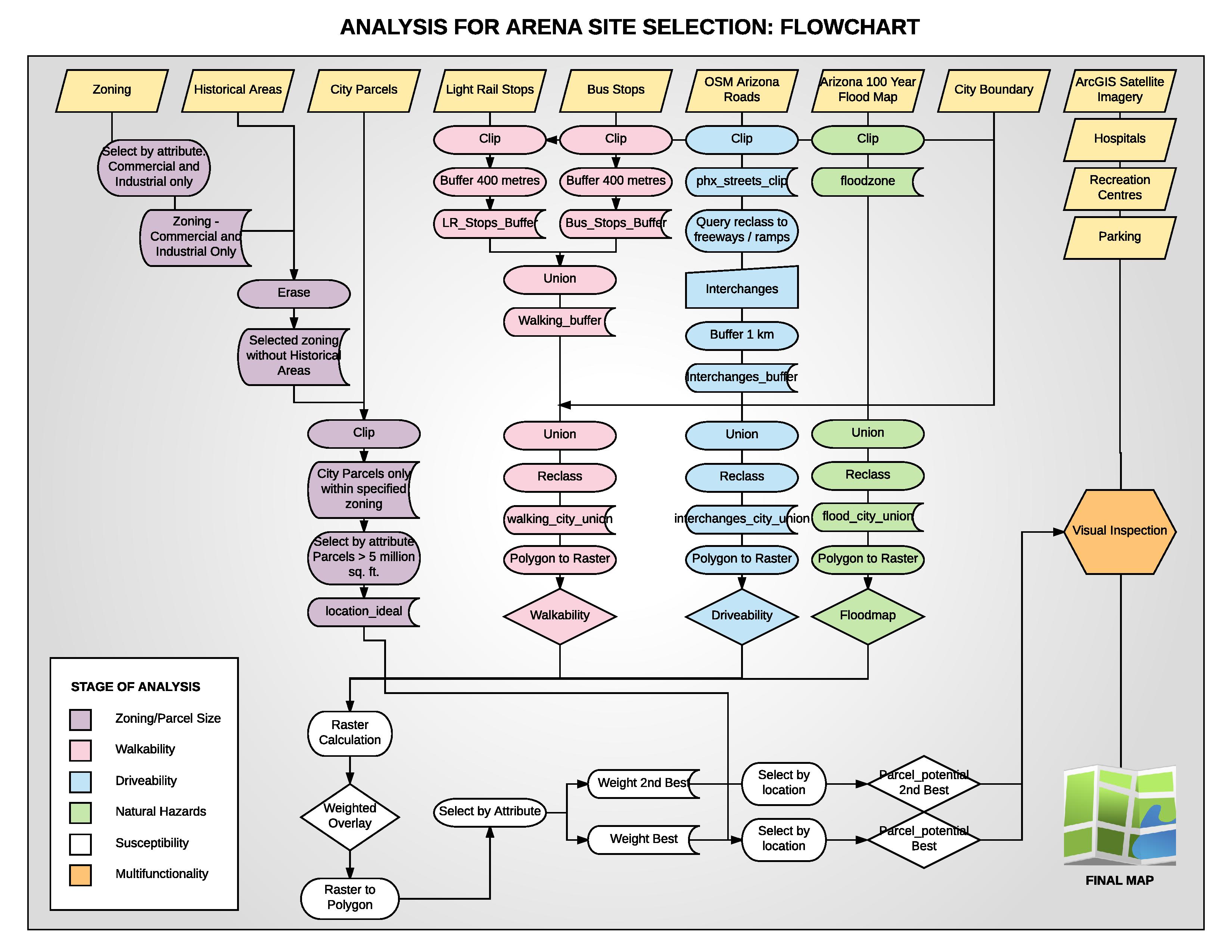
Flowchart illustrating the overall process

Results and Discussion

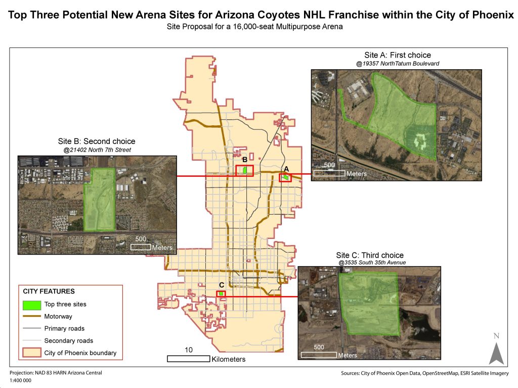
Map1: (the final product) Top three potential new arena sites for the Arizona Coyote NHL within the city of Phoenix

Site A: Determined to be the best option, we were able to definitively conclude that its close proximity to public transport, freeway interchanges and distance from flood zones, all allowed for it to be the discernibly superior option. Furthermore, the site sits close to a hospital, has 8 hundred thousand square feet. of pre-existing parking lots on site and the locale is serviced by only one other recreation center. The one drawback that must be addressed is far from the city hub. Without data on the location of the fan base this may prove to be either a negative, positive or a null inquiry.

Site B: The decision to rank this plot second was based on the accessibility of public transport and its location outside of the flood zone. Moreover, based upon satellite imagery it appeared that Plot B was largely undeveloped, implying that any demolition-related costs could be reduced. 

Site C:  Though Plot C was our third choice, it lacked many of the qualities of the previously described locations. Positives of this site were its location to public transport and major highways. Additionally, from satellite imagery, Plot C is largely undeveloped. From a negative perspective, this site had parts existing in the 100 year flood zone. This would affect both the overall structure of the building and the insurance associated to a building in a flood zone. Moreover, the surrounding area was already serviced by two recreation centers, and lacked any hospital and significant parking lots within the boundary.  

In conclusion, it can be stated that the most preferred option was Plot A. This was due to the locations adherence to our criteria, most notably as it was the only site which was successfully adjacent to a hospital, far from any recreation centers, had substantial parking areas, was greater than 5 million square feet, and within areas of accepted walkability and drivability.


Team Management

This group (Wasinee, Kanchi, Templar and Stephen) dynamic had balanced itself in a rather satisfying manner where half of us worked mainly on the map, while the other halves were in charge of figures and the report. Cross-section between these two aspects of the project had happened occasionally, since the details about the map naturally had to be writing out in the report and vise versa.  All members were active for finding the data layers, then our responsibilities had spread out since, but within three majors grounds: to make maps, to arrange the flowchart and to build the report. We rarely had tension among the member’s opinion, but did appeared a slight irritation on the work distribution. Fortunately, the members are of hard workers. So instead of an endless complaint, one just simply worked to compliment the others’s absence. Hence, if each member contribution has to be specified, it would not be of a quarter equally among the members. This, however, has been a pleasant journey of its own that I would not change for anything else♥


Standard
GEOB270

Last words?: My GIS expertise and the overall experience

There is no easy way to be descriptive about what I had learned and accomplished in this course because there are many and, to me, this is still an ongoing development I hope to pursuit. But since such summary is needed to capture my journey through this course, it would be that I am confident in my expertise and ability to take on any GIS analysis project in the future, let it be for social geography or environmental assessment. To work on the project from scratch to the last page of my analysis report (finding necessary datasets, making decision on the option of tools to operate in ArcGIS and creating comprehensible maps as the visualized representatives of the result) is what I am now capable of doing, and it is all thanks to this GEOB270 course, the wonderful professor Sally Hermansen and great support throughout the term from the TAs, Wes and Tobias. I shall not take credit for the potential accomplishment all to myself, but to always remember the people who enable my potential to accomplish so. Thankyou!

Standard