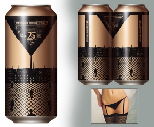
“ Sex sells”. That is especially true in the beer industry, from explicit commercials to implicit sexual innuendos in their advertisements. RAMM, a russian brewery took a step further in designing a most creative and controversial design for their beer cans.
As you can see on the picture, the design of the bottle once joining together with another, gives the illusion of a female body. The design is very appealing the to the predominant male beer drinkers and just simply amusing for the rest of us.
The innovative packaging makes the cans stand out from a crowd of beer cans. When consumers are shopping, the unusual package immediately capture their attention by appealing to the affective component of the consumer attitude. Being different could be a risky decision since most beer buyers just “grab and go”. The odd colour may confuse people about the nature of the drink. However, RAMM made sure to print the alcoholic percentage of the beer in the largest font, bigger than the company name to ensure people that this is indeed what they were looking for.
While most companies are spending big bucks on primetime commercials, RAMM found a cheap way of getting people to pick up their products from the selves and asking “ who made this?”


0 responses so far ↓
There are no comments yet...Kick things off by filling out the form below.
Leave a Comment