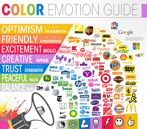
As Kamilla Bekbulatova wrote some days ago (you can see her original post here), logo colours are of utmost importance in becoming a successful and renowned brand. According to her research, she found out that people do, in fact, remember brands better because of their colours since most of them will provoke some type of reaction to the consumers.
Her post made me realize how companies need to put a lot of effort in every single detail in order to survive in today’s competitive market, since any small mistake or lack of attention to some minor detail may give them a disadvantage. For example, if a fast food company, who’s target market are children and teengers, decides to make their logo green and blue, it is very likely that they will not attract a very significant amount of people. This happens because the colours they chose gives the customers a more health-councious and trustworthy feeling, instead of an exciting and energy-filled feeling that children are looking for.
Also, it is impressive the brain’s power to associate colours to very specific things. therefore, it is also very important to make sure your logo colours reflect exactly what you offer because if they do, it is very likely people will assimilate your logo to various feelings and situations based on your colour choices.

