Sometimes firms try to change their positioning.
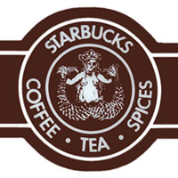
The original hippie Starbucks owners did not sell espresso drinks, but mostly sold coffee beans, tea and spices.
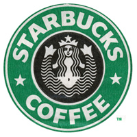
 The next, more familiar green logo has a more attractive stylized siren. The chest is hidden, but the belly button is still there.
They cropped the siren image so that only a hint of the tails is visible.
Lately, Starbucks changed the siren logo as part of store decoration and on coffee packaging again. Now it only has one tail. I guess the family-unfriendly image of a fish-woman spreading her tails is on its way out.
Since Starbucks has tons of experience of branding and repositioning, I think this is a significant sign that are not just coffee anymore.
Recently, Starbucks CEO Howard Schultz outlined a three-part approach to growing the company’s brand, including growing social media efforts, expanding to grocery stores and the single-cup market, and expanding its brand to non-coffee products.
Hopefully, this is not just a short-term success of brand expanding since the sophisticated brand recognition is diluted.

