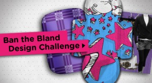
On adfreak, the new Kotex “get your creative juice flowing” ads really caught my attention. I stopped thinking “huh? how is Kotex linked to creativity?” I was really surprised to see that the new campaign was to get girls and women to create their own designs on a pad! and the winner would be able to collaborate with designer Patricia Field to create a new design on the pad. Although this is a really unique approach to re vamping the product I can’t help but think its unnecessary. The main purpose of pads is not how nice it actually is but rather how well it is designed for protection. For me, the “design” of it won’t really change my purchasing decision
However, Kotex has also taken this creativity “ban the bland design challenge” and incorporated with their packaging as well. The box and the package itself is black with bold colored designs and also the sleek packaging. The actual pad and tampon packaging is also differentiated from other brands with its small size and bright bold colorful designs. Rebecca Cullers who posted the article on adfreak, it makes girls less embarrassed if they accidentally dropped it or if someone sees because of the different packaging. Its really different from the norm so people won’t associate it with pads.
For me I think the packaging has a greater impact during my purchasing decision rather than the actual creative design of the pads itself, but I think it is a great initiative and allows for girls to go on the website and be involved and more informed.


