Culture Jam
Half-naked women, suggestive slogans, topless men – sex appeal has always been used as a tool by corporations to better sell their products. These products are meant to be sold to the general public, which is why representations in advertisements can be a controversial issue – we are shaped by what we see, but what we see is also shaped by who we are.
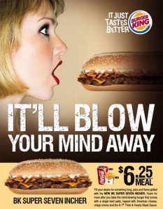
In 2009, Burger King released an advertisement to promote their new sandwich, the BK Super Seven Incher. The advertisement featured a blonde model with her red lips wide open while facing the sandwich, which is sort of an oblong oval shape – an almost phallus-like shape. And in front of the image reads “It’ll blow your mind away”, placing emphasis on the “It’ll blow” part by arranging it on top of the second half of the sentence but also by making the words slightly larger. This line references the expression “mind-blowing”, but it can also serve as a reference to oral sex as using “blow” as a verb can be used as a slang to reference the act of giving a fellatio.
Underneath the image, there’s a description of the sandwich. Terms like “long”, “thick”, “yearn”, and “desire” are used to describe this sandwich, these terms can all be used in a sexual context although that’s not necessarily the case here. But since the sandwich is called the BK Super Seven Incher, the sexual connotations of the terms won’t go unnoticed. “Incher” is used to refer to a penis when describing the size of it, so “Super Seven Incher” can easily mean something other than a sandwich outside of the context of this advertisement – in fact, the sandwich most likely wouldn’t be the first thing to come to mind in the first place anyway.
To top it all off, the slogan, “It just tastes better” works with the sexual imagery and references – it further pushes the reference to oral sex. This is a very sexual advertisement, and it does objectify women – the emphasis on the male-centered sexual imagery was meant to pander to a male audience, which probably means that the company saw it to be more important to cater to their male customers than female customers.
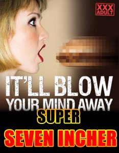
The intention of my alteration was to show the over-sexualisation within the advertisement by appropriating the original advertisement into an advertisement or cover for pornography. By doing this, I hope it showed how easily the original advertisement could be corrupted and how it could be easily be manipulated into a pornographic poster – revealing the subtext the audience notices within the original advertisement.
I tried to work within the confines of the original advertisement as much as possible, the reason being that I want to work with how the original advertisement served as a representation – if I had to completely reconstruct this advertisement to corrupt it, then it probably wasn’t so problematic in the first place, if that makes any sense.
To start off, I pixelated the sandwich – this was to reference the male body without having to bring in additional material outside of the original advertisement. Pixelating genitalia is a common practice within the Japanese porn industry, so that also influenced my decision to pixelate the sandwich. I kept the original slogan for the sandwich, but I did replace the Burger King logo with a logo that would signify – or inform – the audience of pornographic content. To top it off, I added this really bold title using the name of the sandwich, using bold, clashing colors and an obnoxious font to imitate the over-the-top aesthetic found in porn.