Windows made its first big break in the PC market with its creation of Windows 95. It featured a simple interface based entirely around squares not due to design decisions, but due to technological boundaries. Yet, it still shows off Microsoft’s ingenuity with its creation of the familiar taskbar and desktop combination which is still used to this day.
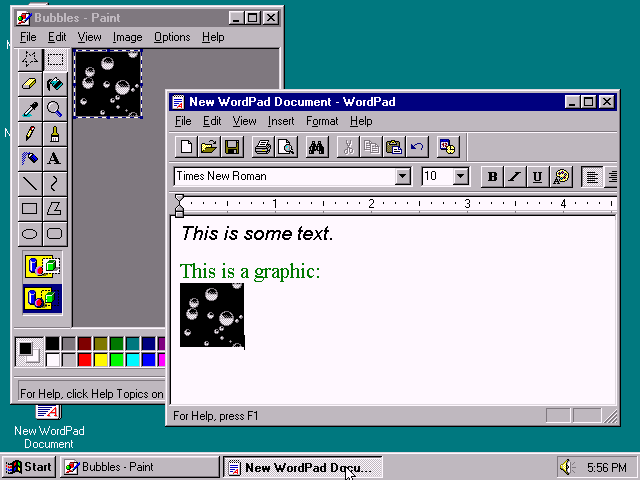
An example of Windows 95’s user interface.
However, as technology evolved more and more, Microsoft was eager to show off the new crazy and advanced things they could do. This started with Windows XP, which featured rounded edges and a slight gradient to give the entire interface a bubbly, three-dimensional look. It was a huge advancement for its time, and was well-accepted by the general public.
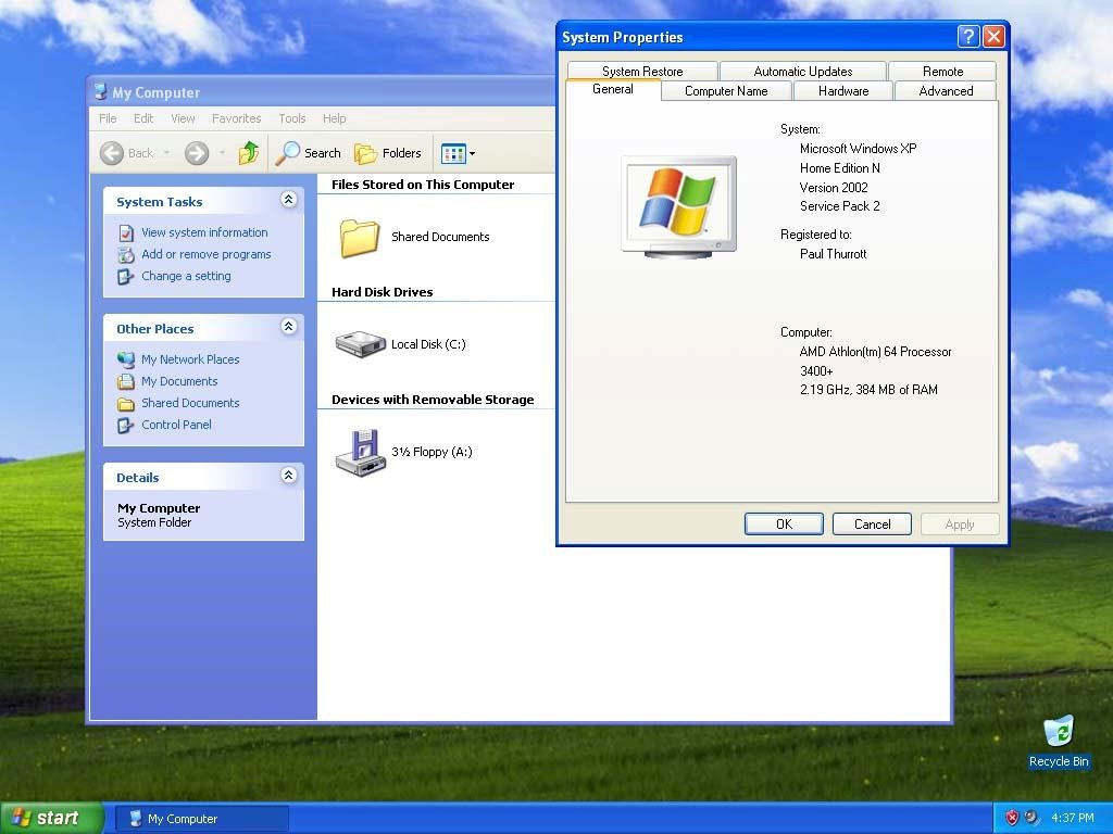
While maintaining similar design principles as Windows 95, XP showed the next big step in the evolution of the Windows UI.
Then came along Vista. The design that was supposed to be cooler, more sleek, and more modern, unfortunately ended up falling flat on its face. With its attempt to show off 3D capabilities with the Flip 3D task switcher and the “Aero” theme that showed coloured, glass-like transparencies to give more depth, ended up being overwhelming for the general user, and clunky for the power user. It felt slower due to the transition speeds of its animations, and was not nearly as simple to understand as its predecessor.
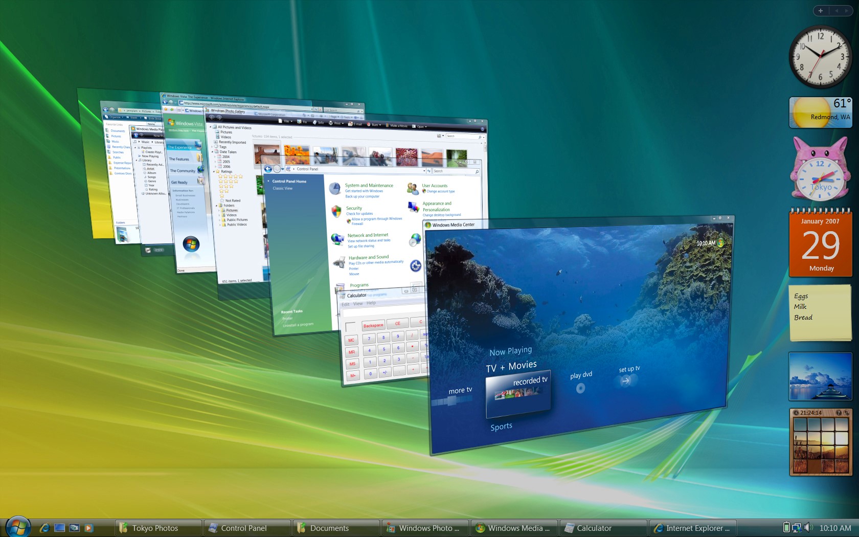
An example of Windows’ Flip 3D task switcher.
Windows 8 was Windows’ next big attempt to be cool. It took a whole new approach, embracing the new touchscreen technology that was being developed, and opted to go back to a basic, flat, 2D UI. While it was simple and easier to understand than Vista, Windows had deviated very far from its tried and tested formula and alienated a lot of users. Not to mention that touch screens were unfortunately not accessible to many, making its new interface clunky and not optimized for non-touch screen users.
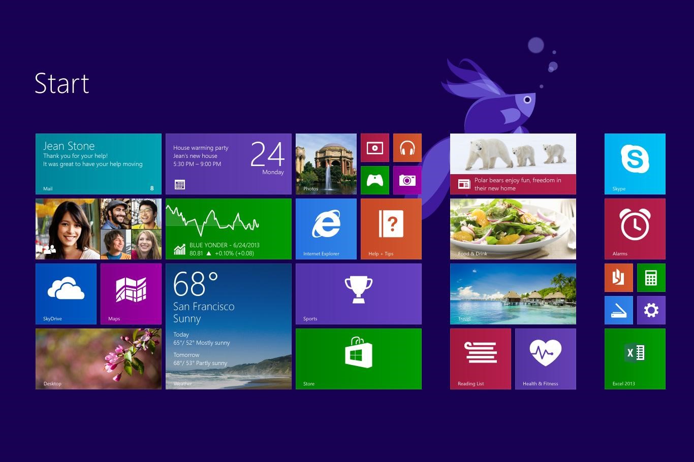
Windows 8’s touch-optimized tile home screen.
Windows 10 is the newest operating system, and truly goes back to its roots. With the desktop and taskbar combo, Windows 10 opts to use flat designs with slight transparencies to give depth, simpler icons, and even voice recognition for easier usability. While still in its infancy, many are saying that Windows 10 may be the best Microsoft operating system yet, and is a great reminder that sometimes when designing for users, we just need to KISS: keep it simple, stupid.
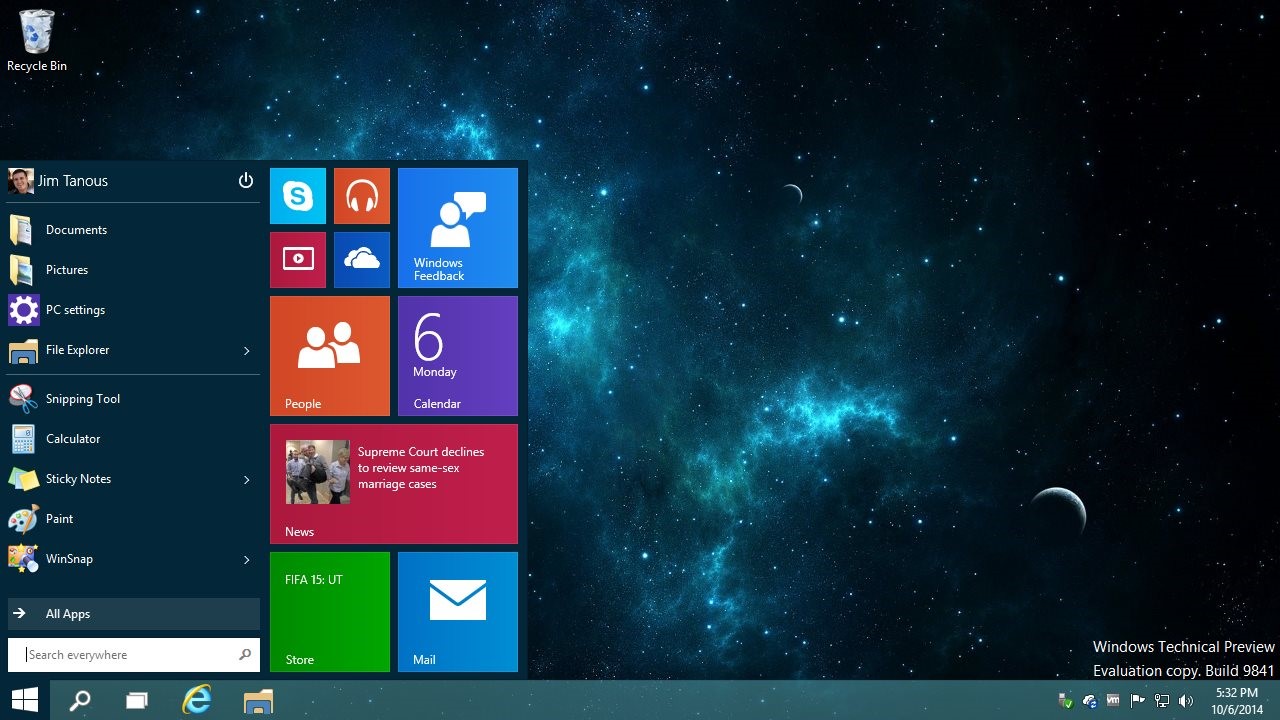
Windows 10 takes the touch designs of 8 and makes them optimized for PC.
Sources:
toastytech.com
forbes.com