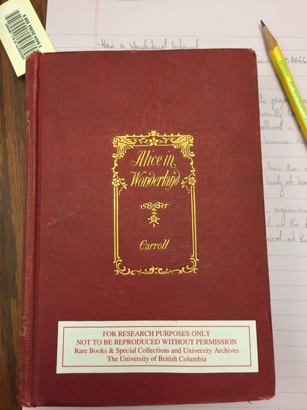
As can be seen by looking at the picture above, our edition of Alice in Wonderland is bound in red cloth and stamped in gilt on the front cover and spine. The gilt depicts an architectural border adorned with leaves and flowers within which appears the title of the novel and the author’s last name. The cover appears to be very austere and simple, with its sparse decoration and un-patterned cloth, but this was typical of the early beginnings of cloth bindings (along with a predilection for gold stamp).
Cloth bindings for books really became prevalent in the early 19th century. This was in part due to the increase in demand for books at the time, which transferred bookbinding from being a handmade method to a mechanised one (and cloth was a more partial material). It was also the result of the fact that the publishers of the time were now taking control of the entire book-making procedure, including editing, printing, and binding. Through doing this, publishers began to view the book as a whole and saw the cover as an integral part of the marketing process. It could convey the content of the book, who its intended audience was, and most importantly, the cover could attract customers to their edition. While cloth bindings were not favoured at the beginning of the 19th century, by the time our 1893 edition was published, they were the norm.
One of the things that I found most interesting about this cover of Alice in Wonderland is how there seems to be a complete disconnect between the content of the book and its outdoor appearance. While the proverb “Never judge a book by its cover” springs to mind with this criticism, I am still at a loss to reconcile how astonishingly different these two aspects of the book are from one another.
In our modern day and age, the cover of a novel almost always reflects at least some hint of the genre it is displaying. With this edition, however, not a single detail from the cover suggests to me that this would contain a children’s story, complete with a fantastical world of less than punctual rabbits and queens whose soldiers are made of paper.
What the cover does suggest to me is that this particular edition of Alice in Wonderland was not meant to be marketed towards children, but instead was to be seen as a symbol of the buyer’s wealth; due to this book being made of hardy and expensive materials as implied by the incredible preservation of a 123-year-old book and the acidification stain of a forgotten bookmark.
The scant decoration of the cover could also point to Lewis Carroll’s renown as an author or Alice’s renown as a story. Either way, with the original being printed in 1865, this 1893 reprinting points to the popularity of the book. This might mean that the popularity of both author and story were enough to sell the book without any additional ornamentation to attract the reader.