
*Warning: I have purposefully made the illustrations huge in order for a better observation of the detail within each*
One of the main reasons I picked this edition of Alice in Wonderland is because of the beautiful illustrations found throughout the novel. While more traditional than the 1969 copy illustrated by Salvador Dali (which can be found in UBC Rare Books and Special Collections), the images in this 1893 edition still captured the “wonder” associated with Alice’s Wonderland. Not only are whole pages dedicated to their display, but the illustrations are incorporated into and can even be seen as interacting with the text. There are two main types of illustrations within the novel: lithographic images and engraved ones.
When you open the book, you are immediately presented with a highly detailed illustration showing the Queen of Hearts calling for Alice’s head. The fine lines and amount of immense detail put into the image
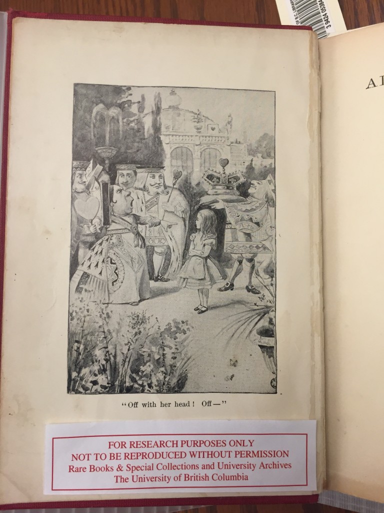
immediately suggest that this was a painting that was printed within the book using the technique of lithography.
Invented in 1796 by a German playwright, lithographic printing revolutionised the production of images within the 19th century. Economical and easier to use than previous methods, lithography had an immense range of utility. It was used for anything from the exploration of different mediums by contemporary artists like Eugene Delacroix to the printing of images in books, newspapers, and a variety of other “bookish” objects.
Derived from the Latin words for stone (litho) and mark (graph), lithography is a method of printing in which an image is drawn onto limestone with an oil-based substance like fat or wax. The plate of limestone is then treated with chemicals, which would essentially “eat away” the parts of the stone that were not protected by the wax. The eroded areas of the stone would retain water so when oil-based ink was applied to the plate, the remaining water would repel the oil and cause it to stick only to the original image. This was then transferred to paper, and voila! An illustration is born!
Due to the nature of lithography, the paper onto which an image is printed usually has a waxier consistency than other pages that utilise a different printing method. This was one of the clues that allowed me to conclude that the illustration above was done through lithographic means. When I touched the paper, it felt richer than the page next to it that housed an engraved image.
And that’s a nice segue into the other type of printing method used for illustrations: engravings!
The use of engravings for illustrations has a much longer history than that of lithographic printing. Beginning during the 15th century, engraving was initially thought of as a branch of goldsmith art. It later developed to being used as a way to produce multiple copies of the same illustration. This was because an artist could carve one image into a block of material and then use it as a stamp.
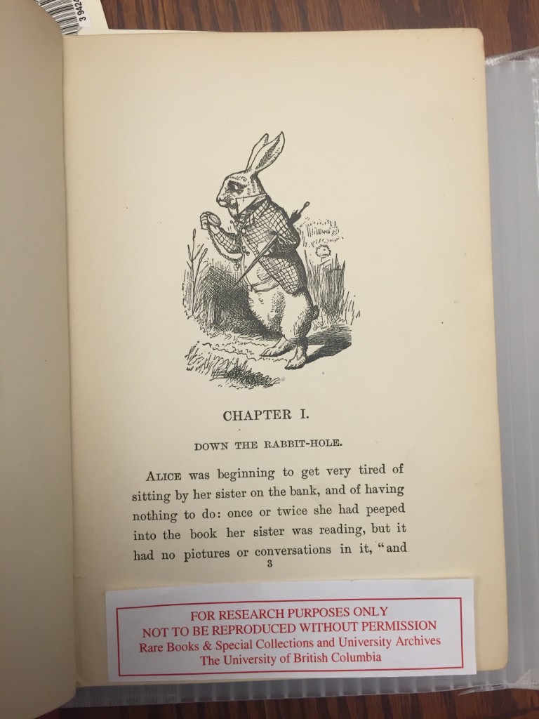
Engravings are very distinguishable from other types of illustrations. This is because of the identifiable trademark of “cross-hatching“. If you look closely at the image of the White Rabbit to your left, you can see the evidence of the artist’s cross-hatching in the grass, upon his jacket, and along his lower body. This is done in order create the impression of texture and shadow within the image. It could also be a stylistic result of working with wooden blocks/ metal plates for printing.
The images engraved in our book are steel engravings. One easy way to tell this is to look at the publication date of the book. If it was published before 1821, you can assume it was copper that was used for the engraving process. But, if it was after 1830, it is almost guaranteed to be steel due to most artists switching to this sturdier metal.
As stated before, before steel became the prominent method, copper was used (and before copper it was wood, but we won’t get into that here). Copper was favoured because it was a soft metal and easy to carve. Yet due to the same properties that made it a favourable material for printing, they also limited the amount of defined detail that could be put into a sketch. Additionally, the repeated use of the copper plate caused even more prominent lines to degrade due to the malleable nature of the metal. This was a main reason why people switched to tell. Although steel was a harder metal to carve, it allowed finer details to be engraved and better quality illustrations to be produced. Steel engravings were one of the main methods of printing images until lithography emerged as a easier and more economical alternative in the 19th century.
Hmmm, now isn’t that odd? Why, if lithographic printing is simpler and less expensive than engravings, is the image of Alice and the Queen the only lithographic print in the entire book? This particular edition is chalked full of engravings like the one of the rabbit, which through our research, we have found to be the more expensive mode of printing. So, why would the publisher make this decision?
Returning to what we learned earlier about the cover of our book, it seems that one of the possible reasons the publisher did this was because they wanted this book to be a symbol of wealth. However, I believe this to be unlikely. In my opinion, due to the book having no accredited illustrator, I believe that the publisher employed steel engravings because they closely resemble the wooden-block engraved illustrations done by Sir John Tenniel in the first edition of Alice in Wonderland. This would have possibly evoked nostalgia in the older clientele that this edition was probably marketed towards and would have increased sales.