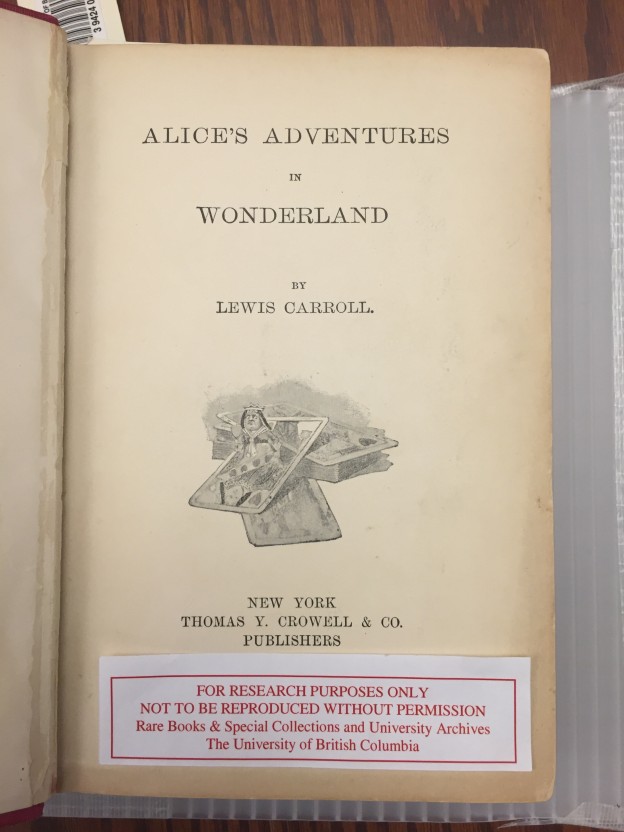
So, you might be wondering why the heading of “The Publisher” is under that of “A Children’s Book?”.
Well, the main reason is because by the end of the 19th century (when our dear book was published), publishers had taken over the entire book-making process, from editing, to printing, to bookbinding (which included cover design). As has been discussed at length in the section of the blog on the cover of this book, the cover does not seem to reflect the “whimsy” commonly associated with the tales of Alice. While it is clear from the history and content of the story, the illustrations, and the handwritten inscription that is scrawled across one of the inside pages of the novel, that this is indeed (in genre) a children’s book; the cover does not seem to support this claim.
Why though? That was my main question. Why does a book that is so clearly in the realm of children’s literature not look like it belongs? Was this intentional? Was it ever intended to be “a children’s book” (i.e. marketed towards children)?
Due to our previous knowledge about publishers and the book-making process by the end of the 19th century, these quandaries brought me to do some research on the publisher of our novel: T. Y. Crowell & Company.
T.Y. Crowell & Company was a publishing company that was founded by Thomas Y. Crowell in 1876. Originally it was a bookbinding business, but Crowell bought it from the wife of the deceased owner in 1870 and expanded. The Company was based in New York and remained under the Crowell family’s control until in 1968, they were sold to Dun & Bradstreet; and then were subsequently bought by Harper & Row in 1978.
Through looking at the books published by T.Y. Crowell, it seems that the genres most prevalently distributed by the Company were that of poetry and Romantic literature, with a focus on Robert Burns and Lord Tennyson. While they did seem to print a variety of children’s books, it was by far not the lucrative “bread and butter” of the business.
As a result of my research, I came to two very different (one being completely abstract) conclusions. Let’s start with the more logical one, shall we?
My first conclusion was that my intuition was right when looking at this copy of Alice: it was never intended to be a “children’s book”. It was probably designed in such a way in order to attract an older clientele, who would have been impressed by the cloth and gilt cover. Upon closer inspection (due to the popularity of the story and Carroll by this time), they would have realised it was actually a children’s book and have bought it as gift. This seems to have been what happened with this particular edition as evidenced by the handwritten dedication at the front.
The first theory tends to make sense, especially when we consider the time period and how customers interacted with books. Even though they were increasing in popularity, books were still seen as status symbols at the end of the 19th century and as a result, only adult would have been able to afford them. Therefore, it makes sense that even the most children-y of children’s books would have been geared toward a more mature audience.
My second theory is a bit more, let’s say, on the English literature side of interpretations? Either way, it seems unlikely, but I thought it was an interesting reading (pardon the pun) of the cover.
Purely based on outside speculation (i.e. not considering the historical context in which the book was published), it is my belief that the cover of this edition of Alice was purposefully sparse of childlike decoration due to it trying to reflect the rabbit hole that transported Alice to Wonderland. Like the rabbit hole, the cover seems dull and mundane; not worth a second glance. But like Alice falling down the rabbit hole, once you crack the spine and begin to indulge in the story between the pages, this ordinary book offers the reader a fantastical escape into the mysterious and extraordinary charms of Alice’s Wonderland.
