For my third link, I have chosen Sasha’s Emoji Story.
Difference in Approach
I decided to link to Sasha’ emoji story because we took vastly different approaches to this assignment. Whereas Sasha chose to summarize her TV show of choice using very few emojis, I used a LOT of emojis and conveyed the film scene-by-scene. It strikes me that in order to use a TV show for this task, you have to stick to only the most important aspects of the overall plot, as separating the show into episodes using only emojis would make it very difficult to guess. Both Sasha and I used emojis to represent a combination of ideas and words, and neither of us took the approach of breaking a word down into syllables.
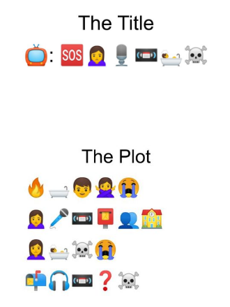
I think Sasha and I have different interpretations of the word “plot” in relation to this assignment. While Sasha succinctly used emojis that represented the show’s beginning, middle, and end, I used emojis to show the movie’s full sequence of events. I think I may have also been influenced by the image of the excerpt from Emoji Dick on the Task 6: An Emoji Story page on Canvas. Seeing the sentence-by-sentence breakdown in this image led me to think about how I could communicate the story of Mulan, my chosen movie, in a similar fashion. I started typing out emojis for certain scenes, and it evolved from there. I’ll admit that I may have gone a little overboard with all of the details I included in my emoji plot, but I remembered so much from the movie that it felt wrong to remove any of the scenes once I had already written them out using emojis. Sasha’s minimalistic approach to this assignment is in stark contrast to my detailed rendering.
Tools Used
Another difference lies in the tools that we used to craft our emoji stories. Sasha used an online emoji keyboard, emojikeyboard.io, to create her emoji story, whereas I used the Notes app on my iPhone. While the emojis are technically the same on both apps, their appearances are different. This does not change the meaning of the emojis we chose, but for me, it changes the feeling they evoke. When I think of emojis, I immediately think of the emojis on the iPhone keyboard. Any other type of emoji, such as the Android emojis, look “off” to me. I think this is because I am an avid emoji user via text, and I have been on Team iPhone for the past eight or so years. I tried using the emoji keyboard online, because, in theory, I thought it would be more user-friendly. I was mistaken, however, as the different appearance of the emojis really threw me off. I found myself looking harder for emojis that I would have had no problem finding on the iPhone emoji keyboard, and it did not take me long to switch back to my tried and true iPhone emojis. One of the key issues I had with emojikeyboard.io was that you could not change the hair colour of the people emojis. From what I understood, you could change the skin colour, but not the hair colour. This likely did not affect Sasha’s emoji story much, but for my story, I wanted to make sure the emojis looked as much like the characters as possible.
End-User Interface
I appreciate that Sasha’s website is clean and easy to navigate. One noticeable difference between our websites is how our posts are categorized. At the top of Sasha’s website, the user is able to navigate the contents of the website by selecting from three menu options: About, Linking Assignments, and Tasks. When I went to the Tasks tab, I immediately noticed the drastic difference in layout compared to my website. You can scroll through all of Sasha’s tasks just by clicking on the Tasks tab, whereas on my website, each task is separated into its own post. I think this feature of Sasha’s website communicates that the tasks all work together to form a cohesive whole, rather than being truly separate entities. At first, I wasn’t sure where the “Comments” section was on Sasha’s website, and I scrolled all the way to the bottom of the Tasks page to see if the comments accumulated collectively at the bottom. I then realized that the comments on Sasha’s website are labelled as “Thoughts,” and you have to click the title of the task or the “Thoughts” hyperlink to view the post in isolation. This differs from my website, where all of my tasks and links are previewed on my home page, and you are able to click into the posts to view them. Neither of our approaches are “right,” they are just simply different. I appreciate seeing all of the many ways that my peers have put together their websites for this course!
Sasha’s Website
